
Visualizing $1 Trillion
Elon Musk is the world’s first trillionaire, and SpaceX’s current valuation is $2.1 trillion. Students may use this example to find ways to visualize large numbers for their audiences.
The Wall Street Journal published creative, interactive graphics. The authors use three examples: a slider, scrolling down a page, and numbers of pennies.
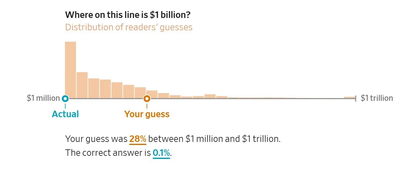
The slider and scrolling are nifty ways to show how much more $1 trillion is than $1 million—one million times more. My guess along the slider was completely off.
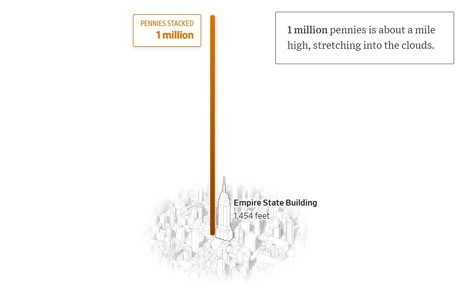
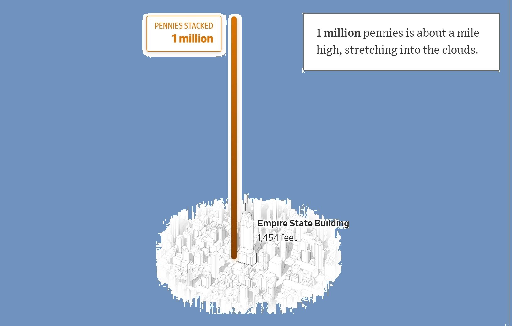
The number of pennies creates a fun illustration, but a billion is too tall to show in this graphic. Also the comparison doesn’t seem to relate to a point. Instead, students may be challenged to think of other ways to visualize $1 trillion. Comparisons should support their communication objectives. Here are a few examples:
IPO success: Compare SpaceX’s valuation to Meta’s IPO valuation.
Market domination: Compare SpaceX’s valuation to that of established Magnificent 7 companies.
Global wealth: Compare Musk’s net worth to the net worth of all billionaires.
Income inequality: Compare Musk’s net worth to that of the average American citizen.
Concentrated wealth: Compare Musk’s net worth to a country’s GDP. (This is a common numerical comparison.)
Government spending: Compare Musk’s net worth to federal budgets for NASA, education, etc.
This exercise may help students translate other numbers in their proposals and presentations, for example, visualizing excessive spending. Of course, they may find ways to normalize large numbers, for example a capital expenditure, if that serves their communication objectives. For Elon Musk’s wealth, that might prove difficult.
Comparing Artists’ Statements about Freedom 250

Students might compare how performing artists communicated their decision to withdraw from a Freedom 250 event.
The same day the Great American State Fair concert on the National Mall was announced, several artists changed their mind about participating. Some said they were misled, believing the event wasn’t as non-partisan as initially described to them. Here’s the description on the Freedom 250 website:
Freedom 250 is the national, non-partisan organization leading the celebration of our Nation's 250th birthday. Working together with the White House Task Force 250, federal agencies, and the Commission, Freedom 250 serves as the official public-private partnership that connects, aligns, and amplifies national and local efforts to deliver the defining presidential moments of this anniversary year.
At its heart, Freedom 250 is creating a movement of citizens, organizations, companies, and leaders from across the country to honor our Nation's proud history, cherish our God-given freedoms, and build the Golden Age of Opportunity for the next 250 years. Other signature events include the Great American State Fair, Memorial Day Parade, and Evening Candlelight gathering, Sail4th 250, Salute to America (DC July 4), and the Patriot Games, among others.
Here are statements to compare and a few distinguishing elements. Links to full posts illustrate disconnections in some, jumping from the decision to a global statement without any substantive rationale.
Brett Michaels: Emphasizes concern for fan safety and failing integrity—inconsistency is messaging—of event organizers.
“Concerns have also been raised regarding the safety of my fans, band, crew, family and myself, including threats that are completely unfounded and unforgivable.”
“Unfortunately, what was presented to us as a celebration of our country has evolved into something much more divisive than what I agreed to be part of.”
Martina McBride: Also emphasizes integrity—in this case, consistency between her actions and her songs.
“It greatly upsets me that any fan who has been moved by my music may now feel like I’m abandoning the meaning behind those songs.”
Young MC: Also says he was misinformed, although students might question why he and others didn’t know the event was “Trump backed.”
“The artists were never told about any political involvement with the event. And despite the claims by the organizers that the event is non-partisan, SPIN magazine describes [it] as Trump-backed.”

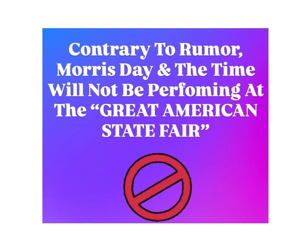
Morris Day: Says little but posted this image with jarring colors, an outdated circle-slash, (likely) Cooper-Black font, and the caption, "It's A No For Me.”
The Commodores: Published a statement about their values, as others do.
"Our music has always been our voice, and we choose not to publicly affiliate with any single political party. We support the betterment of all Americans."
Students may find more posts and analyze them for their own illustrations of character as well as inconsistencies and reasoning gaps.

Viral Staples Videos

Staples has an employee turned social media star with fun viral videos. The “Staples Baddie” Kaeden Rowland somehow makes office products look interesting.
In this video with 5.7 million views, she explains how to make a signature stamp.
Rowland says she’s autistic and wanted to show her work as a print specialist:
I was like, How can I make people really feel, not just see, the passion I have for these stationery office products?

Staples leadership supports her authentic videos, which we might expect given her following. User comments include, “You are single-handedly saving staples,” and “omg are you the staples baddie i saw someone do a presentation in their class about????” The Staples social account engages on some videos, as you see here.
An engaging class project can ask students to develop a video series relevant to a brand that could go viral. What might make the videos take off? How would they ensure that the series aligns with brand values? What are the risks and challenges?
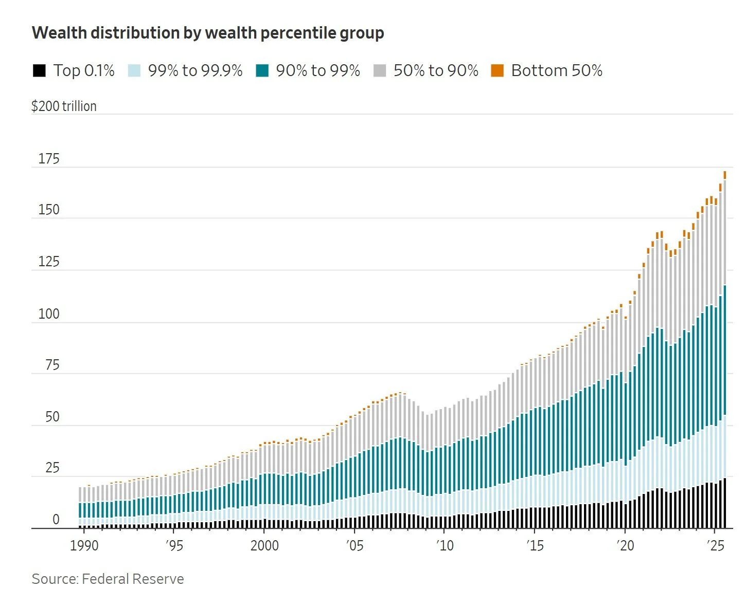
Problems with a Stacked Wealth Chart
Students might find better ways to display data than this stacked chart showing U.S. wealth distribution over time.
The chart in the WSJ article, “Billionaires’ Low Taxes Are Becoming a Problem for the Economy,” shows that wealth has grown tremendously over time and that those with the most wealth have accumulated far more over time. But the comparisons are hard to see with the stacked area chart. We’re missing percentages of wealth. Because the point is “distribution,” we want to know the share of each group. We don’t know by looking at this chart.

The WSJ chart emphasizes numbers (not just relational data) over time, both in the interactive mouseovers of specific data points (which show dollar amounts) and in the tiny vertical columns, which makes the chart both more precise and uglier.
Compare that version to the original, a Federal Reserve chart. Also a stacked area chart (click to enlarge), but this one uses solid colors to reflect distribution and places the lowest 50% at the bottom, where, intuitively, we might expect them to be. That bottom placement also shows at least some wealth of that group (instead of the mere orange specks at the top of the WSJ’s chart).
The default of the Fed chart is “units” (top left), but a toggle shows shares for percentages. The mouseover is more useful, showing a summary of percentage (or dollar amounts on the default chart) at any point. However, visually, the differences don’t look as dramatic as they are because the growth in dollar amount is so much higher than the percentages. We don’t see the writer’s point:
The bottom half of American households have lost ground. Their 2.5% cut of the country’s wealth has slipped from 3.5% in 1990.
Curiously, this note at the bottom of the WSJ article shows how people conflate percentages and numbers:
Corrections & Amplifications
An earlier version of the chart “Wealth distribution by wealth percentile group” incorrectly had a percentage sign instead of a dollar sign on the y-axis. (Corrected on Feb. 19.)
Another point may be worth mentioning with students. We’re talking about inequality, so numbers of households—people—might be included somewhere.
From the Fed’s data file, I asked ChatGPT to create an indexed line chart. This sets all group values in 1990 at 100 for an equal starting point—a way to show comparative growth over time. The chart labeling doesn’t follow business communication principles, but now we see what has happened since 1990. This chart far more clearly illustrates a main point of the WSJ article:
Only the richest 1% of households have grown their share of overall U.S. wealth since 1990.
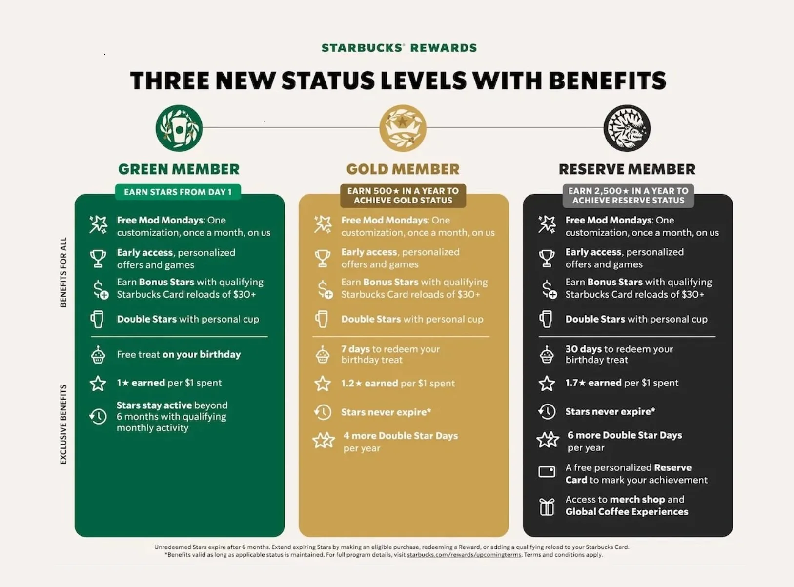
Starbucks Communicates New Rewards
Starbucks changed its rewards program, reinstating tiers lost in 2019 and adding yet a higher status. The program encourages customer engagement, a good topic for business communication students in addition to analyzing the company’s language and graphic choices.
As always, customers earn “Stars” for buying stuff—more stars for more expensive stuff. But the company is moving away from everyone earns equally back to levels: Green and Gold, as in the past, and the new one, Reserve.
The word reserve deserves attention. I’m on the finance committee of a nonprofit organization, and we pushed back on our financial advisor for using “reserve” to describe our short-term investment fund. To some of us, the word would more appropriately describe our long-term fund: something stored away, not used unless necessary.
The Starbucks level follows this thinking. Reserve implies high social status, which is appropriate for Starbucks’ increased divisions. Wildlife and nature reserves are protected, exclusive areas. Only Reserve members receive a personalized card to flaunt while waiting for a latte. Of course, what isn’t stated is that those in the lowly Green and Gold categories receive rewards at lower rates, therefore devaluing rewards for most customers.
The three tiers are clearly explained in this graphic. Black indicating the highest level aligns with marketing we see in other industries, for example, “Black Label” Johnnie Walker and the American Express Centurion “Black Card.”
The global chief brand officer explained the focus on engagement:
We’re redefining the industry with customer-focused benefits that set a new standard and ignite fandom. Starbucks Rewards has always been about creating connection, and we’re evolving the program based on what our members told us matters most, offering faster, more meaningful benefits that make them feel appreciated. This evolution is a key milestone in our Back to Starbucks strategy and will reinvigorate what it means to be a Starbucks Rewards member.
Critics say, as the company encourages use of the app, customer data is collected with every click.
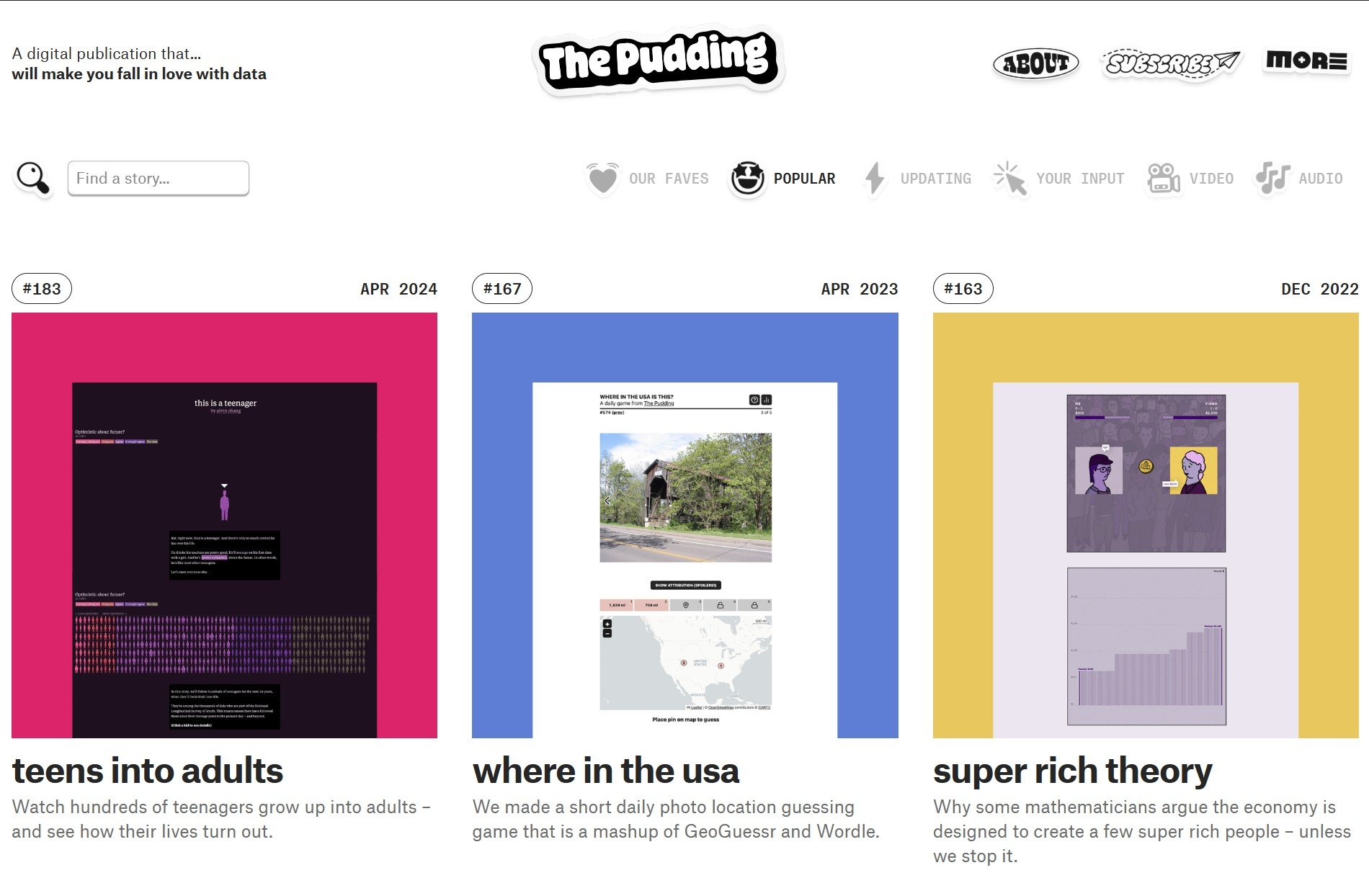
The Pudding: Visualizations
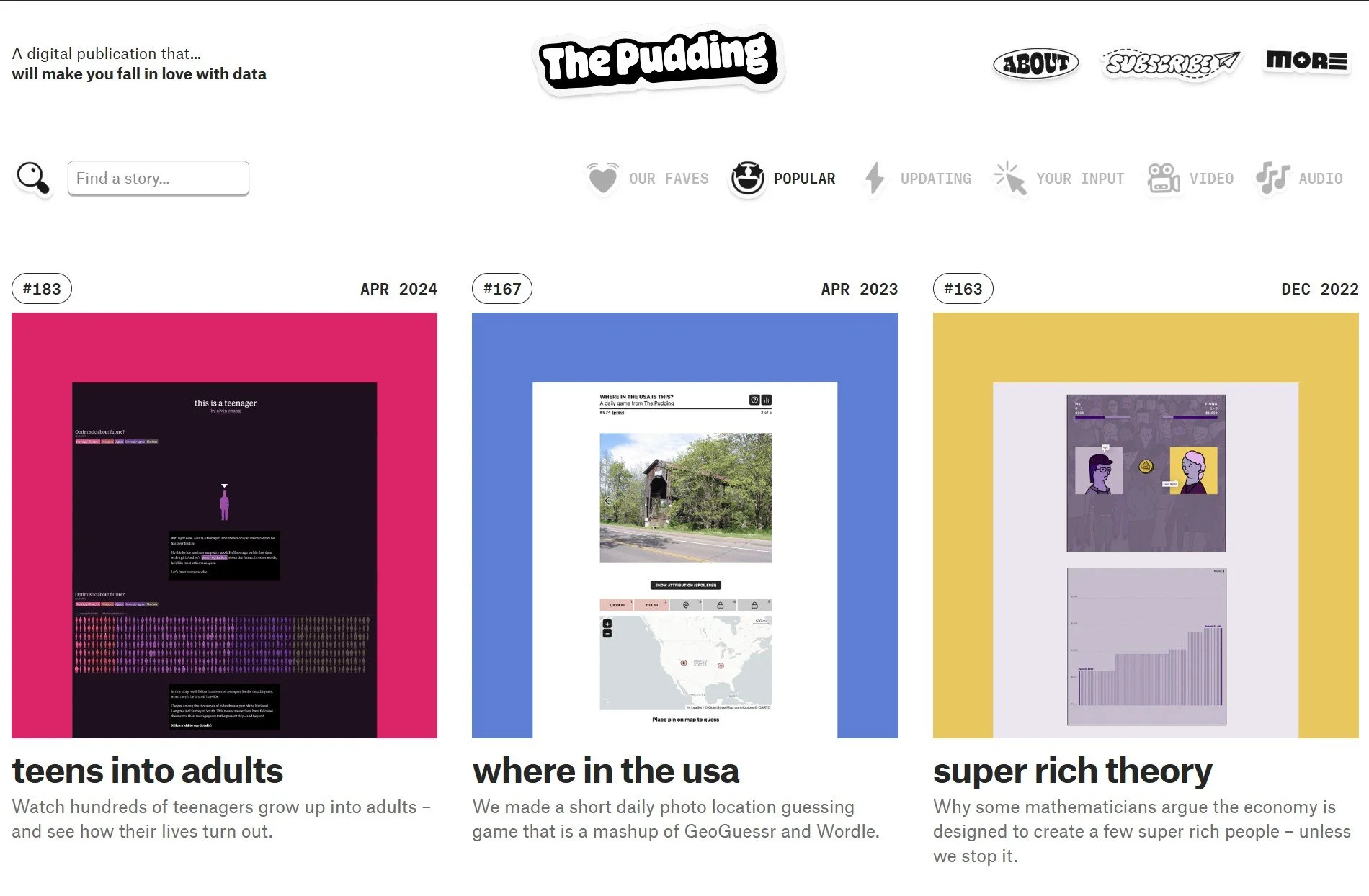
The Pudding is a treasure trove of visuals for business communication classes—and a great way to pass a day. Here are a few that might interest students:
Students might explore a few of these or others on the site, and then reimagine a visual for a class project.
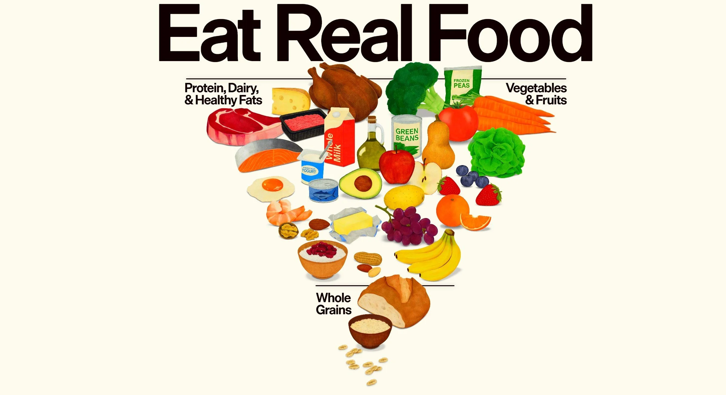
New Dietary Guidelines Website

The new U.S. dietary guidelines are represented visually on a website, realfood.gov. Students can analyze the content and graphics for the primary audience of Americans.
Here are a few points students might identify:
Clear, simple language appropriate for the audience. “Real Food” is a consistent message, and the summary works well upfront:
Better health begins on your plate—not in your medicine cabinet.
The new Dietary Guidelines for Americans defines real food as whole, nutrient-dense, and naturally occurring, placing them back at the center of our diets.
Colorful, but navigation doesn’t work well. Lots of graphics engage the user, but some of the graphics don’t work quite right, at least on my screen. Numbers in red boxes increases with each click without new corresponding text. The static text, “America is sick. The data is clear,” shows for several increasing percentages, so the data isn’t clear. When I tried the mouse instead of keystrokes, I got a blank red screen.
Consistent messages. Language reinforces the connection between diet and health throughout:
90% of U.S. healthcare spending goes to treating chronic disease—much of which is linked to diet and lifestyle.
Debatable evidence. WIthout sources, the user can’t research claims further. Above is a good example we might want to explore, particularly what “much” means in this context. Also, the “links” are quite complex and vary by person.
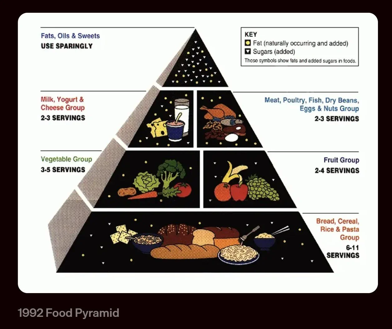
Misleading history. The site includes a food pyramid from 1992, shown here, which has been updated. Also, the associated text doesn’t match the situation then or now:
For decades we've been misled by guidance that prioritized highly processed food, and are now facing rates of unprecedented chronic disease.
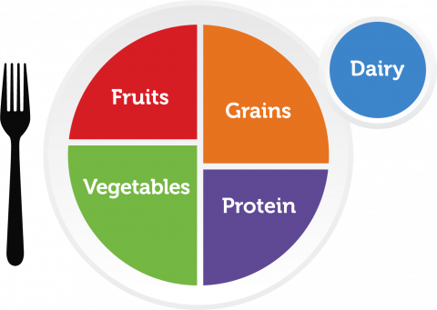
Nowhere do the 1992 guidelines or any since, including the simplest and most recent, MyPlate, recommend processed foods.
Simplistic FAQs. Expanded boxes at the bottom of the site include silly questions and answers, for example:
What about hydration?
Hydration matters. Choose water or unsweetened beverages to accompany meals and snacks.
Few disagree with the push for real food and fewer preservatives. But critics question the emphasis on animal protein—the environmental impacts and the dangers of over-consuming saturated fat and sodium. In addition, the “inverted pyramid,” with its clipart food images, doesn’t offer guidance for limiting quantity or balancing of food choices, which MyPlate tried to address. Finally, the high cost of food makes the recommendations for some families difficult or impossible to follow.

Analyzing an Opinion About Climate Disclosure
Students can analyze and debate an argument that Zillow should include climate risks on real estate listings. The situation raises questions about integrity—transparency in communication and consistency.
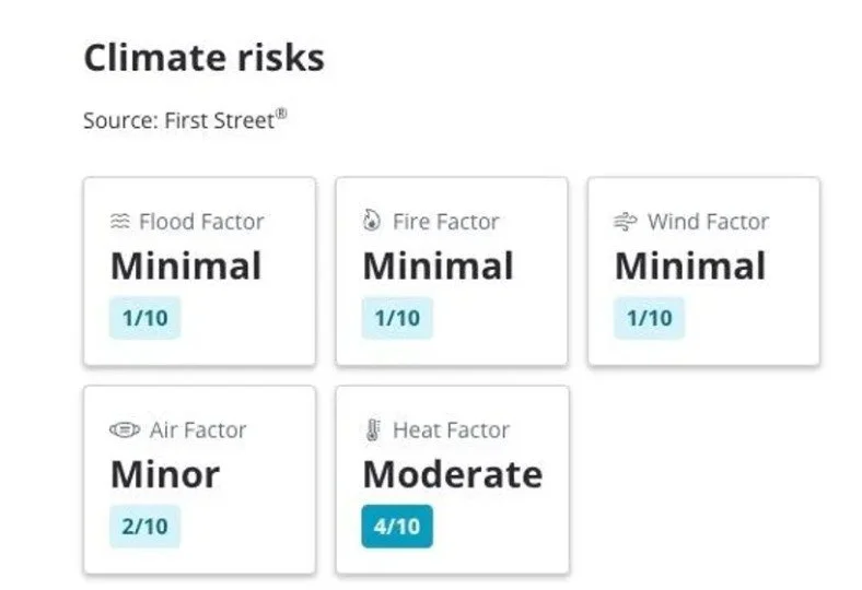
In an opinion letter, a nonprofit climate marketing executive argues that, despite pressure, Zillow should reinstate information about flood, wildfire, air-quality, and other home risks (shown here). Critics (mostly realtors and home sellers) argue that disclosures affect home prices.
This situation is ripe for student analysis and research. They might pursue questions such as the following:
Do home buyers want to know climate risks of homes for sale? What do they say are the reasons and how the information might affect home buying decisions?
Related to the first question: What is the reality? How does knowledge of climate risk affect home prices and home purchases? For example, how does location factor in, for example, whether people are looking locally or nationally?
Should home sellers be required to disclose climate risks? What are the ethical arguments of disclosure from the sellers’ perspective? How does this argument balance the consumer’s right to know?
Research mandated disclosures by U.S. state.
Zillow’s information, from the risk-modeling company First Street, has been questioned. How can we measure the quality of the data?
What are the strongest and weakest arguments in the opinion piece?
How does the opinion writer use logical arguments, emotional appeal, and credibility to persuade the reader?
To what extent does displaying or removing climate risk information align with or contradict Zillow’s mission? How is this a potential issue of integrity?
These assignments involve ethics, integrity, data, and persuasive communication. Students also might be interested in this topic for their own future—whether they buy or rent in an area vulnerable to climate events.

Comparing Elon Musk’s Likely $1 Trillion

We teach students to help audiences grasp large numbers, and Elon Musk’s wealth is a good example. What is the value of $1 trillion, a number Musk is estimated to hit in the next decade given his current $475 billion? How can we everyday people wrap around what this type of wealth?
One approach is to compare data to concrete purchases or costs. CNN provides a few examples, and students might identify their own:
Every car sold in the United States in 2024
Five times the total endowments of Ivy League universities
Every house in Hawaii
Another approach is to create a visual. In this example, students might question the $100 bill and stack of bills, which are out of line with the other graphics. Also, this visual shows what $1 trillion looks like but not the value. Students will find other creative visualizations.
The exercise encourages students to put their own data into perspective. For example, tons of emissions, wasted food, corporate travel expenses, etc. The closer the comparisons are to the data point, the more reasonable—and the more likely the audience may be persuaded to, for example, upgrade computer systems instead of travel for in-person meetings.
Slop Videos in Business Communication
Students might be entertained by slop videos, but they should consider the dangers of this new technology, including misuses in business communication.
Slop videos are low-value, AI-generated content designed to get clicks and views. They have little creative value or other purpose. Apps like OpenAI’s Sora makes it easy to spit out repetitive scenes both banal (a cat driving a car) and frightening (Hitler spewing hate). AI tools like Sora label content, but it’s small, and already people found ways to remove the mark.
Students might defend this content, but a classroom discussion could explore potential harms, particularly related to course topics. Here are a few examples of how slop could be used against companies:
Misuse of brand identities
Fake ads promising results products can’t deliver
Deepfakes of company leaders
The potential consequences for companies follow:
Reputation damage
Difficulty establishing credibility and building trust with authentic content
Reduced engagement
Increased legal expense
Diminished creativity and professional standards to compete with slop for engagement
Other harms are worth discussing, for example, the tremendous energy demands, an increasing shift towards quantity over quality, and, at its worst, a slow degradation of reality.
OpenAI’s blog post, “Launching Sora Responsibly,” acknowledges the tip of these harms. But students may see limitations in the plan, just as we see limitations in how Meta manages content on Facebook and Instagram.

Blunt Signage
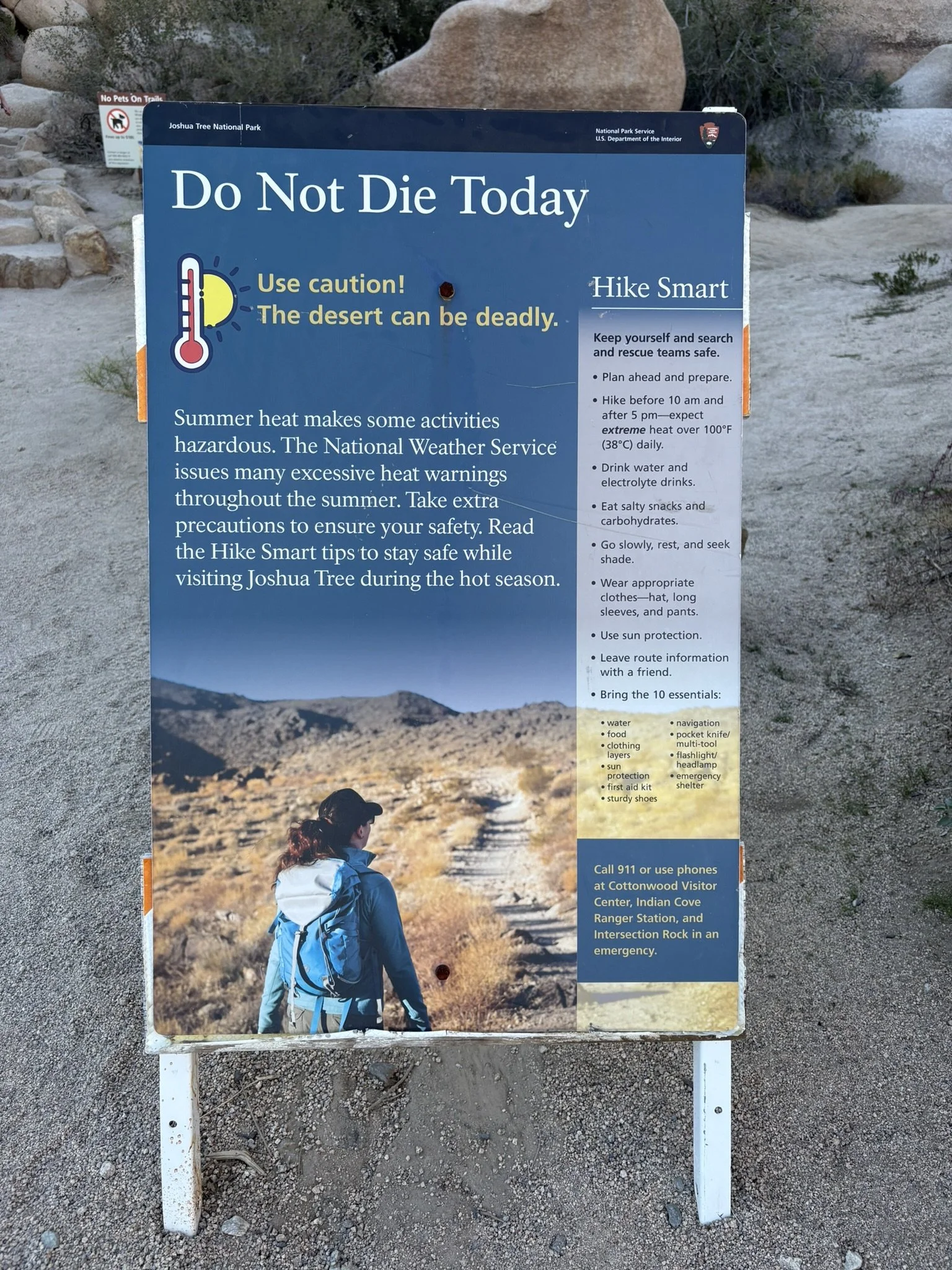
Signage near Joshua Tree National Park is direct. Students might analyze this display board, shown at the visitor’s center and at the beginning of a trail, to find the following and more:
What Works Well
The title certainly catches the eye and encourages visitors to read more.
The thermometer and sun graphic show the issue.
“Hike Smart,” at right, is catchy.
The bullets, at right on the lighter background, are parallel and provide useful information.
Although not essential, the woman on the path adds visual interest.
The “10 essentials” are clear and cleverly placed on the lightened terrain.
Overall, the visual balance and colors work well.
What Could Be Improved
The paragraph text in reverse type is hard to read and not necessary. The first sentence states the issue, but the others don’t seem to add value.
The long list of bullets and 10 essentials might be categorized in some way.
Much of the information is useful only before we reach the park.
Is that a bullet hole at the top? Not sure what happened there.
The suggestion to call 911 is moot; the park has almost no cell service.
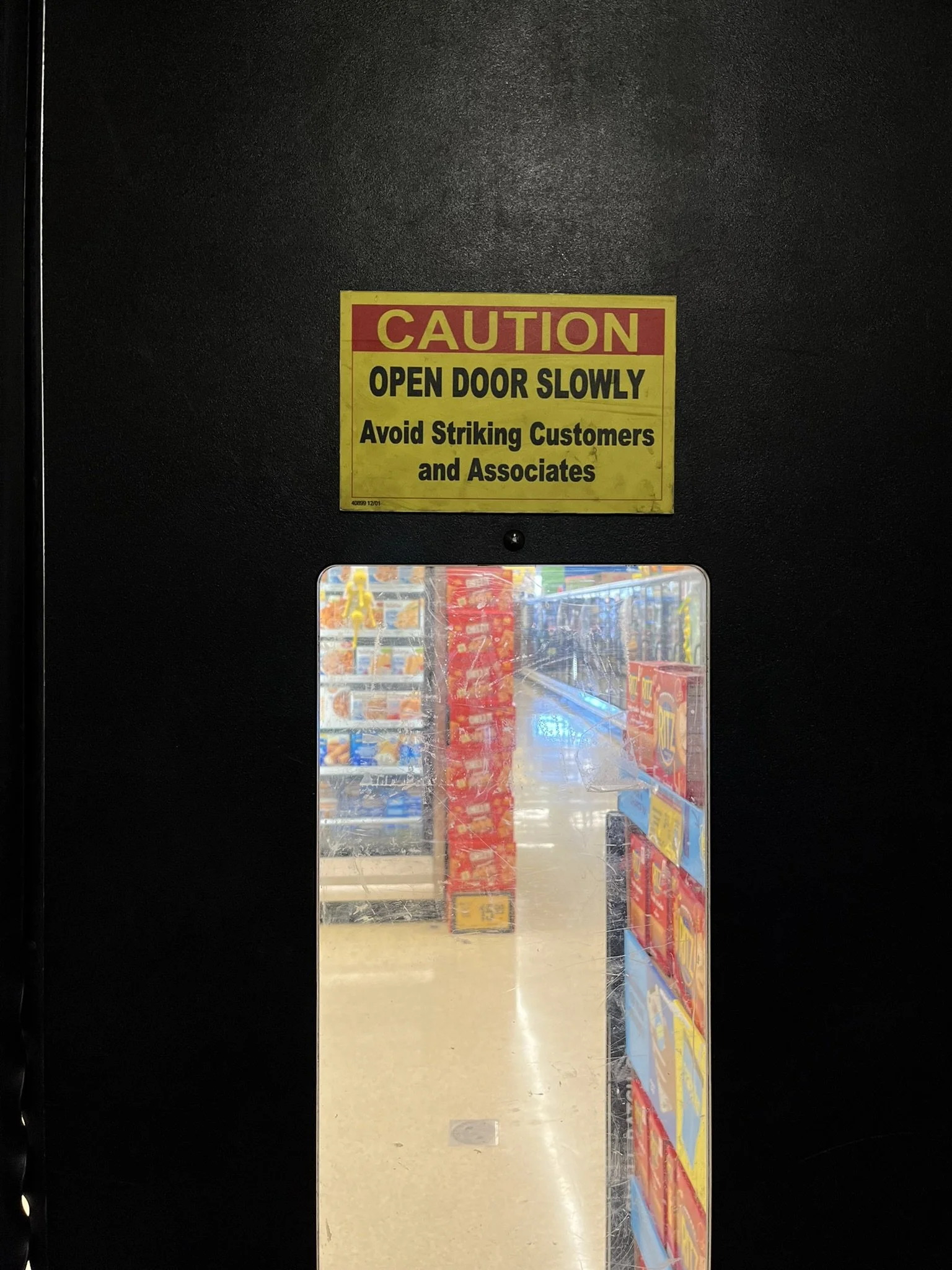
The second sign, in a Vons grocery store, appropriately warns people against swinging a door open from a back room. Maybe “hitting” would work better than “striking”? Either way, the advice is good practice, regardless of the door swing.

In Charts: Disappointing Summer Movie Sales
Students can analyze charts and create their own to illustrate that moviegoers are venturing out less and less for the summer theater experience.

The first chart, created by the New York Times, is attractive and, focusing on just the top five movies each summer, gives us an idea of movie results. Here are a few issues students might find:
Movies six through ten could have had good results that significantly change the comparisons. For example, in the bar and line charts, below, we see that total 2023 box office sales were higher than 2024, which doesn’t show here. But if the goal is to focus on only a few movies, then, at a glance, we can see the winners and their contribution to the group.
Years 2020 and 2021 are missing, which makes sense because theaters were closed for much of that time. But omitting them entirely from the X axis may be misleading.
The chart includes a subtle organizing principle: the biggest hits are at the bottom. But the progression is difficult to see because several others are close in sales. Wider white dividing lines might better distinguish each movie.

The second chart from the NYT represents total box office sales dating back to 1980 with all years included. The bars provide a specificity that ChatGPT’s 2010-2025 line chart, below, doesn’t. (ChatGPT’s first version didn’t adjust for inflation, so the numbers didn’t quite match.) With the line chart, we see the downward trend since around 2015 more clearly. With the bar chart, we see more dramatic changes, for example, drops between 2013 and 2014 and between 2016 and 2017. These moves either don’t show on the line chart as clearly or, quite possibly, ChatGPT has a data issue. Without data labels on both these charts, nuance is difficult to see.
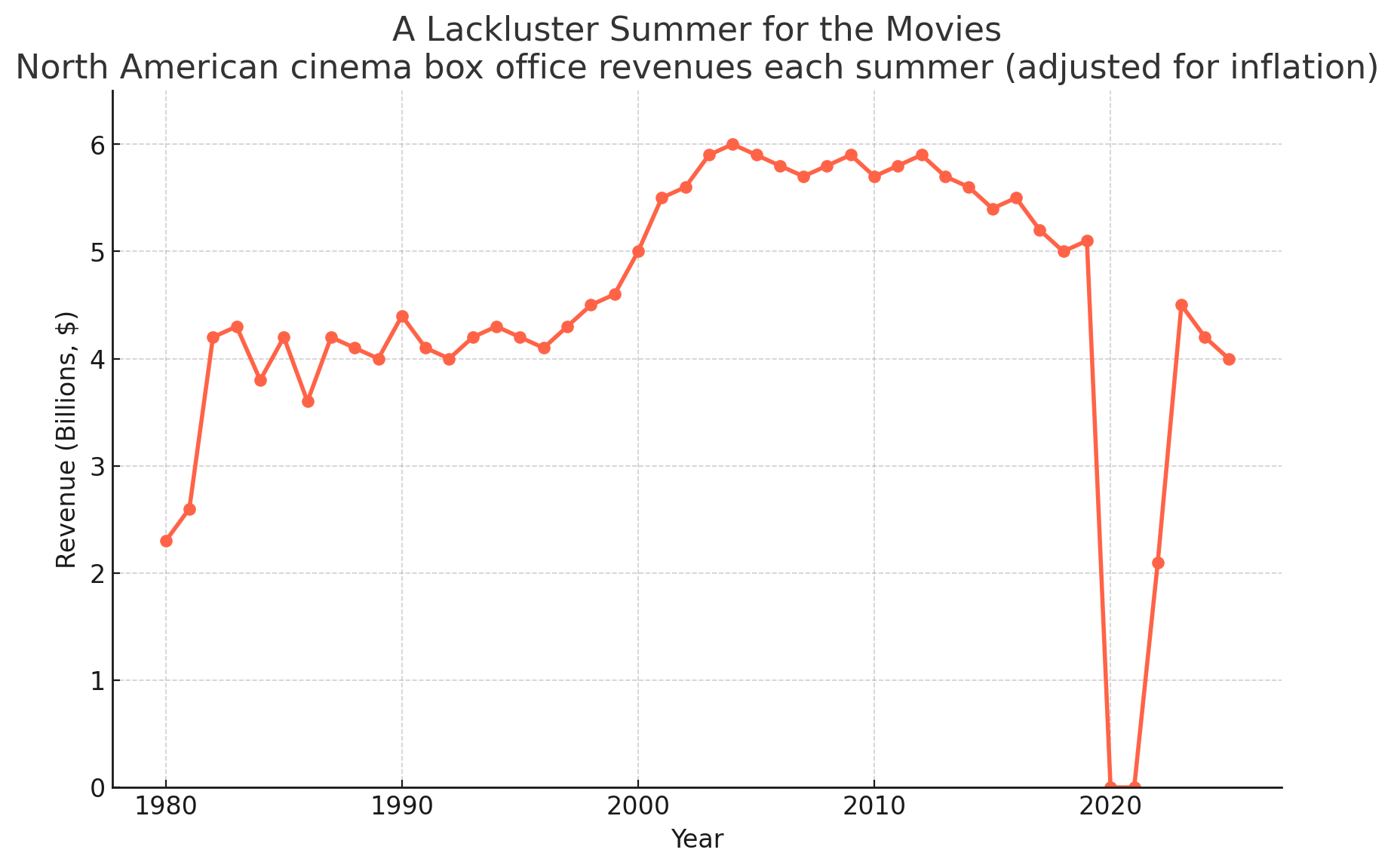
Comparing the bar and line charts illustrates the importance of choosing a graphic for the purpose and audience: a focus on results from each year or a trend over time. Either way, the news isn’t good for an industry trying to make a comeback.
Students might create their own charts. They might have fun comparing box office sales for their favorite summer movies or showing where theaters get their revenue. Superman cost me $12 for two matinee movie tickets and an embarrassing $24 in snacks. Despite high-margin extras like popcorn and soda, audiences who visit a few times a year won’t sustain a local theater. Clearly, Nicole Kidman’s AMC ad, spoofed by SNL, didn’t convince us to leave our houses for “the indescribable feeling we get when the lights begin to dim.”

“Rigged” Data Questions in Business Communication
Without getting too political, we could talk with students about what “rigged” data might look like in a business setting. President Trump used the term to explain his firing of the Bureau of Labor Statistics (BLS) commissioner.
Students might first review the BLS report, “The Employment Situation.” Then, they might read an interview with Cornell University Economist Erica Groshen, who was the BLS commissioner for four years during President Obama’s administration.
Data integrity refers to its accuracy, completeness, and consistency over time. In the interview, Groshen disputes claims by highlighting the BLS’s rigor (choreographed, specific roles) and repetition (consistency):
With regard to allegations of altering the data, the process is highly, highly choreographed, with tight deadlines. BLS does this every month, and everybody knows who needs to do what job on what day to get this out on time.
Without getting into the details of the jobs report, students might explore potential “rigged” data in other contexts. What does “rigging” mean? Although a colloquial term, we could interpret it to mean falsifying or manipulating inputs or presenting results to intentionally mislead.
Some examples are obvious, but others are not so clear-cut. For example, at what point could apple polishing, cherry picking, or comparing apples to oranges legitimately be labeled rigging data? If one month of weak sales data during a product recall is omitted from a line chart, is that rigging the data? How about if a rural location is compared to an urban location? On a dating app profile, if someone claims to be 5’ 11” when they are 5’ 10”, is that rigging data? What if they’re 5’ 10.2'“?
Students might consider the consequences of data reporting. Manipulating drug testing results is clearly different from exaggerating customer feedback about a food truck start-up. Students might discuss plans to ensure accuracy in their own data reports—and the consequences of inaccuracies or omissions.

Google’s Defense of AI Search
A blog post by VP, Head of Google Search, Liz Reid illustrates persuasive strategies and data interpretation to deny the negative impact of AI search features on website traffic.
Although reports find that Google AI search summaries reduce clicks to news and other sites, the company argues that is not the case. In a blog post, Reid writes, “user trends are shifting traffic to different sites, resulting in decreased traffic to some sites and increased traffic to others.” A TechCrunch writer describes the rhetoric well:
That word “some” is doing heavy lifting here, as Google doesn’t share data about how many sites are gaining or losing. And while chatbots like ChatGPT have certainly seen traffic increase in recent months, that doesn’t mean online publishers aren’t suffering.
In business communication, we encourage students to find more precise words than “some” and “very.” Here we see Google hiding behind vague references and aggregate data to mask the impact on publishers. Reid also wrote, “overall traffic to sites is relatively stable.“
Reid claims, “AI in Search is driving more queries and higher quality clicks.” Google argues that click “quality” is improving, meaning people are more purposeful, engaging longer on sites they choose for a reason instead of responding to clickbait. That may be, but organic searches (from unpaid sources) is still down for “some” news outlets already hurting because of declining print and digital subscriptions.
If users get their questions answered from the AI summary, why go to the original source? Students might discuss what, if any, responsibility Google bears for compensating content creators.

McDonald's Quarterly Earnings Report and Comm Strategies

McDonald’s had a good second quarter, with global sales up 6%. Students could analyze the report formats and communication strategies executives used during the earnings call.
One lesson for students is the multiple communication channels and report formats McDonald’s published to communicate its quarterly earnings. The press release, quarterly report in four formats (PDF, Zip files, HTML, and Excel), and recorded Webcast earnings call (and transcript) are all open to the public and convey a consistent message, which is upfront in the press release:
Our 6% global Systemwide sales growth this quarter is a testament to the power of compelling value, standout marketing, and menu innovation—proving again that when we stay focused on executing what matters most to our customers, we grow. Our technology investments and ability to scale digital solutions at speed will continue to elevate the McDonald's experience for customers, crew, and our global System.
Any question and answer during the earnings call provides examples of communication strategies. For example, executives use what we might teach as hedging or tentative language (“I think”); however, students can see these responses employed strategically. They persuade the audience by demonstrating humility and credibility—qualifying responses to show a cautious approach and, in effect, saying, “I don’t know everything.” This language also protects an executive whose prediction turns out wrong, and it conveys a conversational tone to build trust.
Although the news is good, the first question challenged the company’s reliance on “value,” particularly in the United States, where families are under increasing financial pressure. Here are the first question and answer as an example from the transcript (my notes in green italics):
David Palmer, Analyst, Evercore: Thank you, and thanks for all of your, comments. Sounds like you’re still exploring ways to bolster value perception in The US. Ahead of anything there, you know, could you just speak to where you think McDonald’s value and affordability scores are today in The US? You know, perhaps before and after Snack Wrap and your recent McValue menu changes. You know, where is the consumer perception today versus McDonald’s in the past and versus near end competitors and maybe even fast casual competitors?
And and if there’s a difference between The US perception in terms of value versus other key IOM markets, would love to hear about that as well. Thanks so much.
Chris Kemczynski, Chairman and Chief Executive Officer, McDonald’s Corporation: Hi, David. It’s Chris [builds trust with first names and a friendly tone]. Thanks for the question. I think [demonstrates conversational style and humility with hedging language] when we talk about value, it’s important that we we really break it down and and get very specific about the different consumer segments. And I’ll start with, our most loyal consumers, and these are the ones who are on our loyalty program [previews content].
Roughly a quarter of our business in The US is on our loyalty program [frames the response and emphasizes return business]. And what we see is if you [conversational style] are a loyalty member at McDonald’s, we have we have exceptional value and affordability scores amongst those consumers. And probably that’s most evidenced by what I shared in in the prepared remarks, which is the uptick that you see in terms of frequency when we have a loyal consumer in our loyalty program going from 10 roughly 10 visits to 26 visits. So I think [again] with our loyalty members, our most ardent McDonald’s customers, we’re in a really good position as it relates to value [reinforces “value” throughout] and affordability perception. If you move then to the McValue program, McValue is working.
And if you think about what we have with McValue, we have the $5 meal deal, which is the anchor for that. That continues to perform very well for us. And then we also have the buy one, add one for a dollar program. What’s interesting is [highlights what’s important] those two programs are very complementary. If you look at consumers who are using both, it’s only about 8% or so who are actually using both.
So they’re going after two very different occasions, two very different users, but compelling to both. So I feel good about the loyalty program. I feel good [uses anaphora to emphasize his confidence] about where we are with McValue. But the issue or the opportunity is if you add those two up, that’s, call it, roughly 50% of the business. And we know there’s the other 50% that today isn’t coming into our restaurant, isn’t using McValue, isn’t using the loyalty program [anaphora again], and that’s where we have the opportunity, which is around core menu pricing that we talked about in our prepared remarks [transitions to an “opportunity”—is more direct in the next section].
Today, too often, if you’re that consumer, you’re driving up to the restaurant and you’re seeing combo meals could be priced over $10 and that absolutely is shaping value perceptions and is shaping value perceptions in a negative way. So we’ve got to get that fixed [addresses concern directly]. As I mentioned in my remarks, we’re having, I think [again], very active and productive conversations with the franchisees. But the single biggest driver of what shapes a consumer’s overall perception of McDonald’s value is the menu board. And it’s when they drive up to the restaurant and they see the menu board, that’s what’s shaping the that’s the number one driver. [Could be clearer, but the gist is that the low-priced meals are good sellers, but pricier menu items negatively affect consumer perception.]
So we’ve got more work to do on that in The US. I’d say on the IOM [international operational markets—insider abbreviations for the audience] side of the business, we’re in a better position on that. Part of it is, as I mentioned in in the remarks [Fourth time he refers to the remarks—could demonstrate consistency/integrity] as well, we have a really strong EDAP program in all of our markets. So these are essentially $1 $2.03 dollars $4 euro pound whatever the currency is. But that is proving to be a very strong addition to the value programs in the IOM market.
And then also, as I mentioned, our operators there have been very prudent and I think [again] are doing the right things to make sure that our core menu pricing continues to be at leadership levels in the market. I would just note [tentative language], also on our international side, it’s not as competitive a market as it is in The U. S. There’s a lot of different players in The U. S.
We don’t face the same breadth of those players or competitors in our international markets. And so I think it’s a little bit easier for us to stand out and represent good value in international.

Passive Investing in Charts
Simple charts illustrate passive and active investing. A new documentary, “Tune Out the Noise,” which The Wall Street Journal calls “a nerdy and genuinely engrossing documentary about investment strategy,” might interest finance and other business students.

These two charts show the total net assets and the net asset flows of active and passive investments over time. The area chart is a useful way to illustrate the percentage of total assets, while the line chart illustrates dollar value over time, clearly showing a shift beginning around 2005.
This might be an opportunity to explain the difference between active investing (trying to outperform the market, which may involve frequent moves and higher costs) and passive investing (buying and holding stocks for the long term, often in index funds with lower fees). A WSJ article raises questions of humility for active investing:
Picking stocks is at heart an arrogant act.
It requires in the stock picker a confidence that most others are dunces, and that riches await those with better information and sharper instincts.
A class activity or assignment could ask students to research and create visuals for active and passive investments over time. Results seem to vary by asset class. For example, a recent Morningstar analysis found higher long-term success rates of active investing in real estate, bonds, and small-cap equities, and the lowest rates in U.S. large-cap equities.
Comparing Stock Charts for Perspective
This was a bad week for the U.S. stock market, but graphics make the news look worse than it is. Students can compare charts to see how truncated axes affect perception.

Yahoo!’s monthly chart has a short range: 41,000 to 44,000 for this monthly line chart. With the red line and shading, the results look awful. Noting the 6.87% drop is helpful—it’s not great but not devastating either. For the 62% of Americans (varying largely by demographic group) who own stock in some way, their portfolios are unlikely to be invested 100% in DJIA stock, so their personal losses are probably smaller.

This one year chart, also Yahoo!’s, shows a more complete view of the market. Over a year, stocks were still in positive territory—green(!)—and the recent dip is in clearer perspective. Not that short-term investors and perhaps retirees shouldn’t be concerned, and we might be headed into a recession, but this chart recognizes the extraordinary gains in the past year as well as the recent losses.
Students can find longer-term charts to see an even fuller picture of U.S. stock market returns. They might also find, or need to create, charts with a Y-axis starting at 0.
As always, the data visualization depends on the audience and purpose. If your audience is television viewers, and your purpose is to engender fear, then short time frames and truncated axes do the trick. If you’re a financial advisor, and your audience is a client who is a long-term investor with a balanced portfolio, you would probably not show these charts at all and instead focus on their portfolio returns over time.
Jobs Report and Graphics

A Wall Street Journal article illustrates simple graphics for the latest jobs report and serves as a good discussion starter for students about their own prospects.

The classic bar chart shows non-farm jobs added over the past couple of years. Student might compare the Bureau of Labor Statistics’ presentation and the Wall Street Journal’s. Of course, the WSJ adds some color, including red to highlight the latest data point. But the axis ranges show the biggest differences. The WSJ pulled data back from 2022, forcing a larger x-axis range and including the uptick in 2022, which may imply more volatility and a lower number in 2025.
The BLS includes -100 on its x-axis—a good idea to illustrate potential losses, which of course, we see in longer-range job charts. For perspective on the current employment economy, these would be interesting for students to explore.
Students might create a different chart from the BLS data and tell their own story. Their story might involve a tougher time finding full-time employment, which is an obvious problem with these domestic averages.
A useful discussion is why the BLS and WSJ chose a bar chart for jobs added and a line chart for the unemployment rate. The bar compares discrete values each month, while the line chart shows the trend of a continuous data point over time. A line chart could work for jobs, too, and we’ll see this display as well. Students could search for “jobs added” and compare the graphics.
BCom Lessons From the VP Debate

The U.S. vice presidential debate offers business communication lessons in reporting, delivery style, evidence, and answering questions.
A large, top-of-page Wall Street Journal heading claims victory for J.D. Vance and highlights delivery skills: “Vance Confident, Walz Uneven in Debate Heavy on Policy.” Students might discuss how “confident” and “uneven” are assessed. What makes Vance sound “confident”? Does “uneven” refer only to Walz’s delivery style or to his overall performance?
The beginning of the debate (before I fell asleep) offers obvious examples of delivery. Tim Walz, the first to respond to a question, spoke slowly and hesitated during the first few sentences, repeated words (said “fundamental” four times in four consecutive sentences), and said “Iran” instead of “Israel.” Vance came out strong. Before answering the first question, he gave a mini-bio, including his difficult upbringing—relating to voters who also find themselves in difficult life circumstances.
Unlike the right-leaning WSJ, the left-leaning New York Times homepage requires scrolling past five articles about the war in the Middle East on the left-hand side before we see the headline: “Takeaways From the Vance-Walz Debate: Civility and Then a Clash Over Jan. 6.” If I recall correctly, the placement on each publisher’s webpage was about opposite for the presidential debate, which analysts reported as a victory for Kamala Harris.
Students can analyze CBS News’s fact-checking, presented in a video. The video allows for clips from the debate and nuance. We see a slider—not a yes/no—assessment of four points. The first, about opioid deaths, receives a “partially true” rating with an explanation of when data started to be collected and the percentage claimed. We don’t hear the sources of the claimed or the fact-checked data, and students might question the source of the fact-checking itself. Like any source, CBS News demonstrates bias, if not in the analysis, then in the selection of issues to check. Another news source would choose different “facts” to check. Regardless, the video—only 8 minutes to fact check the entire debate—could make for good class viewing.
Another relevant topic is how the candidates responded to questions. Three examples might be interesting to explore with students. First, Vance’s responses to the question about immigrants in Springfield, OH, which caused his mic to be turned off. Second, Walz’s response to his claim of being in Hong Kong during the Tiananmen Square protests. And third, that last question from Walz: “Did Trump lose the 2020 election?” For this question, Vance chose the classic communication strategy of deflecting the question, saying he wanted to stay “focused on the future,” and then transitioning to, “Did Kamala Harris censor Americans from speaking their mind in the wake of the 2020 Covid situation?" Of course, that is also is the past. Walz called his response a “damning non-answer.” Students might analyze what “damning” means in this case. Damning for what or whom?
Otherwise, the debate was more civil than many, with candidates pointing out areas of agreement throughout. This is worth students’ attention as well.
Bud Light Ad, Demographics, and Visual
An AdAge article describes a new Bud Light ad and references a movie from the 70’s, raising questions about the target demographic.
The scene is a dean’s office, with a student being accused of plagiarism. The joke is that others admit to failings just to get a cold bottle of Bud Light.
The AdAge writer describes “a scene recalling Dean Wormer admonishing the Deltas in Animal House.” Although the movie is of my generation, I have no memory of that scene and wonder whether others do. It was a cult film at the time, but still, the cohort is in their 60s now. Maybe students know the movie—or think the ad is funny regardless.

Bud Light’s target demographic is younger, according to this report:
While among Baby Boomer beer drinkers Bud Light has a brand popularity score around 30 percent, it’s almost 40 percent among Gen Z consumers. Similarly, around 40 percent of Millennials have consumed Bud Light in the past 12 months, as compared to 24 percent of Baby Boomer respondents.
According to this Statista chart, Baby Boomers consume less Bud Light than the other demographic groups. Students might redesign the chart. To be fair, the main point isn’t about consumption but is about all key performance indicators (KPIs) of the brand. Still, one obvious problem with the chart is the similarity of colors, which makes them difficult to distinguish in the legend. We’re also missing the total, which is greyed out in the legend. In addition, students might question the order of the KPIs on the x-axis, which, at first glance, appear to be in rough numerical order, but that doesn’t hold when we see the Buzz group. Maybe a radar or bubble chart would work better—or at least a horizontal bar.