
Blunt Signage
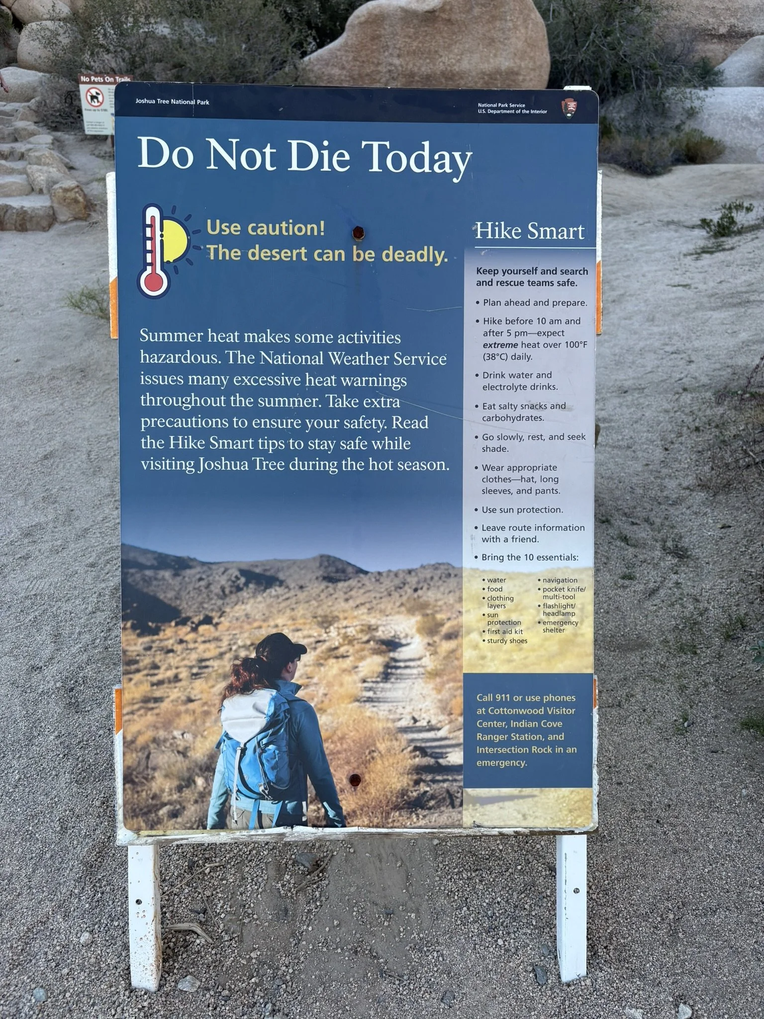
Signage near Joshua Tree National Park is direct. Students might analyze this display board, shown at the visitor’s center and at the beginning of a trail, to find the following and more:
What Works Well
The title certainly catches the eye and encourages visitors to read more.
The thermometer and sun graphic show the issue.
“Hike Smart,” at right, is catchy.
The bullets, at right on the lighter background, are parallel and provide useful information.
Although not essential, the woman on the path adds visual interest.
The “10 essentials” are clear and cleverly placed on the lightened terrain.
Overall, the visual balance and colors work well.
What Could Be Improved
The paragraph text in reverse type is hard to read and not necessary. The first sentence states the issue, but the others don’t seem to add value.
The long list of bullets and 10 essentials might be categorized in some way.
Much of the information is useful only before we reach the park.
Is that a bullet hole at the top? Not sure what happened there.
The suggestion to call 911 is moot; the park has almost no cell service.
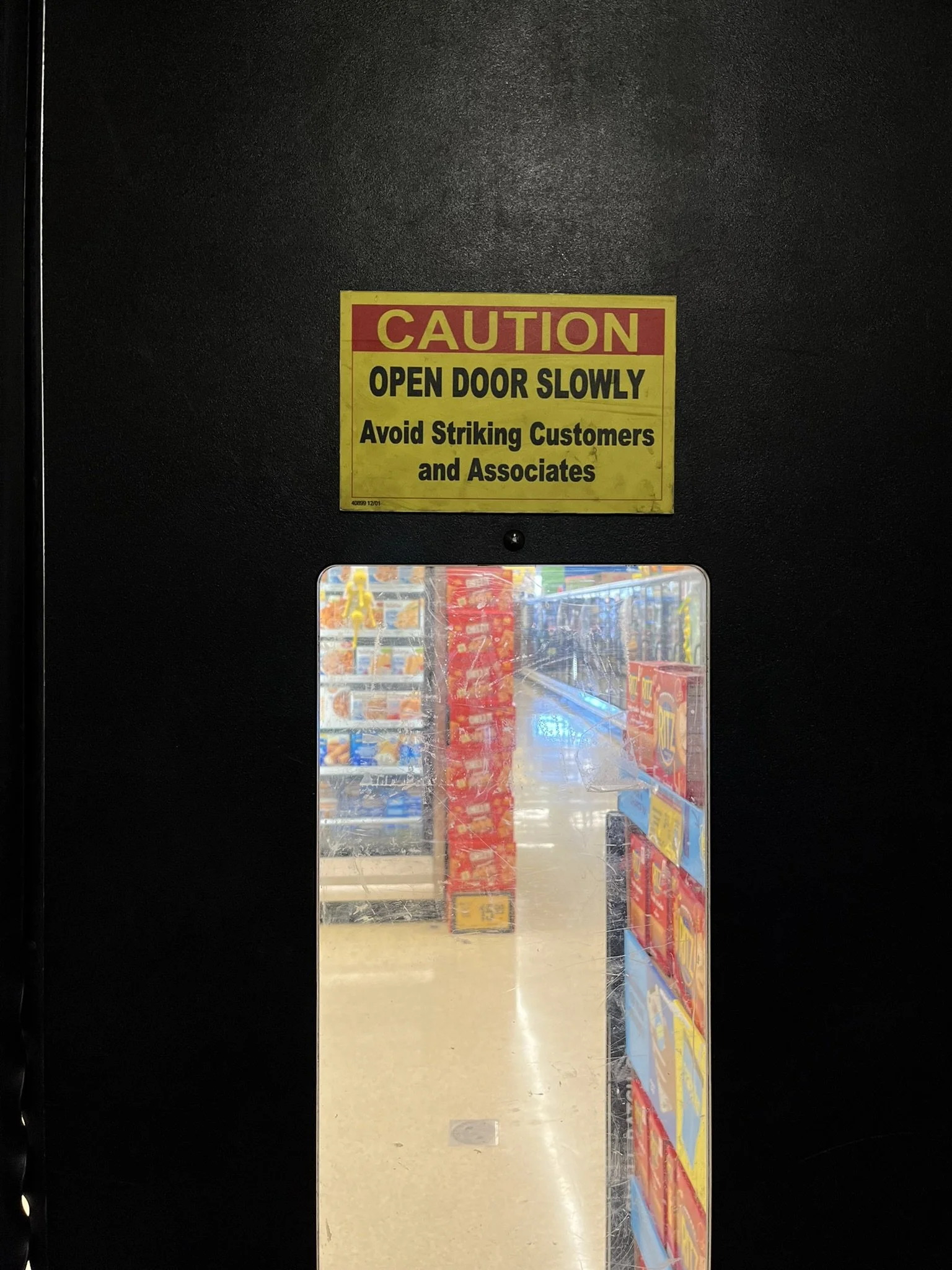
The second sign, in a Vons grocery store, appropriately warns people against swinging a door open from a back room. Maybe “hitting” would work better than “striking”? Either way, the advice is good practice, regardless of the door swing.