
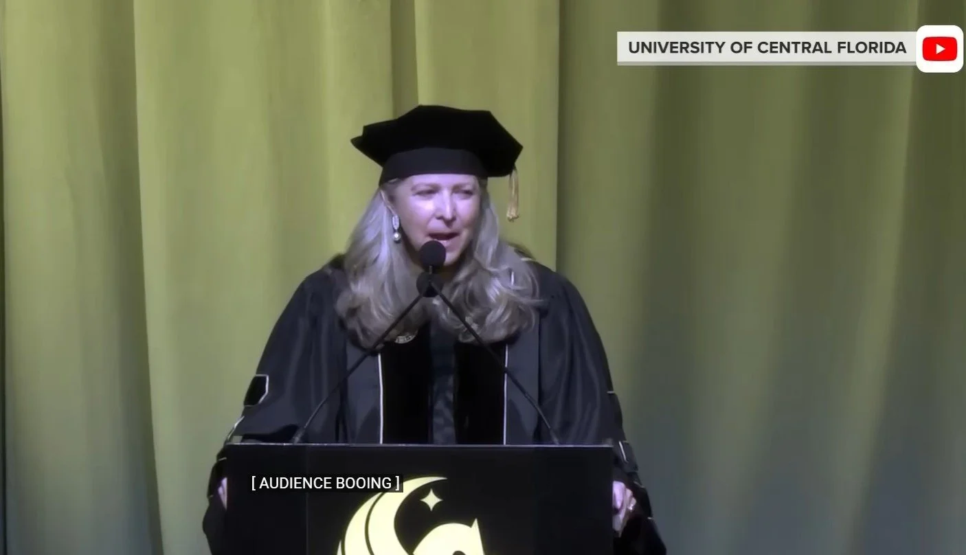
UCF Commencement Speaker’s AI Talk Got Booed
A real estate executive addressed graduating students at the University of Central Florida about the promise of AI and got booed. Her audience analysis, the student’s reactions, and her recovery are worth class discussions.
Gloria Caulfield said, “The rise of artificial intelligence is the next industrial revolution.” “Boo!” from the crowd. She is surprised and looks back at others on stage, asking “What happened?” She is shaken. When she continues, her voice is unsteady, and more boos follow. Cheers follow when she says, “Only a few years ago, AI was not a factor in our lives.”
Perhaps most relevant is the audience. She’s speaking to graduates at UCF’s College of Arts and Humanities and its Nicholson School of Communication and Media—students who have faced challenging job prospects for years and are greatly affected by AI today. As one student said, “Talking about artificial intelligence at a college for arts and humanities can be, you know, a bit rough because it kind of goes against the humanities part.”
In addition, recent Gallup research shows a steep decline in young people’s confidence in AI. As of now, only 27% of people ages 14 to 29 feel hopeful about AI, and 48% of working Gen Zers in the workforce “believe the risks of AI in the workforce outweigh its benefits.”
The boos made headlines and took Caulfield off guard, but looking at the video of the crowd, we see a mixed response, with some students silent as others cheered loudly. Caulfield referred to the “bipolar topic”; another word choice might have been better.
LinkedIn comments give students a window into how academics and industry folks reacted to the commencement scene with some saying students need to face reality.
Students can discuss how Caulfield handled the situation. Was it a misjudgment for her to talk about AI as she did? Should she have anticipated the response? Should she have avoided the topic entirely? She did preface that part with a pep talk about change, but apparently, it wasn’t enough. Perhaps a softer approach, recognizing students’ vulnerabilities and fears would have been better—and solutions or suggestions.
How Universities Communicate Community Engagement Projects
Connecting with local businesses and nonprofits is challenging for universities looking for community engagement (service-learning projects). Students can analyze a few examples and recommend improvements:
First, students might identify the primary audience (partners) and communication objectives for these pages. The primary objective is to encourage organizations to partner with schools for student projects. More specifically, they want prospective partners to understand the potential value of student work and identify projects that fit course and learning objectives.
Second, an audience analysis will tell them that these folks don’t have a lot of time or resources to spend learning about the program or partnership. The webpage is an indication of how much work they’ll need to invest—and it can’t be too much.
Then, students can develop a short list of criteria for these pages—the usual for audience analysis, content, organization, writing style, design, etc. For example, they might judge “you-focus” on the partner, including what the partner will get out of the partnership; clarity and conciseness of the writing; a clean visual look; examples of past projects; branding for the university or college; and a call to action with contact information.
Following are a few examples of webpages, with a couple of notes on each. Students might notice that many start with the program mission, which sounds like academic jargon—not a good choice for the opening of these pages for a partner.
Cal State San Marcos: Clear call to action with a form to complete.
Davidson College: Strong “you” focus in the first few paragraphs.
Florida Gulf Coast Service Learning: Also good “you” focus and clear design (although a lot of clicks).
Michigan State Community-Engaged Learning: Finding something positive from this page, which starts with “Criminal Background Checks,” is challenging.
NYU Wagner Capstone: Strong description of students and the value they bring.
Seattle Community Partnerships: Confusing with two separate sections, and link headings aren’t descriptive or organized in an intuitive way.
University of Nevada, Reno, Partner Resources: Welcoming suggestion to contact them up front, but the service-learning guidebook isn’t available—why mention it?
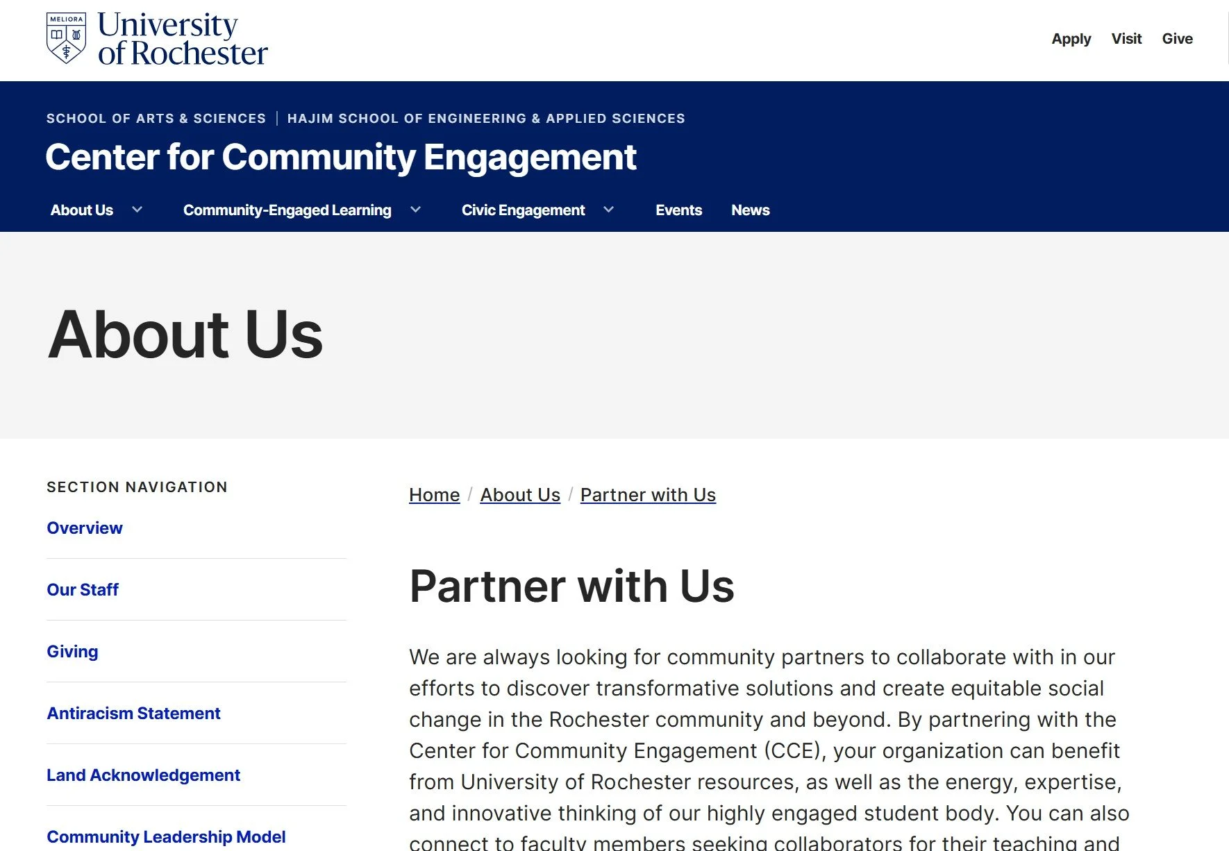
University of Rochester Community Engagement: Starts with clear “you” focus, but the writing sounds like academic jargon, and the organization mixes purpose and programs.
West Texas A&M Quality Enhancement Plan: Big points for the only video in this bunch, but we hear from students and faculty—not partners. If information is available for partners, it’s not apparent.
AI’s Hilarious Descriptions of Competitors’ Writing

A Wall Street Journal writer asked ChatGPT, Claude, and Gemini to describe each other’s writing style, and the results are hilarious. But the writer’s conclusions about detection aren’t supported by research.
Gemini says Claude’s hallmark style is that of “a nervous graduate student terrified of losing their funding or offending the thesis committee.”
ChatGPT, in contrast, writes like a “McKinsey junior partner aggressively pitching a synergy strategy on LinkedIn,” according to Gemini. “It writes with absolute, unwavering confidence but strips out all specific, concrete details, resulting in prose that sounds authoritative but evaporates the moment you try to extract actual meaning from it.”
According to the OpenAI app, Claude is “an earnest grade [sic?] student who will not take a position. If you ask Claude, ‘Is this policy good,’ it replies: ‘It can be understood as operating within a broader ethical framework that may, depending on one’s normative commitment.’ By the time Claude finishes clearing its throat, the Roman Empire has fallen again.”
Perhaps like humans, AI bots have writing styles, although let’s stop short of calling them personalities.
Boldly, the writer claims in the article headline, “AI-Generated Writing Is Everywhere, and It’s Still Easy to Spot—for Now,” but the research says otherwise. Human detection is running around 50% (maybe better for business communication faculty, but who knows?), and detection tools aren’t reliable. As AI improves, detection will get more challenging.
Sure, we all heard about overuse of em-dashes and words like delve and myriad, but as soon as ChatGPT became public, our colleagues have been wary of accusing students of using AI.

The “Ningnong” Who Wants Replacement Parts
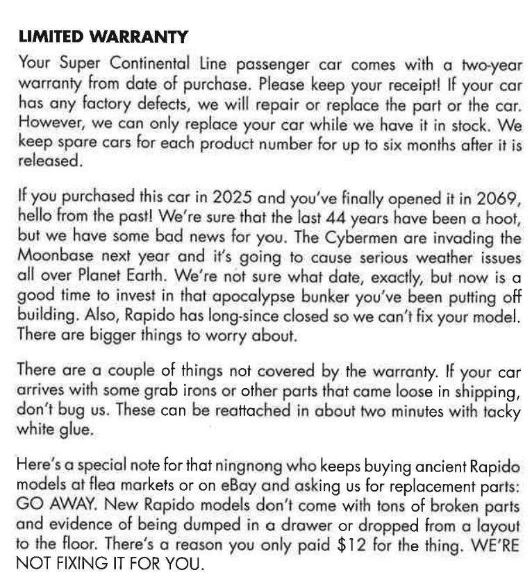
This customer communication from a model train company would make a fun class discussion or activity. The company focuses more on what they won’t do than how they can help.
In the “Limited Warranty” section of product documentation, they try to be funny, and I admire that, but it doesn’t land well. Projecting 44 years into the future when a customer might want to get repairs covered under warranty, the writer suggests that the customer should retreat to a bunker instead. Are we at that point where a pending apocalypse is funny?
I also understand that a company can get whacky requests. This one apparently has customers seeking replacement parts for lesser quality items purchased elsewhere. But are these “ningnongs” likely to read the company’s warranty information? They seem confused about their audience—and calling them ningnongs might not inspire them to become customers.
By far the overarching issue with this section is the company’s focus on the negative rather than the positive—the situations in which you can’t get your train fixed instead of what they can do for you. Even the bit about parts coming loose in shipping is strange. Why not help customers out by telling them the simple fix and apologizing because products really shouldn’t fall apart in transit. This situation seems like a good opportunity for a customer to call, make a connection, and perhaps order more parts.
Students may rewrite this section and compare their revisions. Obvious changes like removing ALL CAPS will immediately improve this missive. Students might want to rephrase “Limited Warranty,” but this is standard language that protects the company. Still, the rest of it doesn’t need to sound like a bad-news message.
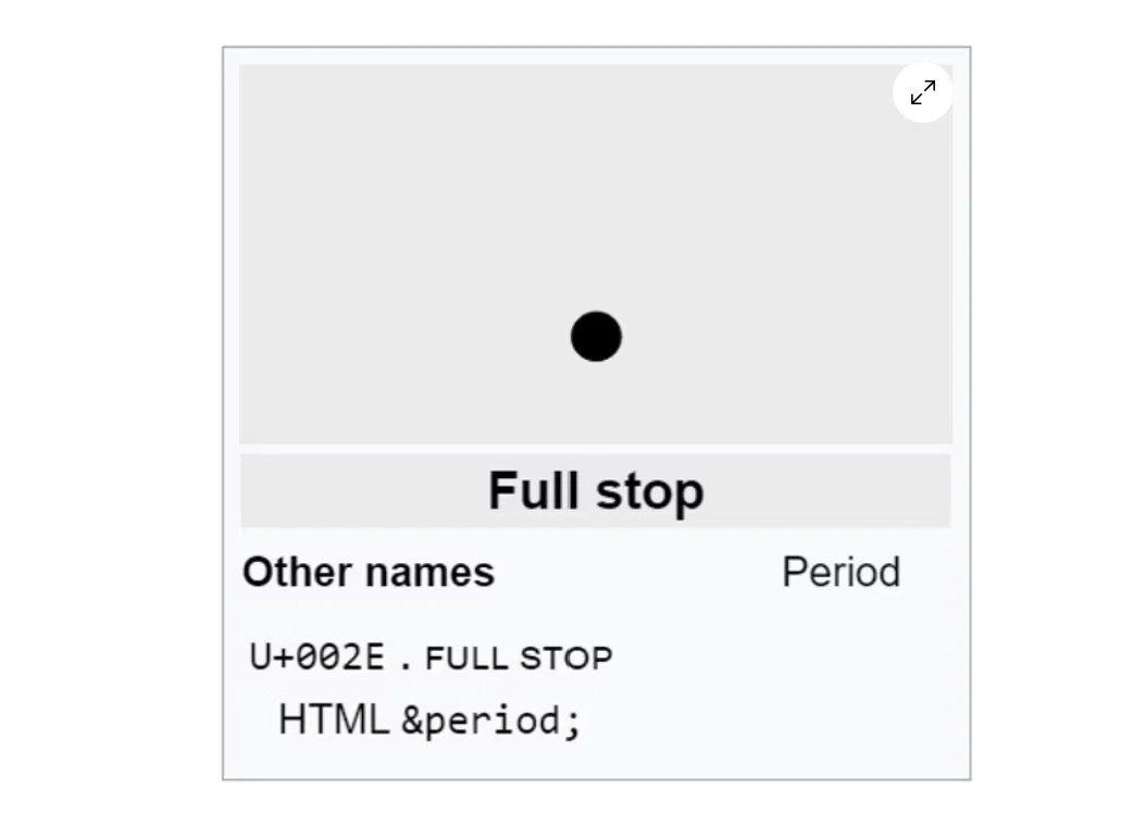
That Grumpy Old Period

A writer wonders why we hesitate to use a period in texts and emails. Instead, we overuse exclamation points, question marks, and in less formal writing, emojis, “ha,” or “lol” to soften our message. He theorizes that “It’s the lack of context—the fact that more and more of what we communicate is aimed at somebody we don’t know or rarely speak to, with little base line of what we’re normally like.”
Students might discuss their own punctuation. Does it differ for people they know well? Are they less tentative in these situations and therefore more definitive? This might be tough to answer if they eschew punctuation entirely, as some young people do. The period has long been criticized for its finality, particularly in short texts, as in, “Sure.”—apparently meaning, to some, I will hate you forever.
In business communication, the period can be just a period, doing what it was intended to do: end a sentence. Students might develop the confidence to simply declare something.
On the other hand, we teach students to observe others in an organization and, to an extent, match communication styles. An email riddled with exclamation marks sent by a manager warrants one or two exclamation marks in return regardless of the employee’s personal style. Otherwise, exclamation points are more art than science, as the writer says:
It is widely understood that exclamation points must be inserted into the modern professional email at precise intervals—just enough to create a tone of eagerness and warmth without tipping over into sounding fake, sycophantic, or batty.
The period seems simpler, but maybe not to a student or new employee. Tone is trickly, and we don’t know each other at work as we did in the old days, when we met in person, spent time chatting over coffee, and went out after work. We could, in lieu of perfect punctuation rules, give each other the benefit of the doubt, assuming good intentions instead of overanalyzing every dot and dash.

Australian Government’s Comms Banning Social Networks for Kids
Students can analyze the Australian government’s communications to ban social network accounts for kids under 16 years of age. In many ways, this is a classic change communication case study with strategic communication planning and individual messages.
The initiative is bold, and the tone is unapologetic. Clearly, the government has support from officials, parents, and educators to enact this dramatic change. Messaging to young people is trickier, obviously, because they are affected and less inclined to agree. But young people are not the primary audience, as they don’t get a vote in the process.
An enormous number and variety of messages chronicled on the eSafety Commissioner’s webpage comprise the communication campaign called, “For the good of their wellbeing.”
To study the communication strategy and plan, students might work backwards to identify elements of communication planning:
Audiences (segmented for tailored messages)
Communication objectives for each audience
Medium/Channel choice for each
Key points for each
Messenger for each
Timing for each
This communication planning template can be used for this activity or others. (See sample completed template.)
The campaign includes messages to segmented audiences:
A “hub” of resources shown here
Videos for “parents and carers”
Radio/digital audio campaign materials for parents and carers, under 16s, and First Nations (worth discussing why this group is segmented)
Print materials
Community resources (e.g., emails, posters)
Digital toolkit
Research findings report
Additional resources for First Nations (e.g., parenting guide, workbook)
Some resources are translated into ten languages.
As the ban goes into effect, students may revisit the messaging to determine how other countries could communicate their own bans and adapt messaging for cultural differences.
Calibri Oust Offers a Lesson in Typeface and Analyzing Claims
The U.S. State Department demanded that agencies revert back to Times New Roman (14-point font!) instead of Calibri, offering an opportunity for students to learn about typeface and analyze claims for the change. In a cable, Secretary of State Marco Rubio cites the importance of “a unified, professional voice in all communications,” the “tradition, formality, and ceremony” of serif fonts, and “yet another wasteful DEIA program,” that is, the switch to a sans serif font to increase accessibility. Without the flourishes (little legs) of serif fonts, sans serif fonts may be more easily read by people with low vision, dyslexia, and other disabilities. (Here’s a deep dive into questions of legibility, readability, and accessibility.)
Students can analyze Rubio’s argument. One claim is that changing from Calibri back to Times New Roman “did not lead to a meaningful reduction in the department's accessibility-based document remediation cases.” They might question whether remediation—changes to documents—is that best way to measure success. Most often read on screens, what does the research say about serif and sans serif fonts? In addition, he doesn’t include the cost of what news reporters called an “about face”; after all, reprinting existing documents is remediation.
Rubio also argues for consistency with letterhead, but that could be modernized. Finally, what’s the value of what he refers to as “decorum” and “professionalism,” terms that have connotations of their own?
Poor Calibri. First replaced, after a 17-year run as Microsoft’s default font by taller, curvier Aptos, and now this.

My Beloved Em Dash—In the News
My favorite punctuation mark—meant to highlight important bits—has become the important bit itself. Let’s look at the AI issue.
Most business communication faculty probably know by now that the em dash has been viewed as a marker for cheating with ChatGPT and other Gen AI. Turns out, the dash is a weak indicator, if one at all. Let’s remind students that AI mirrors existing writing, including writing that uses and overuses the em dash.
An Insider Higher Ed contributor warns about overuse—in an article entirely em-dash free, which I find both laudable and disappointing:
[A]s writers, we should be connecting thoughts smoothly and taking care to use just the right punctuation for a specific purpose while resisting the allure of an em dash that might save us the expert work of choosing the precisely placed period, comma, parenthesis, semicolon or colon.
I see her point, but sometimes the em dash is the perfect mark, isn’t it? In my example before the indented quote, I see awkward alternatives:
An Insider Higher Ed contributor warns about overuse in an article entirely em-dash free, which I find both laudable and disappointing: [modifier problem: the overuse isn’t in the article, obviously]
An Insider Higher Ed contributor warns about overuse. In an article entirely em-dash free, which I find both laudable and disappointing, she writes the following: [choppy and needlessly long]
In an article entirely em-dash free, which I find both laudable and disappointing, an Insider Higher Ed contributor warns about overuse: [complicated and too long before we get to the main subject and verb]
Most important, none of these options use my favorite punctuation mark.
Although punctuation isn’t the most exciting business communication course topic, this might be time to discuss the differences among the hyphen, en dash, and em dash. (For geeks like me, you can read this history of the em dash.)
Whatever students decide for their own writing, I hope they don’t cast off the em dash for fear of a plagiarism accusation. We need all tools available for clear, fluid writing.

Lessons from Amazon Alleged Deception for Prime Sign-Ups
Amazon’s $2.5 billion “historic” settlement with the U.S. Federal Trade Commission (FTC) offers lessons for ethical webpage design. The lawsuit accused Amazon of misleading customers to subscribe for a Prime account.
Following are examples of the FTC’s evidence—how students might avoid designing webpages that intentionally or inadvertently dupe users:


“Dark patterns”—design choices to intentionally deceive. One example is the prominent, yellow subscription button compared to the faint “No thanks.” Another example is the visual option for shipping. Students can compare how differently the shipping options are presented on Amazon today.
“Iliad flow”—a long, confusing process, for example, how to cancel a subscription. The FTC cited the need for customers to “navigate a four-page, six-click, fifteen-option process" to cancel but only one or two clicks to enroll.
Deceiving text—for example, this button for “30 days of Prime for . . . FREE.” When users selected this option, they were immediately enrolled but not told that the subscription would auto-renew monthly and for how much.

The FTC report also cites evidence from Amazon’s internal documents. Messages refer to “accidental” signups, acknowledge that “subscription driving is a bit of a shady world,” and call unwanted subscriptions “an unspoken cancer.” This is a reminder for students to watch what they put in writing, even in informal messages.
As we know, when a company settles a suit, it doesn’t admit guilt. Amazon’s short statement says little, but they did agree to the agreement terms, which include clearer buttons, explicit disclosures, and easier ways to cancel a subscription.

Cracker Barrel Subordinates the Change and then Reverts to Old Logo
Following backlash from updating the logo, Cracker Barrel will keep “Uncle Herschel”—the man and the barrel. Students can identify business communication issues in the communication.
The restaurant has a rich history, with its first store, a restaurant with gas station, opening in Lebanon, TN, in 1969. Now 664 restaurants, Cracker Barrel maintains an old-timey, country feel: a menu of comfort food and farmhouse decor with antiques unique to each location.

The logo and decor change are hidden in a press release on August 19 titled, “Cracker Barrel Teams up with Country Music Star Jordan Davis to Invite Guests to Discover ‘All the More’ this Fall.” It’s as though the company leaders knew trouble might ensue. Note the placement in this paragraph, further subordinating the news:
Since 1969, Cracker Barrel has delivered heartfelt service, homestyle food and an unmatched dining experience. With nearly 660 locations nationwide, the brand remains a go-to for guests seeking community, comfort and special moments they can carry with them long after they leave. Its more popular menu offerings like farm fresh scrambled eggs and buttermilk biscuits even serve as inspiration behind the hues of a refreshed color palette featured in the new campaign. Anchored in Cracker Barrel's signature gold and brown tones, the updated visuals will appear across menus and marketing collateral, including the fifth evolution of the brand's logo, which is now rooted even more closely to the iconic barrel shape and word mark that started it all.
After years of subtle adjustments, the dramatic logo change hardly supports the conclusion, “now rooted even more closely to the iconic barrel shape and word mark that started it all.” The redesigned logo is rounder, but the most obvious change—omitting the man (“Old Timer”) and the actual barrel—is key and unmentioned. We might say the leadership lacks accountability for the decision, hiding behind positive/neutral news like a music partnership.
Try as it might to update the brand, Cracker Barrel is thrown back to earlier days. Brighter interiors with fewer, better organized items were meant to appeal to younger crowds, but fell flat. Instead, it felt like an affront to conservative values and became a political issue. As Americus Reed, marketing professor at The Wharton School, said, “If it ain’t woke, don’t fix it.” In the end, the logo redesign was deemed intolerable, as evidenced by the 7% stock price drop.
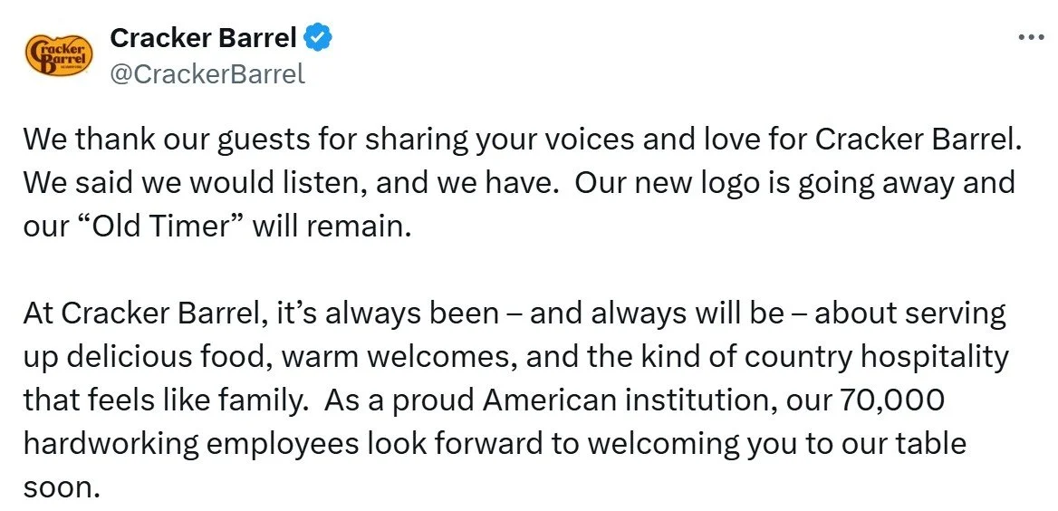
Social media backlash was fierce, and President Trump’s Truth Social post might have been the final straw. In a rare about-face post on X, the company said they listened and would change the logo back. Unfortunately, in the message, we don’t see the barrel on the X account.
The stock rebounded, and all is right again. Students might discuss lessons learned: get better feedback, make more incremental changes, stand behind your decisions or don’t make them, and perhaps, above all else, stay attuned to the political climate.

Name Change from MSNBC to MS NOW Gets Ridiculed
MSNBC is rebranding itself as MS NOW, short for My Source News Opinion World, but memes are drowning out the company’s enthusiasm.

Critics say “MS,” leftover from when Microsoft held part ownership years ago, is most commonly associated with multiple sclerosis, and they question why the letters remain. My Source News Opinion World seems a forced fit for the letters and makes little grammatical sense. Luckily, they probably won’t be muttered out loud.
Others say “NOW” is so yesterday sounding, and that the logo “looks like something you’d scroll past in a pile of poltical [sic] campaign logos from 2004.” Although the company statement confirms no change, the American flag could signal a more conservative slant.
The statement also conveys a self-importance that might not resonate with viewers:
For our viewers who have watched us for decades, it may be hard to imagine this network by any other name. We understand. But our promise to you remains as it always has. You know who we are, and what we do.
Students might have reactions about the change—or about other brand changes they have noticed. Here are two recent controversial examples:
Broligarchy and Skibidi Added to Cambridge Dictionary
More than 6,212 words have been added to the Cambridge Dictionary, the primary resource for English-language learners. Students might enjoy an all-slang video, and the new business terms are interesting
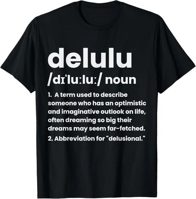
The ones that made headlines—delulu, tradwife, and most popular, skibidi—are funny sounding and/or have ambiguous meanings. No one seems able to define skibidi except to say it’s an “all-purpose,” “dump” word.
Here are a few business- and tech-related words (from here and here):
snackable: content for limited attention spans
digital decay noun: process by which online content disappears or becomes inaccessible
fast tech: cheap products that lead to e-waste.
technofossil: plastic and other products that last forever.
vibecession: a period when people think the economy is doing worse than it is.
cardboard box index: a way to measure economic growth by the number of boxes shipped.
Dictionaries must evolve. As the Lexical Programme Manager of the Cambridge Dictionary Colin McIntosh says, "Internet culture is changing the English language, and the effect is fascinating to observe and capture in the dictionary.“ In addition, he explains, “It’s not every day you get to see words like ‘skibidi’ and ‘delulu’ make their way into the Cambridge Dictionary. We only add words where we think they’ll have staying power.”
A writer for The Times defends including slang words. Unlike the historian who criticizes dictionaries that have “surrendered to usage,” Oliver Kamm reminds us of a dictionary’s purpose:
Dictionaries record usage so we can learn the semantics, etymology and history of any given word. Sometimes these usages are slang, being the currency of particular demographic groups (especially but not only young people). I want to know what they mean; a dictionary that shuns them won’t help me.
In this fun video (start at 1:53), polyglot Arieh Smith (aka Xiaomanyc) delivers a speech entirely in “Gen Alpha” language. Students at Westtown High School in West Chester, Pennsylvania, go wild.
Columbia President's Resignation

Columbia University President Katrina Armstrong’s resignation statement serves as a worthy example for analysis. The political situation is extremely controversial, and she avoids direct references.
Her emphasis is on the “interim” nature of her position. In other words, she wasn’t planning to stay long, anyway. She mentions this early in her short statement and reinforces her “few months” of service at the end. She also emphasizes up front that she will return to her former role at the university.
Armstrong speaks well of Columbia and subtly refers to the controversy, using words like “healing” and “moving forward.” At the end, she hints at having a bigger voice: “The world needs Columbia University, and you can be assured that I will do everything I can to tell that story.”
It’s difficult to think of what else she could reasonably say, given the university’s precarious situation with the government and with all its many constituents. She may have said just enough.
This is one of those messages that could be classified as positive or negative news, depending on the receiver’s perspective. But appointing yet another interim president is not great, for sure.
Claude Wins a Writing Contest
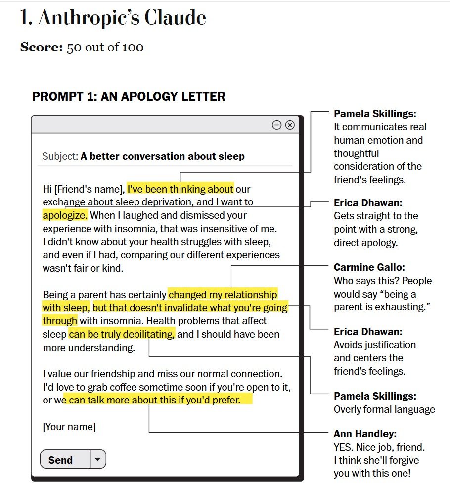
A Washington Post reporter compared five AI tools and found Claude the clear winner. The prompts and analysis are interesting for a class discussion and activity.
The five prompts covered a range of communication topics: an apology to a friend, a CEO layoff message, a request to a spouse, a weird work proposal, and a breakup text. Five judges, “who have all written books and teach courses on communication,” rated the tools in this order:
Anthropic’s Claude
DeepSeek
Google’s Gemini
OpenAI’s ChatGPT
Microsoft Copilot
Judges found Copilot particularly “stilted” and “robotic,” generating the dreaded “hope you’re well.” That’s too bad because Copilot is built into all Microsoft 365 products, a popular choice for work.
I wish we could see all the writing samples and judges’ feedback, but the article includes only a couple of examples. But students could use the same prompts for a class activity and compare results.
We could ask students to put more effort into the prompt, with detailed context and a more thorough audience analysis. We also could give students more specific guidance for evaluating the results. Or, students could create their own prompts. With more instructions—both to AI and to students—students might rank the tools differently.
Comparing Stock Charts for Perspective
This was a bad week for the U.S. stock market, but graphics make the news look worse than it is. Students can compare charts to see how truncated axes affect perception.

Yahoo!’s monthly chart has a short range: 41,000 to 44,000 for this monthly line chart. With the red line and shading, the results look awful. Noting the 6.87% drop is helpful—it’s not great but not devastating either. For the 62% of Americans (varying largely by demographic group) who own stock in some way, their portfolios are unlikely to be invested 100% in DJIA stock, so their personal losses are probably smaller.

This one year chart, also Yahoo!’s, shows a more complete view of the market. Over a year, stocks were still in positive territory—green(!)—and the recent dip is in clearer perspective. Not that short-term investors and perhaps retirees shouldn’t be concerned, and we might be headed into a recession, but this chart recognizes the extraordinary gains in the past year as well as the recent losses.
Students can find longer-term charts to see an even fuller picture of U.S. stock market returns. They might also find, or need to create, charts with a Y-axis starting at 0.
As always, the data visualization depends on the audience and purpose. If your audience is television viewers, and your purpose is to engender fear, then short time frames and truncated axes do the trick. If you’re a financial advisor, and your audience is a client who is a long-term investor with a balanced portfolio, you would probably not show these charts at all and instead focus on their portfolio returns over time.
New AI Copyright Ruling and My Book Guidance

Students may want to know about the U.S. Copyright Office’s new ruling: AI-assisted works can be copyrighted if enough human creativity contributed to the product.
With 207 citations, the 52-page report clarifies what AI output can be copyrighted, challenging previous thinking that no output can carry the protection. The ruling is most relevant to people in creative fields who use AI to produce music, film, artwork, etc., but has implications for all of us. The National Law Review summarized the latest:
The Office reiterated its position that copyright protection may currently be available for: (a) human-created works of authorship used as inputs/prompts that are perceptible in AI-generated outputs; (b) creative selection, coordination, or arrangement of material in the outputs (i.e., compilations); (c) creative modifications of the outputs; and (d) the prompts themselves if they are sufficiently creative (but not the outputs created in response to the prompts).
The last point is perhaps the most relevant: prompts alone do not constitute human intervention into AI results. Additional human creativity and authorship are essential.
With a reference to Paula Lentz’s article on ethical authorship, here’s what I included in the upcoming 12th edition of Business Communication and Character on the topic:
Regardless of how you use AI, you are always the author of your work. Maintain your own authorship, including your authority and authenticity, over your writing—in other words, yourself. You want your writing to represent you and your character—not whatever content GenAI generates from existing sources; that output isn’t necessarily original work. Depending on the task, think of AI as a collaborator, an assistant, or a coach—but never a replacement for you.
With this guidance, AI output can certainly be copyrighted. For example, inputting a curated dataset or rearranging or changing results could be enough human creativity. But what is sufficient to reach this threshold remains to be seen.
Lyft and Apple Updating Terms of Service
A useful class activity would ask students to analyze how companies summarize changes to user agreements. Lyft and Apple Pay sent emails this week, but details about the changes aren’t clear.

Lyft’s email includes these major changes:
Terms of Service We're making updates related to the arbitration agreement between users and Lyft, restricted activities on the platform, insurance coverage for certain rides, and user eligibility requirements. These updates will apply to everyone who uses the Lyft Platform, including drivers, riders, and those who use bikes and third-party services.
Privacy Policy As part of our commitment to respecting your privacy – and explaining how we're complying with new state privacy laws – we're adding information to our Privacy Policy. This includes more detail about the data we collect and why, how we use it, and how we may share it. It also includes updates that reflect new initiatives, such as rider verification. Plus, we've added details about our privacy tools and options to help you better understand your rights and the choices you have related to our data practices.

Apple Pay & Wallet summarized these changes:
We have simplified our Terms and Conditions for Apple Pay and Wallet so that your review and agreement of these Terms and Conditions is effective across all of your Apple devices.
For our US customers, Apple Pay is a service provided by Apple Payments Services LLC, a subsidiary of Apple Inc.
Our Terms and Conditions now include standard assignment provisions.
Lyft’s changes seem significant. Maybe not the privacy policy changes, but all the terms of service changes sound like restrictions. If the changes mean stricter arbitration requirements, less platform functionality, reduced insurance—and who knows what about user eligibility, that could affect a user’s rights and experience.
Lyft’s entire Terms of Service (with the URL tag “preview,” so the link might change) is, according to ChatGPT, about 8,500 words, For such a long document, students might consider a company’s responsibility in communicating changes. Are the email summaries sufficient? I find myself wanting to see documents marked up to show the textual changes. Maybe they could show before-and-after tables?
Weighing in at a mere 5,000-6,000 words, Apple Pay & Wallet’s Terms and Conditions covers simpler transactions and relationships than does Lyft’s. The first two bullets in the email reflect administrative changes, and the last is legal-jargony, at least to me. Here’s the relevant last section, which comes after the ALL CAPS liability section.
8. Assignment
You may not transfer or assign any rights or obligations you have under these Apple Pay & Wallet Terms. Apple and Apple Payments Services may each transfer or assign these Apple Pay & Wallet Terms or any right or obligation under these Apple Pay & Wallet Terms at any time.
Is this new? Is this important to students? Should Apple have written more about this in the email?
I almost always breeze past these notices and wonder whether students do the same. It’s a potential issue of the company’s integrity if the email summary downplays important information for users.
How to Introduce People via Email

A Financial Times article offers advice for introducing people by email. Students can reflect on their own experience introducing others or getting introduced.
Most important: Before introducing anyone, ask their permission. Otherwise, revealing an email address and setting an expectation that the person will respond could be awkward. If someone doesn’t want to meet, they’re left with a tricky decision of whether to go through with it anyway, ignore the email and a possible follow-up from the other person, or respond and decline the invitation, which could feel hurtful. For the latter, the receiver could cite deadlines, other pressing priorities, or something perhaps more truthful, for example, “It sounds like you have a lot of interesting work in progress. I find my own interests moving away from xx but wish you the best of luck with your projects.” Maybe students could talk about how they might react to that type of email—or draft their own polite decline, as we talk about in business communication textbooks.
The article gives an example of not asking permission: when someone knows the person very well and sends a thoughtful, complimentary email. Students might agree, particularly if they are looking for work and an introduction gets them close to a potential hiring manager.
The author raises the question of how long to keep the introducer on the email chain. I suggest including the introducer on one email from each responder. “Thanks, Jamie, for the introduction! Matt, I’m glad to meet you . . .” As the introducer (which I was recently, after getting permission from both parties, of course), I like to see that the people responded. But that’s enough. I don’t need to be involved in plans for a lunch to which I’m not invited.
Comms About the Internet Archive Breach

After a major breach, the Internet Archive founder sends casual bad-news messages.
The Archive, including the Wayback Machine, is home to more than 840 billion web pages. Last month, the BBC reported the Archive as a valuable and vulnerable resource, and this month, we’re seeing why. The article also describes controversy about the service offering books and other content for free, the subject of a lawsuit the organization lost in 2023.
Although user information for more than 31 million people was compromised, the founder’s message on X focused on what most concerned the public: the integrity of the content and when the site would be back up.

In addition to the message on X, I found only three short posts on Bluesky and Mastodon—all below and at right:
Update: @internetarchive’s data has not been corrupted. Services are currently stopped to upgrade internal systems. We are working to restore services as quickly and safely as possible. Sorry for this disruption.
A note on the website just says simply this:
Temporarily Offline
Internet Archive services are temporarily offline.
Please check our official accounts, including Twitter/X, Bluesky or Mastodon for the latest information.
We apologize for the inconvenience.
These aren’t the typical data breach emails from a CEO. Kahle doesn’t offer suggestions for users to, for example, change passwords, which others advise.
He sounds like someone who lives in a high-crime area and expects to be robbed: “Sorry, but DDOS folks are back . . .” Kahle says nothing about the group, but a Newsweek article reported that a "pro-Palestinian hacktivist movement” claimed responsibility for the attack. Kahle might be more cautious about accepting that claim—or might not want to give the group publicity, whether it is responsible or not.
FEMA Website and “Rumor Response”

As southern parts of the United States manage through two recent hurricanes, students might find it useful to analyze the Federal Emergency Management Agency (FEMA) website, including its response to criticism.
Students can start by identifying the audience and communication objectives for the website. They might identify the primary audience as people in immediate need and the secondary audience as other U.S. citizens. One main goal is to help people find assistance, and another is to encourage preparation. When I attended a New York emergency preparedness training a few months ago, the speaker was clear about the purpose: to build our confidence, with the theory that we’ll fare better in a crisis if we have some tools (e.g., a to-go bag, a LifeStraw) and a positive mindset that we can help ourselves and others.
On the upside, the FEMA website is kept current. Milton gets top billing, with Helene, just days earlier, on a second screen. I question the graphic choice on this home page. Do we need to see what a hurricane looks like? Two other photos on the carousel seem like better choices: people talking, presumably being helped by FEMA agents.

The next section shows ways FEMA can help. The icons and actions are all clear. Students might compare the current site with former versions at the Internet Archive (currently down because of a hack—another post on that communication is coming). Farther down the page, we see how people affected by Helene, by state, can apply for assistance. Soon, I’m sure we’ll see links for those affected by Milton.
Politicians have criticized FEMA’s response to Helene, and the agency defends itself on a separate page titled, “Hurricane Rumor Response,” a curious title that could also be, “Hurricane Response Rumors.” Either way, “rumor” is a clever framing, clearing some political muck by downgrading the issue to office gossip or a child’s bullying.
The rumors are so plentiful that FEMA apparently has a database searchable by text or topic (two hurricanes so far). Someone spent some time on this, and a worthwhile class discussion would ask students why. Officials have talked about rumors preventing people from getting available help they need—and about morale issues within the agency (which I’m guessing is already feeling beleaguered). It’s, indeed, a strange time when the agency deployed for a crisis faces one itself.
Perhaps writing them as positive actions people can take instead of as negative rumors would more likely achieve the agency’s purpose, as in this example:

Why not surface the second part first? I would hate for someone, reading quickly, to take away that “FEMA only provides loans.” The point is to get people to apply for assistance, not to highlight the rumor.