
Calibri Oust Offers a Lesson in Typeface and Analyzing Claims
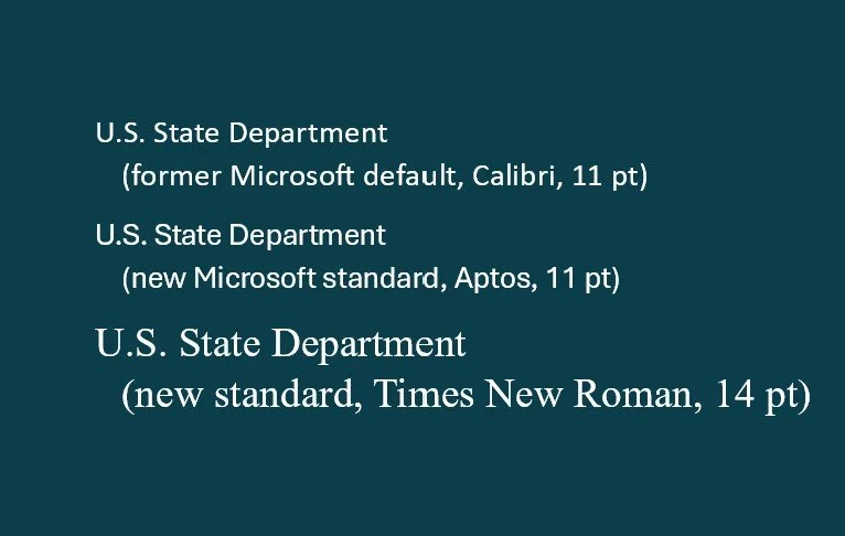
The U.S. State Department demanded that agencies revert back to Times New Roman (14-point font!) instead of Calibri, offering an opportunity for students to learn about typeface and analyze claims for the change. In a cable, Secretary of State Marco Rubio cites the importance of “a unified, professional voice in all communications,” the “tradition, formality, and ceremony” of serif fonts, and “yet another wasteful DEIA program,” that is, the switch to a sans serif font to increase accessibility. Without the flourishes (little legs) of serif fonts, sans serif fonts may be more easily read by people with low vision, dyslexia, and other disabilities. (Here’s a deep dive into questions of legibility, readability, and accessibility.)
Students can analyze Rubio’s argument. One claim is that changing from Calibri back to Times New Roman “did not lead to a meaningful reduction in the department's accessibility-based document remediation cases.” They might question whether remediation—changes to documents—is that best way to measure success. Most often read on screens, what does the research say about serif and sans serif fonts? In addition, he doesn’t include the cost of what news reporters called an “about face”; after all, reprinting existing documents is remediation.
Rubio also argues for consistency with letterhead, but that could be modernized. Finally, what’s the value of what he refers to as “decorum” and “professionalism,” terms that have connotations of their own?
Poor Calibri. First replaced, after a 17-year run as Microsoft’s default font by taller, curvier Aptos, and now this.