Cracker Barrel Subordinates the Change and then Reverts to Old Logo
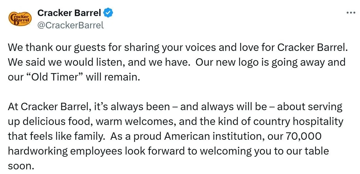
Following backlash from updating the logo, Cracker Barrel will keep “Uncle Herschel”—the man and the barrel. Students can identify business communication issues in the communication.
The restaurant has a rich history, with its first store, a restaurant with gas station, opening in Lebanon, TN, in 1969. Now 664 restaurants, Cracker Barrel maintains an old-timey, country feel: a menu of comfort food and farmhouse decor with antiques unique to each location.
The logo and decor change are hidden in a press release on August 19 titled, “Cracker Barrel Teams up with Country Music Star Jordan Davis to Invite Guests to Discover ‘All the More’ this Fall.” It’s as though the company leaders knew trouble might ensue. Note the placement in this paragraph, further subordinating the news:
Since 1969, Cracker Barrel has delivered heartfelt service, homestyle food and an unmatched dining experience. With nearly 660 locations nationwide, the brand remains a go-to for guests seeking community, comfort and special moments they can carry with them long after they leave. Its more popular menu offerings like farm fresh scrambled eggs and buttermilk biscuits even serve as inspiration behind the hues of a refreshed color palette featured in the new campaign. Anchored in Cracker Barrel's signature gold and brown tones, the updated visuals will appear across menus and marketing collateral, including the fifth evolution of the brand's logo, which is now rooted even more closely to the iconic barrel shape and word mark that started it all.
After years of subtle adjustments, the dramatic logo change hardly supports the conclusion, “now rooted even more closely to the iconic barrel shape and word mark that started it all.” The redesigned logo is rounder, but the most obvious change—omitting the man (“Old Timer”) and the actual barrel—is key and unmentioned. We might say the leadership lacks accountability for the decision, hiding behind positive/neutral news like a music partnership.
Try as it might to update the brand, Cracker Barrel is thrown back to earlier days. Brighter interiors with fewer, better organized items were meant to appeal to younger crowds, but fell flat. Instead, it felt like an affront to conservative values and became a political issue. As Americus Reed, marketing professor at The Wharton School, said, “If it ain’t woke, don’t fix it.” In the end, the logo redesign was deemed intolerable, as evidenced by the 7% stock price drop.
Social media backlash was fierce, and President Trump’s Truth Social post might have been the final straw. In a rare about-face post on X, the company said they listened and would change the logo back. Unfortunately, in the message, we don’t see the barrel on the X account.
The stock rebounded, and all is right again. Students might discuss lessons learned: get better feedback, make more incremental changes, stand behind your decisions or don’t make them, and perhaps, above all else, stay attuned to the political climate.


