
Problems with a Stacked Wealth Chart
Students might find better ways to display data than this stacked chart showing U.S. wealth distribution over time.
The chart in the WSJ article, “Billionaires’ Low Taxes Are Becoming a Problem for the Economy,” shows that wealth has grown tremendously over time and that those with the most wealth have accumulated far more over time. But the comparisons are hard to see with the stacked area chart. We’re missing percentages of wealth. Because the point is “distribution,” we want to know the share of each group. We don’t know by looking at this chart.
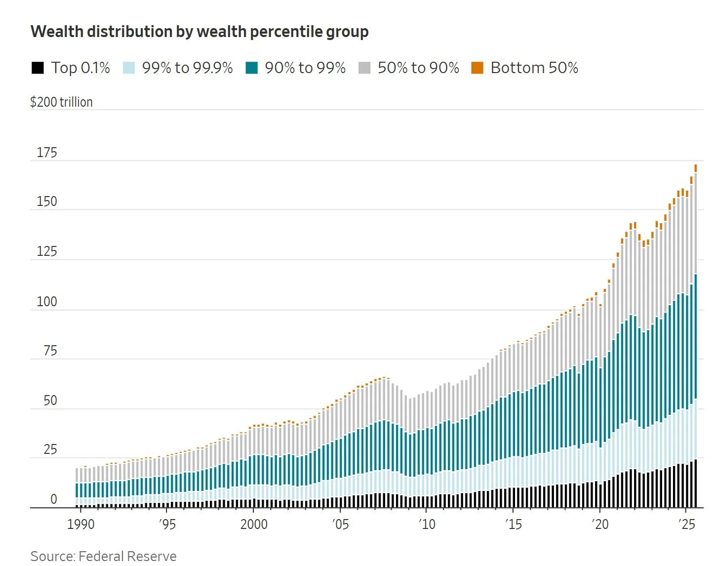
The WSJ chart emphasizes numbers (not just relational data) over time, both in the interactive mouseovers of specific data points (which show dollar amounts) and in the tiny vertical columns, which makes the chart both more precise and uglier.
Compare that version to the original, a Federal Reserve chart. Also a stacked area chart (click to enlarge), but this one uses solid colors to reflect distribution and places the lowest 50% at the bottom, where, intuitively, we might expect them to be. That bottom placement also shows at least some wealth of that group (instead of the mere orange specks at the top of the WSJ’s chart).
The default of the Fed chart is “units” (top left), but a toggle shows shares for percentages. The mouseover is more useful, showing a summary of percentage (or dollar amounts on the default chart) at any point. However, visually, the differences don’t look as dramatic as they are because the growth in dollar amount is so much higher than the percentages. We don’t see the writer’s point:
The bottom half of American households have lost ground. Their 2.5% cut of the country’s wealth has slipped from 3.5% in 1990.
Curiously, this note at the bottom of the WSJ article shows how people conflate percentages and numbers:
Corrections & Amplifications
An earlier version of the chart “Wealth distribution by wealth percentile group” incorrectly had a percentage sign instead of a dollar sign on the y-axis. (Corrected on Feb. 19.)
Another point may be worth mentioning with students. We’re talking about inequality, so numbers of households—people—might be included somewhere.
From the Fed’s data file, I asked ChatGPT to create an indexed line chart. This sets all group values in 1990 at 100 for an equal starting point—a way to show comparative growth over time. The chart labeling doesn’t follow business communication principles, but now we see what has happened since 1990. This chart far more clearly illustrates a main point of the WSJ article:
Only the richest 1% of households have grown their share of overall U.S. wealth since 1990.