

Companies Turn Courage into a Riskier Proposition

According to a Wall Street Journal report, “business leaders [are] cracking down on political dissent.” This changes how employees assess risk.
In his book On Moral Courage, Rushworth Kidder defines three elements: “a commitment to moral principles, an awareness of the danger involved in supporting those principles, and a willing endurance of that danger.” He also provides a framework for assessing risk: to assess ambiguity, exposure, and loss.
The workplace is becoming a less tolerant place for disruptions, so employees’ calculations must change. The article mentions political protests as well as policy complaints, for example, JPMorgan Chase’s return-to-work requirement. Here’s the explanation:
The new, hard-line playbook that companies are adopting to confront employee activism reflects two developments: One is a political climate in which companies risk the ire of the White House—and some consumers—if they appear to cater to “woke” forces, including their own staff. The other is an ever-tougher job market in which white-collar workers—especially in tech—have lost considerable leverage.
This is a significant shift. Four years ago, when Basecamp tried to limit employee dissent, it faced resignations and backlash. Now, company leaders are more often saying, “This is a business,” and “You’re an employee, not a volunteer.”
Obviously, this trend follows our political environment, but it also continues a pullback from CEO activism before the recent election. We have seen few company statements over the past few years compared to the expected statements when George Floyd was murdered. So maybe it follows that activism within the employee ranks is less tolerated.
All this to say that employees have additional risks to consider before they dispute company policies and practices they deem unfair or harmful. Kidder’s ambiguity may be less of an issue, with clear policies and some job descriptions restricting disruption, but risk of exposure and lose have increased. Protestors may suffer more ostracism, embarrassment, and job loss. As the Journal writers note, in a tight job market, these risks are even higher.
Image designed by Freepik.

Cracker Barrel Subordinates the Change and then Reverts to Old Logo
Following backlash from updating the logo, Cracker Barrel will keep “Uncle Herschel”—the man and the barrel. Students can identify business communication issues in the communication.
The restaurant has a rich history, with its first store, a restaurant with gas station, opening in Lebanon, TN, in 1969. Now 664 restaurants, Cracker Barrel maintains an old-timey, country feel: a menu of comfort food and farmhouse decor with antiques unique to each location.

The logo and decor change are hidden in a press release on August 19 titled, “Cracker Barrel Teams up with Country Music Star Jordan Davis to Invite Guests to Discover ‘All the More’ this Fall.” It’s as though the company leaders knew trouble might ensue. Note the placement in this paragraph, further subordinating the news:
Since 1969, Cracker Barrel has delivered heartfelt service, homestyle food and an unmatched dining experience. With nearly 660 locations nationwide, the brand remains a go-to for guests seeking community, comfort and special moments they can carry with them long after they leave. Its more popular menu offerings like farm fresh scrambled eggs and buttermilk biscuits even serve as inspiration behind the hues of a refreshed color palette featured in the new campaign. Anchored in Cracker Barrel's signature gold and brown tones, the updated visuals will appear across menus and marketing collateral, including the fifth evolution of the brand's logo, which is now rooted even more closely to the iconic barrel shape and word mark that started it all.
After years of subtle adjustments, the dramatic logo change hardly supports the conclusion, “now rooted even more closely to the iconic barrel shape and word mark that started it all.” The redesigned logo is rounder, but the most obvious change—omitting the man (“Old Timer”) and the actual barrel—is key and unmentioned. We might say the leadership lacks accountability for the decision, hiding behind positive/neutral news like a music partnership.
Try as it might to update the brand, Cracker Barrel is thrown back to earlier days. Brighter interiors with fewer, better organized items were meant to appeal to younger crowds, but fell flat. Instead, it felt like an affront to conservative values and became a political issue. As Americus Reed, marketing professor at The Wharton School, said, “If it ain’t woke, don’t fix it.” In the end, the logo redesign was deemed intolerable, as evidenced by the 7% stock price drop.
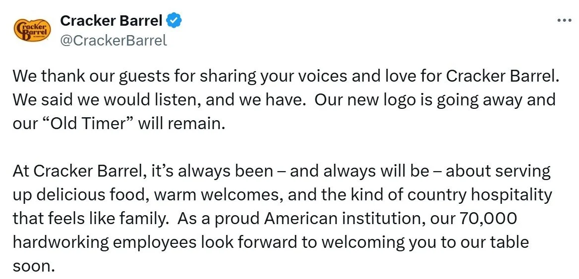
Social media backlash was fierce, and President Trump’s Truth Social post might have been the final straw. In a rare about-face post on X, the company said they listened and would change the logo back. Unfortunately, in the message, we don’t see the barrel on the X account.
The stock rebounded, and all is right again. Students might discuss lessons learned: get better feedback, make more incremental changes, stand behind your decisions or don’t make them, and perhaps, above all else, stay attuned to the political climate.

Another Case for the Thank-You Note: Generosity

Every so often, I see a reminder for sending thank-you notes—not ones after an interview but just because. Students could practice these positive messages as a way to express generosity.
We encourage students to send a thank-you email within a day of a job interview to differentiate themselves because so few candidates send them. These have a clear purpose: to get a job offer.
More personal notes—to a former teacher, religious leader, camp counselor, or baby sitter—might have no ulterior motive. Instead, they can have deep meaning for the receiver and unintended positive benefits for the sender. The notes are an act of generosity, defined as “the virtue of giving good things to others freely and abundantly.” Research shows that being generous helps us feel better, including feeling more satisfied and less burned out at work. Notes also are an act of humility—thinking of others more than ourselves.
We tend to worry that a positive message will be awkward. People might resist writing messages because they underestimate the impact. In one study, receivers were more surprised and happier than the writer anticipated.
Suggestions for writing notes follow suggestions for any positive message: start with the main point, add explanations, and end on a positive note. Students practice writing what the receiver did and how it affected their lives in a meaningful way, which is good practice for recognizing others and giving feedback in a work environment.

Name Change from MSNBC to MS NOW Gets Ridiculed
MSNBC is rebranding itself as MS NOW, short for My Source News Opinion World, but memes are drowning out the company’s enthusiasm.

Critics say “MS,” leftover from when Microsoft held part ownership years ago, is most commonly associated with multiple sclerosis, and they question why the letters remain. My Source News Opinion World seems a forced fit for the letters and makes little grammatical sense. Luckily, they probably won’t be muttered out loud.
Others say “NOW” is so yesterday sounding, and that the logo “looks like something you’d scroll past in a pile of poltical [sic] campaign logos from 2004.” Although the company statement confirms no change, the American flag could signal a more conservative slant.
The statement also conveys a self-importance that might not resonate with viewers:
For our viewers who have watched us for decades, it may be hard to imagine this network by any other name. We understand. But our promise to you remains as it always has. You know who we are, and what we do.
Students might have reactions about the change—or about other brand changes they have noticed. Here are two recent controversial examples:
Broligarchy and Skibidi Added to Cambridge Dictionary
More than 6,212 words have been added to the Cambridge Dictionary, the primary resource for English-language learners. Students might enjoy an all-slang video, and the new business terms are interesting
The ones that made headlines—delulu, tradwife, and most popular, skibidi—are funny sounding and/or have ambiguous meanings. No one seems able to define skibidi except to say it’s an “all-purpose,” “dump” word.
Here are a few business- and tech-related words (from here and here):
snackable: content for limited attention spans
digital decay noun: process by which online content disappears or becomes inaccessible
fast tech: cheap products that lead to e-waste.
technofossil: plastic and other products that last forever.
vibecession: a period when people think the economy is doing worse than it is.
cardboard box index: a way to measure economic growth by the number of boxes shipped.
Dictionaries must evolve. As the Lexical Programme Manager of the Cambridge Dictionary Colin McIntosh says, "Internet culture is changing the English language, and the effect is fascinating to observe and capture in the dictionary.“ In addition, he explains, “It’s not every day you get to see words like ‘skibidi’ and ‘delulu’ make their way into the Cambridge Dictionary. We only add words where we think they’ll have staying power.”
A writer for The Times defends including slang words. Unlike the historian who criticizes dictionaries that have “surrendered to usage,” Oliver Kamm reminds us of a dictionary’s purpose:
Dictionaries record usage so we can learn the semantics, etymology and history of any given word. Sometimes these usages are slang, being the currency of particular demographic groups (especially but not only young people). I want to know what they mean; a dictionary that shuns them won’t help me.
In this fun video (start at 1:53), polyglot Arieh Smith (aka Xiaomanyc) delivers a speech entirely in “Gen Alpha” language. Students at Westtown High School in West Chester, Pennsylvania, go wild.

Communication Implications of AI-Generated Models

As the fashion industry increases use of AI-generated models, students can explore whether communication can play a role in preventing the perpetuation of body-image ideals.
PBS News Hour reports how the industry is deploying AI to reduce costs. One concern is whether viewers will feel increased pressure to achieve a perfect body. Some argue that AI images decrease body-image pressure because viewers know they are not real and, therefore, are unattainable. But, at a minimum, that would require disclosure—clear labeling—that images are AI-generated.
We have no standard, requirement, or means of enforcement for such messages today. However, we do see similar regulations from the Federal Trade Commission (FTC) for product endorsements, with influencers admitting “paid partnership” or identifying sponsorships. Similarly, the FTC requires companies to add “actor portrayal” or “dramatization” labels on commercials when people provide testimony, for example, for a pharmaceutical drug.
Students might explore whether something similar could work for the fashion industry. Still—even with the clearest messaging—could AI models do harm? The potential for comparison may still exist, as it does today. We know models’ images are Photoshopped, but that doesn’t seem to reduce young people’s aspiration or their self-harm to achieve ideals. There’s just so much communication can do.

“Rigged” Data Questions in Business Communication
Without getting too political, we could talk with students about what “rigged” data might look like in a business setting. President Trump used the term to explain his firing of the Bureau of Labor Statistics (BLS) commissioner.
Students might first review the BLS report, “The Employment Situation.” Then, they might read an interview with Cornell University Economist Erica Groshen, who was the BLS commissioner for four years during President Obama’s administration.
Data integrity refers to its accuracy, completeness, and consistency over time. In the interview, Groshen disputes claims by highlighting the BLS’s rigor (choreographed, specific roles) and repetition (consistency):
With regard to allegations of altering the data, the process is highly, highly choreographed, with tight deadlines. BLS does this every month, and everybody knows who needs to do what job on what day to get this out on time.
Without getting into the details of the jobs report, students might explore potential “rigged” data in other contexts. What does “rigging” mean? Although a colloquial term, we could interpret it to mean falsifying or manipulating inputs or presenting results to intentionally mislead.
Some examples are obvious, but others are not so clear-cut. For example, at what point could apple polishing, cherry picking, or comparing apples to oranges legitimately be labeled rigging data? If one month of weak sales data during a product recall is omitted from a line chart, is that rigging the data? How about if a rural location is compared to an urban location? On a dating app profile, if someone claims to be 5’ 11” when they are 5’ 10”, is that rigging data? What if they’re 5’ 10.2'“?
Students might consider the consequences of data reporting. Manipulating drug testing results is clearly different from exaggerating customer feedback about a food truck start-up. Students might discuss plans to ensure accuracy in their own data reports—and the consequences of inaccuracies or omissions.

Google’s Defense of AI Search
A blog post by VP, Head of Google Search, Liz Reid illustrates persuasive strategies and data interpretation to deny the negative impact of AI search features on website traffic.
Although reports find that Google AI search summaries reduce clicks to news and other sites, the company argues that is not the case. In a blog post, Reid writes, “user trends are shifting traffic to different sites, resulting in decreased traffic to some sites and increased traffic to others.” A TechCrunch writer describes the rhetoric well:
That word “some” is doing heavy lifting here, as Google doesn’t share data about how many sites are gaining or losing. And while chatbots like ChatGPT have certainly seen traffic increase in recent months, that doesn’t mean online publishers aren’t suffering.
In business communication, we encourage students to find more precise words than “some” and “very.” Here we see Google hiding behind vague references and aggregate data to mask the impact on publishers. Reid also wrote, “overall traffic to sites is relatively stable.“
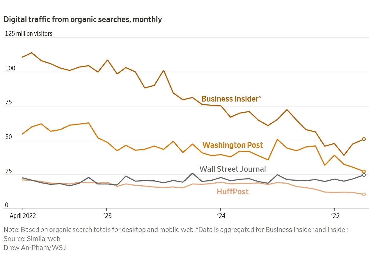
Reid claims, “AI in Search is driving more queries and higher quality clicks.” Google argues that click “quality” is improving, meaning people are more purposeful, engaging longer on sites they choose for a reason instead of responding to clickbait. That may be, but organic searches (from unpaid sources) is still down for “some” news outlets already hurting because of declining print and digital subscriptions.
If users get their questions answered from the AI summary, why go to the original source? Students might discuss what, if any, responsibility Google bears for compensating content creators.

Advice for Taking Time Off

A Financial Times article offers advice for those hesitant about taking time away from work, particularly time away from email. The suggestions from company executives may be useful to new graduates and others starting a career.
Here’s my summary with character dimensions that may be illustrated by each action:
Set clear expectations with friends and family about work commitments. (accountability, courage)
Empower people to respond for you and have a plan for emergencies. (humility)
Model vacationing without email for coworkers. (accountability)
Respond only during set times during the day, for example, in the morning, if you must. (integrity/consistency)
Write an OOO message that discourages emails waiting for your return. (integrity/transparency)
Resist the temptation to check email! (courage, integrity)

Lessons from Delta Comm Failures
A passenger describes a “total communication breakdown” before, during, and after an emergency Delta flight landing. Following are lessons for students from both the incident and from how the reporter addressed the passenger’s complaint.

On a flight from Madrid to New York City, an engine failed, requiring the plane to land on the island of Azores, a stunning place to visit but perhaps not following an emergency landing. After researching the situation, a New York Times reporter confirmed that “Delta’s crisis communications strategy failed badly.”
Lesson 1: Customers have more credibility when they report what happened accurately and objectively.
The reporter called out a few inaccuracies and generalizations in the passenger’s telling. Here’s one example:
“It is also not exactly true that Delta had no ‘ground support or personnel.’”
The reporter found that the airline contracted with locals who were lauded by other passengers. Delta doesn’t fly to that airport, so they can’t be expected to have their own staff.
As another example, the reporter refines the passenger’s note about compensation:
Marc, you called Delta’s approach “shady and evasive.” I would go with “incomplete and maladroit.”
“Shady and evasive” are character judgments, yet we have no idea whether malintent existed. The reporter sticks with behaviors: a failure of good practice and a lack of skill.
Lesson 2: Overcommunicate (within reason) during a crisis and ensure that all customers get the same message at the same time.
The reporter confirms that the wait for information, particularly whether passengers would have hotel rooms, was long and caused stress. Some got messages, while others did not.
Passengers also saw flight staff “whisked off” to a hotel with no explanation or communication. Turns out, rest was mandatory so the crew could fly the next day. But as business communication faculty know, frequent communication is essential. Passengers felt “in the dark.”
Lesson 3: Crisis situations are not the time for humor.
This next bit sounds outrageous from a crisis communication perspective. Passengers heard “loud, scary noises from the left side of the plane” and estimate that it wasn’t until 10 minutes later—10 minutes!—when they heard an announcement recalled this way (commentary is from the reporter):
“The pilot just woke up from his nap and is going to look into what is happening.” If true, wrote Mr. Durrant [a Delta spokesperson], the nap reference was “likely referring to planned rest periods for flight crew.”
Even if the pilot was napping for legitimate reasons, why share it with passengers? If it was a joke, passengers did not seem to find it funny.
Lesson 4: Demonstrate integrity (consistency, accuracy, and transparency) in all communications.
The pilot announced that another plane would arrive in 6 hours. Any reasonable, hopeful passenger would assume this means they would be leaving in 6 hours, but that wasn’t the case because of rest requirements. Passengers had to spend the night.
In addition, passengers seemed to be compensated different amounts at different times, despite an EU law regulating the amount. Some garnered more after writing a “measured” complaint letter.
In the end, this situation reflected poorly on Delta. A few simple changes would not have made the situation less scary or frustrating but could have reduced the reputational hit.

McDonald's Quarterly Earnings Report and Comm Strategies

McDonald’s had a good second quarter, with global sales up 6%. Students could analyze the report formats and communication strategies executives used during the earnings call.
One lesson for students is the multiple communication channels and report formats McDonald’s published to communicate its quarterly earnings. The press release, quarterly report in four formats (PDF, Zip files, HTML, and Excel), and recorded Webcast earnings call (and transcript) are all open to the public and convey a consistent message, which is upfront in the press release:
Our 6% global Systemwide sales growth this quarter is a testament to the power of compelling value, standout marketing, and menu innovation—proving again that when we stay focused on executing what matters most to our customers, we grow. Our technology investments and ability to scale digital solutions at speed will continue to elevate the McDonald's experience for customers, crew, and our global System.
Any question and answer during the earnings call provides examples of communication strategies. For example, executives use what we might teach as hedging or tentative language (“I think”); however, students can see these responses employed strategically. They persuade the audience by demonstrating humility and credibility—qualifying responses to show a cautious approach and, in effect, saying, “I don’t know everything.” This language also protects an executive whose prediction turns out wrong, and it conveys a conversational tone to build trust.
Although the news is good, the first question challenged the company’s reliance on “value,” particularly in the United States, where families are under increasing financial pressure. Here are the first question and answer as an example from the transcript (my notes in green italics):
David Palmer, Analyst, Evercore: Thank you, and thanks for all of your, comments. Sounds like you’re still exploring ways to bolster value perception in The US. Ahead of anything there, you know, could you just speak to where you think McDonald’s value and affordability scores are today in The US? You know, perhaps before and after Snack Wrap and your recent McValue menu changes. You know, where is the consumer perception today versus McDonald’s in the past and versus near end competitors and maybe even fast casual competitors?
And and if there’s a difference between The US perception in terms of value versus other key IOM markets, would love to hear about that as well. Thanks so much.
Chris Kemczynski, Chairman and Chief Executive Officer, McDonald’s Corporation: Hi, David. It’s Chris [builds trust with first names and a friendly tone]. Thanks for the question. I think [demonstrates conversational style and humility with hedging language] when we talk about value, it’s important that we we really break it down and and get very specific about the different consumer segments. And I’ll start with, our most loyal consumers, and these are the ones who are on our loyalty program [previews content].
Roughly a quarter of our business in The US is on our loyalty program [frames the response and emphasizes return business]. And what we see is if you [conversational style] are a loyalty member at McDonald’s, we have we have exceptional value and affordability scores amongst those consumers. And probably that’s most evidenced by what I shared in in the prepared remarks, which is the uptick that you see in terms of frequency when we have a loyal consumer in our loyalty program going from 10 roughly 10 visits to 26 visits. So I think [again] with our loyalty members, our most ardent McDonald’s customers, we’re in a really good position as it relates to value [reinforces “value” throughout] and affordability perception. If you move then to the McValue program, McValue is working.
And if you think about what we have with McValue, we have the $5 meal deal, which is the anchor for that. That continues to perform very well for us. And then we also have the buy one, add one for a dollar program. What’s interesting is [highlights what’s important] those two programs are very complementary. If you look at consumers who are using both, it’s only about 8% or so who are actually using both.
So they’re going after two very different occasions, two very different users, but compelling to both. So I feel good about the loyalty program. I feel good [uses anaphora to emphasize his confidence] about where we are with McValue. But the issue or the opportunity is if you add those two up, that’s, call it, roughly 50% of the business. And we know there’s the other 50% that today isn’t coming into our restaurant, isn’t using McValue, isn’t using the loyalty program [anaphora again], and that’s where we have the opportunity, which is around core menu pricing that we talked about in our prepared remarks [transitions to an “opportunity”—is more direct in the next section].
Today, too often, if you’re that consumer, you’re driving up to the restaurant and you’re seeing combo meals could be priced over $10 and that absolutely is shaping value perceptions and is shaping value perceptions in a negative way. So we’ve got to get that fixed [addresses concern directly]. As I mentioned in my remarks, we’re having, I think [again], very active and productive conversations with the franchisees. But the single biggest driver of what shapes a consumer’s overall perception of McDonald’s value is the menu board. And it’s when they drive up to the restaurant and they see the menu board, that’s what’s shaping the that’s the number one driver. [Could be clearer, but the gist is that the low-priced meals are good sellers, but pricier menu items negatively affect consumer perception.]
So we’ve got more work to do on that in The US. I’d say on the IOM [international operational markets—insider abbreviations for the audience] side of the business, we’re in a better position on that. Part of it is, as I mentioned in in the remarks [Fourth time he refers to the remarks—could demonstrate consistency/integrity] as well, we have a really strong EDAP program in all of our markets. So these are essentially $1 $2.03 dollars $4 euro pound whatever the currency is. But that is proving to be a very strong addition to the value programs in the IOM market.
And then also, as I mentioned, our operators there have been very prudent and I think [again] are doing the right things to make sure that our core menu pricing continues to be at leadership levels in the market. I would just note [tentative language], also on our international side, it’s not as competitive a market as it is in The U. S. There’s a lot of different players in The U. S.
We don’t face the same breadth of those players or competitors in our international markets. And so I think it’s a little bit easier for us to stand out and represent good value in international.

Walmart Exec Criticizes “Debbie Downers”

A Walmart executive’s claim that “Nobody wants [to hire] a Debbie Downer” may be misleading and is worth a more nuanced discussion with our students.
Executive Vice President and Chief People Officer Donna Morris cautions against being “constantly negative.” She says, “You know they’re going to show up [and] they’re going to bring the problem, never the solution. I like people who bring the problem and a suggestion for how they might resolve [it.]” Fair enough: Age-old advice to any working professional is to offer a solution along with a problem. Morris also distinguishes between being a “downer” and “toxic optimism,” but students may demonstrate a wide range of personality traits and communication practices in between.
One question is whether people with more negative Big Five personality traits could be valuable to an organization. Could those of us who tend towards neuroticism (🙋🏻♀️) or disagreeableness offer a service to the organization? For example, the many dismissed economists and silenced financial industry employees who warned about the 2008 Great Recession were characterized as “Debbie Downers” and worse.
Perhaps Morris illustrates a management issue. Could leaders be more receptive to hearing bad news? Could they do a better job coaching employees to present bad news persuasively and with possible solutions? This is what business communication faculty teach and organizational leaders could learn.
In addition to their delivery, the lesson for students may be to get perspective on their thinking. They might talk with others to be sure their ideas merit review. Are they selective in presenting bad news, or are they nitpicking? Do they present good news, point out benefits, and support others with positive feedback to balance out their keen insight about problems?
I presented character dimensions and virtues along a continuum in the book Recovery at Work. For example, hope rests somewhere between despair and optimism, which may exist at the same time. A despairing person at work may also feel optimistic that the organization will accept new ideas and take action for a more positive future.
Let’s accept and guide rather than belittle our employees who may be struggling at work.

Summer Break
I am taking a break from the blog, working on the 12th edition of the textbook and enjoying the summer sun! See you back in August.
— Amy Newman
Columbia President's Resignation

Columbia University President Katrina Armstrong’s resignation statement serves as a worthy example for analysis. The political situation is extremely controversial, and she avoids direct references.
Her emphasis is on the “interim” nature of her position. In other words, she wasn’t planning to stay long, anyway. She mentions this early in her short statement and reinforces her “few months” of service at the end. She also emphasizes up front that she will return to her former role at the university.
Armstrong speaks well of Columbia and subtly refers to the controversy, using words like “healing” and “moving forward.” At the end, she hints at having a bigger voice: “The world needs Columbia University, and you can be assured that I will do everything I can to tell that story.”
It’s difficult to think of what else she could reasonably say, given the university’s precarious situation with the government and with all its many constituents. She may have said just enough.
This is one of those messages that could be classified as positive or negative news, depending on the receiver’s perspective. But appointing yet another interim president is not great, for sure.

Passive Investing in Charts
Simple charts illustrate passive and active investing. A new documentary, “Tune Out the Noise,” which The Wall Street Journal calls “a nerdy and genuinely engrossing documentary about investment strategy,” might interest finance and other business students.

These two charts show the total net assets and the net asset flows of active and passive investments over time. The area chart is a useful way to illustrate the percentage of total assets, while the line chart illustrates dollar value over time, clearly showing a shift beginning around 2005.
This might be an opportunity to explain the difference between active investing (trying to outperform the market, which may involve frequent moves and higher costs) and passive investing (buying and holding stocks for the long term, often in index funds with lower fees). A WSJ article raises questions of humility for active investing:
Picking stocks is at heart an arrogant act.
It requires in the stock picker a confidence that most others are dunces, and that riches await those with better information and sharper instincts.
A class activity or assignment could ask students to research and create visuals for active and passive investments over time. Results seem to vary by asset class. For example, a recent Morningstar analysis found higher long-term success rates of active investing in real estate, bonds, and small-cap equities, and the lowest rates in U.S. large-cap equities.
Claude Wins a Writing Contest
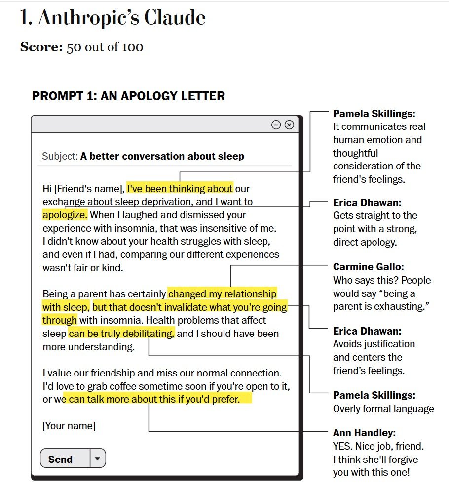
A Washington Post reporter compared five AI tools and found Claude the clear winner. The prompts and analysis are interesting for a class discussion and activity.
The five prompts covered a range of communication topics: an apology to a friend, a CEO layoff message, a request to a spouse, a weird work proposal, and a breakup text. Five judges, “who have all written books and teach courses on communication,” rated the tools in this order:
Anthropic’s Claude
DeepSeek
Google’s Gemini
OpenAI’s ChatGPT
Microsoft Copilot
Judges found Copilot particularly “stilted” and “robotic,” generating the dreaded “hope you’re well.” That’s too bad because Copilot is built into all Microsoft 365 products, a popular choice for work.
I wish we could see all the writing samples and judges’ feedback, but the article includes only a couple of examples. But students could use the same prompts for a class activity and compare results.
We could ask students to put more effort into the prompt, with detailed context and a more thorough audience analysis. We also could give students more specific guidance for evaluating the results. Or, students could create their own prompts. With more instructions—both to AI and to students—students might rank the tools differently.
Comparing Stock Charts for Perspective
This was a bad week for the U.S. stock market, but graphics make the news look worse than it is. Students can compare charts to see how truncated axes affect perception.

Yahoo!’s monthly chart has a short range: 41,000 to 44,000 for this monthly line chart. With the red line and shading, the results look awful. Noting the 6.87% drop is helpful—it’s not great but not devastating either. For the 62% of Americans (varying largely by demographic group) who own stock in some way, their portfolios are unlikely to be invested 100% in DJIA stock, so their personal losses are probably smaller.

This one year chart, also Yahoo!’s, shows a more complete view of the market. Over a year, stocks were still in positive territory—green(!)—and the recent dip is in clearer perspective. Not that short-term investors and perhaps retirees shouldn’t be concerned, and we might be headed into a recession, but this chart recognizes the extraordinary gains in the past year as well as the recent losses.
Students can find longer-term charts to see an even fuller picture of U.S. stock market returns. They might also find, or need to create, charts with a Y-axis starting at 0.
As always, the data visualization depends on the audience and purpose. If your audience is television viewers, and your purpose is to engender fear, then short time frames and truncated axes do the trick. If you’re a financial advisor, and your audience is a client who is a long-term investor with a balanced portfolio, you would probably not show these charts at all and instead focus on their portfolio returns over time.
Musk Email Lands in Italy
Elon Musk’s five-bullet-points email didn’t go over well in the U.S., but the reaction is worse in Italy, raising questions about intercultural communication for students to discuss. The email asks government workers to list five accomplishments in the past week.
With the subject, “What did you do last week?,” these emails were met with mixed reactions in the U.S., with some agencies instructing their employees not to respond. But when Italian workers at Aviano Air Base received the email, the negative reaction was stronger.
Students can explore cultural differences. One framework to explain the different reactions is Hofstede’s model, particularly the dimension of individualist / collectivist society. As one Italian union representative said, Italy “is not the Wild West like the U.S.” This country comparison tool website describes individualism as follows:
The fundamental issue addressed by this dimension is the degree of interdependence a society maintains among its members. It has to do with whether people's self-image is defined in terms of “I” or “W.” In Individualist societies, people are supposed to look after themselves and their direct family only. In Collectivist societies people belong to “in groups” that take care of them in exchange for loyalty.

The differences, shown here according to the comparison tool, aren’t as great as we might think, but Italian unions represent a higher percentage of the population, are more highly centralized, and provide broader protections than U.S. unions do.
Students may find other differences driving these reactions. For example, this past week, Italian President Sergio Mattarella declined a meeting with Musk about a potential $1.5 billion deal for Starlink, the satellite internet service. The request raised concerns about a public institution negotiating with a private entity. All this might be intensified by Europe’s reaction to the U.S. political situation at the moment.
Southwest's Failed Attempt at Humor
When affecting people’s pocketbooks, use humor cautiously. This is a lesson Southwest learned this week after announcing bag fees for this first time in the airline’s history.

The message communicating the bad news is vague. This Instagram post describes what the company will do—offer free bags for certain customers—but omits the obvious change, a significant one for the company that always touted “bags fly free.”
Investors responded well, lifting the stock price in a show of support for potentially greater profits. But customers, as expected, are unhappy.
Although Southwest is known for its folksy way (the stock symbol is LUV), maybe now was not the best time for jokes. The post downplaying the news by comparing it to the NBA trade that outraged fans didn’t go well.
We might see this as a failing of character in two ways. First, a lack of compassion minimizes the impact on customers and, in a way, takes advantage of their loyalty. Second, although consistent with the brand, humor detracts from the bad news and seems like a lack of integrity—inconsistency with the message.
We’ll see how the change affects flying decisions, particularly whether loyalty extends beyond this perk.
Pew Study Shows Workers Worried About AI

A new Pew Research Center Study presents an opportunity to talk with students about their hopes and fears about AI. The report title, “U.S. Workers Are More Worried Than Hopeful About Future AI Use in the Workplace,” puts the main point squarely up front.
Of the American workers surveyed in October 2024, 81% were considered “non-AI users.” Seventeen percent hadn’t heard of AI use in the workplace.

In addition, “about one-in-ten workers say they use AI chatbots—such as ChatGPT, Gemini or Copilot—at work every day or a few times a week; 7% use them a few times a month.” Chatbot is a limited term; more accurately, this and other questions seem to be about generative and other AI, with functionality beyond simple chatbots. What do people—particularly those who don’t use or haven’t heard of how to use AI—think AI means? Also, a lot could change in a few months, so it will be interesting to see similar surveys as they emerge.
Given these low usage rates, it tracks that people are worried about AI. Without experience, people may be more fearful—and perhaps fear keeps them away. When we use AI more, we can understand the possibilities as well as the limitations and see how we need to maintain authority over our work.
Scott Galloway (Prof. G) answered a wealth manager’s question about whether AI could take his job. His recommendation was for the young professional to learn how to use AI—that the differentiator is how well he can use AI tools to improve his work in ways that the competition hasn’t yet learned. We might teach the same to our business communication students: use AI to your advantage, but don’t let it replace you, or your writing.