
Comparing Headlines About the Market

How does the media describe the recent stock market decline? Let’s compare a few headlines:
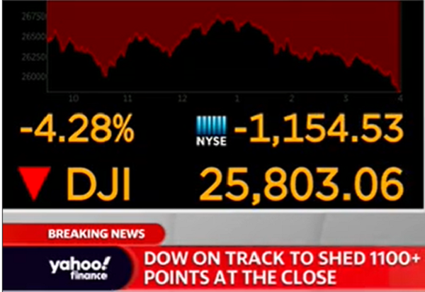
Dow falls 1,191 points -- the most in history (CNN)
Coronavirus Drives Stocks Down for 6th Day and Into Correction (New York Times)
U.S. Stocks Slide Into a Correction as Virus Fears Show No Sign of Easing (Wall Street Journal)
Dow's point drop worst on record as stocks fall into correction (Fox News)
Dow drops 1190 points amid coronavirus fears, S&P 500 sees fastest correction in history (Yahoo Finance)
Of the five, Fox is the only one that didn’t place a headline about the market at the top of its web page.
Discussion:
What do you make of these headline choices, including placement? What might the wording indicate about the media group’s beliefs or audience?
In class after a previous decline, I took issue with headlines like CNN’s. Do you see an issue? (Hint: What does a raw number tell us?)

Report Criticizes Airline Safety and Oversight

A U.S. Department of Transportation report criticizes the Federal Aviation Association and Southwest Airlines for lax safety standards. A New York Times article summarizes the report findings:
“The report found that the Federal Aviation Administration had allowed Southwest to routinely provide inaccurate data to pilots and to operate more than 150,000 flights on planes whose airworthiness had not been confirmed.
“The agency also failed to investigate concerns raised by its own representatives ‘ranging from senior executives to local inspectors’ over Southwest’s safety culture.”
The DOT includes “Four SMS Components,” the FAA’s own description to fault safety culture in both organizations.
Discussion:
What business communication principles are illustrated in the report? Who are the primary and secondary audiences, and how well does the report meet its communication objectives?
The report does a particularly good job of using “message titles” (also called “talking headings”). What are some examples?
What else do you notice about the report? Consider the writing style, organization, and other features. What could be improved?
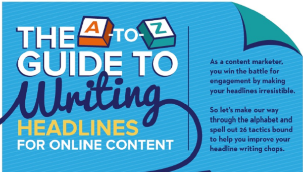
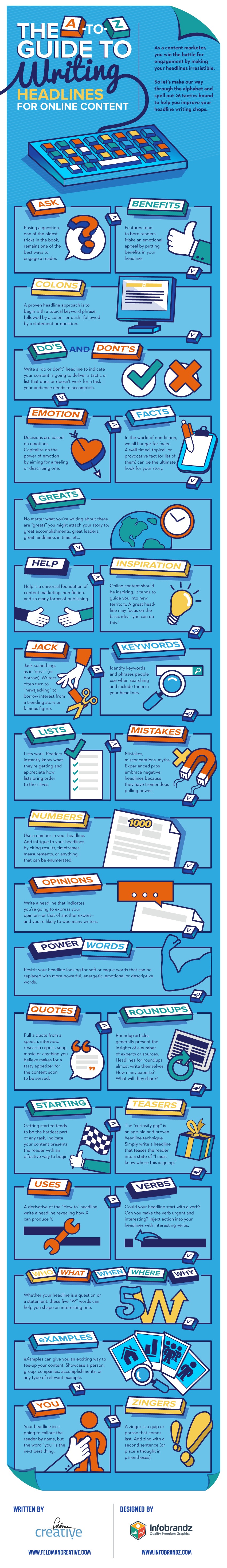
Tips for Writing Headlines

An infographic written by Feldman Creative and designed by Infobrandz offers tips for writing headlines, particularly for online content. The advice focuses on capturing attention, which makes sense in our cluttered online world: posing a question, focusing on the reader, using a colon or m-dash, and using visceral language.
Read the entire infographic on Ragan.com. Some of this advice is useful for email subject lines, which may inspire receivers to read or delete your email.
Discussion:
Read the past 50 or so subject lines of emails you have received. Which of these principles are followed? What differences do you notice in marketing and other emails?
What advice do you find useful from the infographic for online content? What about email subject lines that you write?

Wells Fargo Earnings Call

The Wells Fargo scandal of creating fake accounts became public in 2016, and the company is still suffering the repercussions. Profit is down 53%, and stock performance is lagging.
On an earnings call, Charles Scharf, who has been the CEO since October 2019, explained the bank’s current position:
I was honored to be chosen to lead Wells Fargo because I believe this is an extraordinary company that plays an important role in this country. We came out of the financial crisis as the most valuable and most respected bank in the US, but as you know, we made some terrible mistakes and have not effectively addressed our shortcomings. These circumstances have led to financial underperformance, but we have one of the most enviable financial services franchises in the world and employees that want to do what's necessary to again be one of the most respected and successful banks in the US.
Discussion:
Read the earnings call transcript. What’s your view of how Scharf and John R. Shrewsberry, EVP and CFO, addressed concerns?
How well has the bank recovered its image since 2016? What examples of their communications can you cite?
What could bank executives have done differently in the past four years?
How well does the line chart work to compare Wells to other leading banks? What could be improved?

Data in the Uber's Safety Report
Uber published its first safety report, and the company is lauded for its transparency. A Wall Street Journal article leads with the number of sexual assaults reported during the last two years: 5,981. Of course, any number is too many—no one should be assaulted in an Uber or anywhere else. And sexual assaults are notoriously underreported, so we have no idea how many have actually occurred.
At the same time, a skeptic might want to know the total number of rides in order to put the number of reports in context. The report does provide this information (see the report for footnotes):
The report makes additional attempts to put the numbers in context:
All of that work culminates in the Safety Report that we are sharing with you, the public, today. To put US safety challenges in context:
• In 2018, over 36,000 people lost their lives in car crashes in the United States alone (3)
• Approximately 20,000 people were the victims of homicide in 2017(4)
• Nearly 44% of women in the US have been a victim of sexual violence in their lifetime—which means that more than 52 million women live with that experience every day (5)
Every form of transportation is impacted by these issues. For example, the NYPD received 1,125 complaints of sex offenses in the transit system during the same time period covered by this report.(6,7) In the United States alone, more than 45 rides on Uber happen every second. At that scale, we are not immune to society’s most serious safety challenges, including sexual assault. Yet when collecting data for that portion of our report, we found there was no uniform industry standard for counting and categorizing those types of incidents.
The 84-page report is incredibly detailed and includes external reports for credibility and the number of charges for various types of assaults.
Discussion:
Analyze the report: the audience, communication objectives, organization, writing style, format. What works well, and what could be improved?
Does the context in these examples convince you that the numbers aren’t so bad? Why or why not?
Otherwise, how well does Uber address the safety issues? How do you assess the report credibility? What other questions do you have?
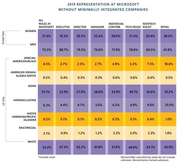
Microsoft's Diversity and Inclusion Report

Microsoft’s 2019 Diversity and Inclusion report is the company’s sixth since 2014.
In the introductory letter, we learn about positive changes in demographic data:
In technical roles alone, we have 49% more women, 48% more Hispanic/Latinx, and 67% more African American/Black employees than we did three years ago. And beyond population growth, this year’s snapshot shows diversity representation has risen in every demographic category we track.
The report includes a few dazzling graphics, such as the one shown here.
Discussion:
Read the entire report. What principles of business communication are followed?
What suggestions for improvement would you suggest to the report authors?
What’s your view of the graphic shown here? What is the main point? How else could the data be shown?
Although the report writers acknowledge that some of the diversity increase in technical roles is attributed to employee growth, what other questions might a skeptic ask?
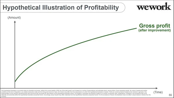
SoftBank's Vague WeWork Slides
SoftBank already took a financial hit because of its investment in WeWork. Now, the company is facing criticism about its data analysis and presentation.
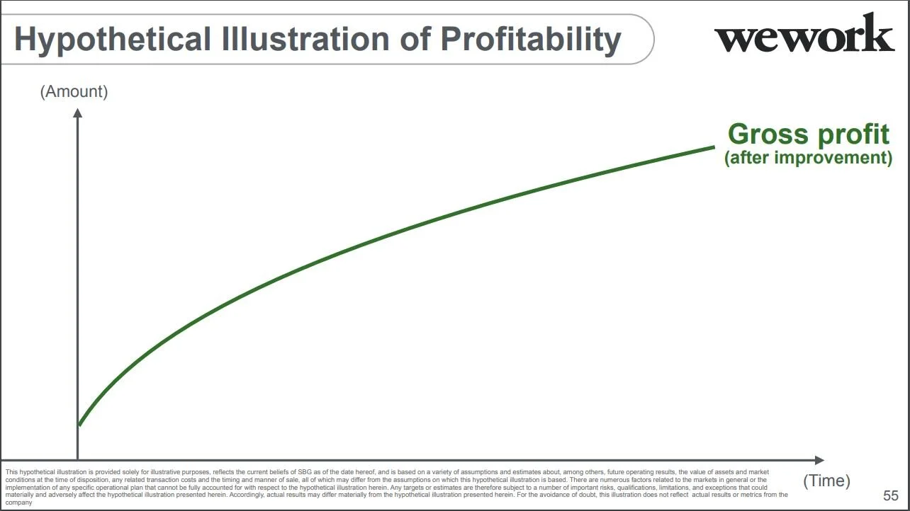
A deck SoftBank Group (SBG) used to justify its WeWork investment includes several “hypothetical” and vague slides, like this one.
If you’re having trouble reading the footnote, here it is:
This hypothetical illustration is provided solely for illustrative purposes, reflects the current beliefs of SBG as of the date hereof, and is based on a variety of assumptions and estimates about, among others, future operating results, the value of assets and market conditions at the time of disposition, any related transaction costs and the timing and manner of sale, all of which may differ from the assumptions on which this hypothetical illustration is based. There are numerous factors related to the markets in general or the implementation of any specific operational plan that cannot be fully accounted for with respect to the hypothetical illustration herein. Any targets or estimates are therefore subject to a number of important risks, qualifications, limitations, and exceptions that could materially and adversely affect the hypothetical illustration presented herein. Accordingly, actual results may differ materially from the hypothetical illustration presented herein. For the avoidance of doubt, this illustration does not reflect actual results or metrics from the company.
The slide title is also odd: the illustration isn’t hypothetical, but the profitability is.
Discussion:
How might this chart affect SoftBank’s credibility?
What other examples in the SoftBank deck are problematic?
What leadership character dimensions are illustrated by this situation?
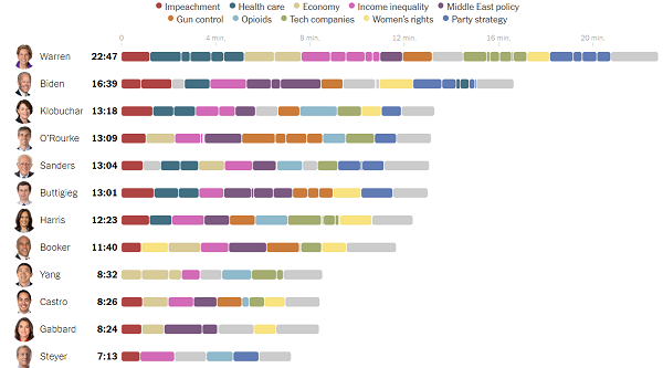
Beautiful Graphic
The New York Times summarizes how much time democratic candidates spoke during a recent debate—and how much time they spent on each topic—in a well-designed graphic.

At a glance, we see that Senator Elizabeth Warren had about three times more air time than did Tom Steyer. We also see the topics that captured the most attention. However, we don’t see a cumulative calculation of topics, which could also be useful.
Discussion:
What works well about this graphic? What could be improved?
What’s your view of the color combination?
If you watched the October 14 debate, does the time allocation surprise you? If so, why do you think that might be?
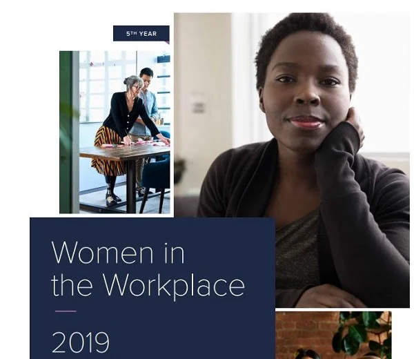
Women in the Workplace Report
Lean In and McKinsey have co-published a report about women at work. The report concludes, “Five years in, we see bright spots at senior levels. But companies need to focus their efforts earlier in the pipeline to make real progress.”
According to the findings, although more women have higher level positions than they did five years ago, they still face obstacles. One stumbling block is getting that first management position. Another is how women are treated at work. The report identifies particular challenges for “only” women—“being the only or one of the only women in the room at work.”
The report is a good example of a well-organized, beautifully designed report with clear graphics, such as this one. However, the axis is truncated.
Discussion:
Describe how the axis is truncated. What problems does this create?
What surprises you about the report findings? What, if anything, doesn’t surprise you?
Describe the report organization.
Which graphics do you find most and lease useful?


Business Leaders Sign Letter to Top Officials

Fifty CEOs and business school leaders signed a letter to President Trump and other top-ranking politicians urging action to allow for more international applications. The letter comes after a report by the Graduate Management Admissions Council showing declining applications.
Report conclusions follow:
[A]llowing top talent to study and work in the country of their choice helps create jobs, not take them. It offers insight into changing trends for historically talent-attracting and talent-supplying countries. Business school applications are a powerful metric—and forecast—of the success of individual economies in prioritizing talent and therefore leading innovation and growth. A survey of these latest metrics shows change in our midst—and for certain economies, warning signs for the future.
In their letter, the business leaders write that the U.S. is “needlessly capping our growth and can do better.” They urge U.S. politicians to allow more movement by taking the following action:
Removing “per-country” visa caps, modernizing our visa processing system, and reforming the H-1B visa program to make it possible for the most talented people to have a reasonable chance of gaining entry to the United States.
Creating a “heartland” visa that encourages immigration to the regions of the United States that could most use the vitality of these talented individuals.
Discussion:
Analyze the letter. Who are the primary and secondary audiences? What are the communication objectives? How do you assess the organization and writing style?
What persuasive communication strategies do the writers use? Which are most and least effective?
Analyze the report using the same questions.
How well does the infographic summarize the report conclusions? What could be improved?
WeWork: "Humbler"
Several articles in the past few weeks have scolded WeWork CEO Adam Neumann and the investors who followed his story.
The Wall Street Journal was the first to describe Neumann’s odd behavior and published another article, “WeWork Investors Turned Off by ‘Sloppy’ IPO Filings.” The recent article explains one problem in the filings (shown below):
“A section headed ‘illustrative annual economics’ that assumed 100% workstation utilization vanished, for example, as did two graphs portraying a typical location going from ‘-$’ to ‘+$,’ with no y-axis showing the actual dollar amounts being depicted.”
A New York Times article, “Was WeWork Ever Going to Work?” criticizes investors for missing obvious problems with the company’s initial business plan, such as the reliance on start-up revenue when most entrepreneurial ventures fail. According to this report, it took people finally looking at the data to realize how much We is losing and how hard it will be for the company to succeed.

The article includes other examples of investors’ blind exuberance:
“It is not merely money that separates the ruling class from the rest of the country. Often it seems as if it is the gaping difference in the application of common sense. Ultimately, it was the bankers, technocrats, statesmen and acolytes of the data-junkie class who were willing to believe that Elizabeth Holmes, a 19-year-old college dropout who thought a black turtleneck would make her Steve Jobs, was going to revolutionize blood-testing. It didn’t seem to matter that she could not deliver any real evidence to prove it.”
An Inc. article, “The Future of WeWork: Leaner, Humbler, and Duller,” suggests a new path for We. The author suggests less hype, fewer employees, and more discipline for the company to survive.
Discussion:
Who do you blame for WeWork’s failed IPO?
If you believe the New York Times article, investors are gullible. Do you agree with this assessment? If so, why might this be the case?
Read the “Note”—the fine print—under the table, shown above. How do you interpret this information?
What should We do now to build credibility and save the business?
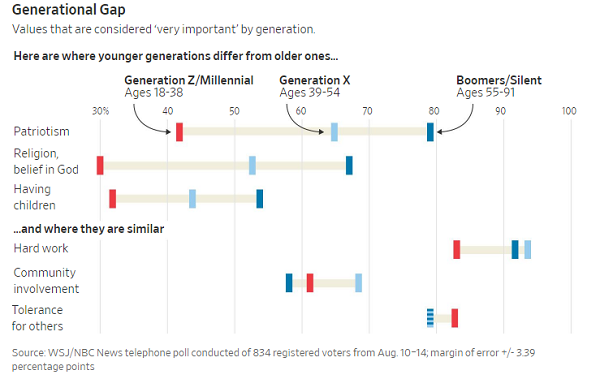
Creative Charts
The Wall Street Journal created a chart to show what Americans value—and how those values have shifted over time. The graphic is a variation on a line chart with generations represented by color.

Understanding the chart may take a while. At first glance, the generation identifiers at the top look like headings, but they point to small bar colors.
The information is interesting, and some points probably aren’t surprising. Older Americans value patriotism, religion (which the poll describes as “belief in God”), and having children more highly than do younger Americans.
Discussion:
Assess the graphic design. How intuitive do you find the chart? What works well, and what could be improved?
What are your reactions to the data? What do you find surprising—and not?
What implications do you see for companies’ attempts to keep employees engaged at work?

Graphical Resumes

Are employers becoming more open to graphical resumes? The boring, standard resume format hasn’t changed much despite some attempts at infographics and video.
A Wall Street Journal article indicates that acceptance may be increasing for resumes that look more like a social profile:
The stodgiest of business documents is in the midst of its most extreme makeover yet—whether employers want it or not. Gone are the utilitarian, black-and-white documents covered in bullet points. As Gen Z enters the workforce, companies are seeing digital CVs filled with artistic flourishes, including illustrations of college mascots, logos of past employers and icons to denote hobbies such as home renovation and watching movies.
Particularly for jobs in fields like marketing, graphical resumes are more common. Candidates might include an avatar or a section called “By the numbers.”
For more traditional fields, it’s a bigger risk: a visual resume might get you noticed but not for the right reasons. For any jobs, bitmojis and other images that seem childish don’t represent candidates in the best light.
Discussion:
How traditional is your resume? Would you consider adding graphics? Why or why not?
In addition to marketing, which fields might be more open to a graphical resume?
What’s your view of the resume shown above? What about this Microsoft template resume?

College Applications Controversy

A Wall Street Journal article reports that colleges are making few changes to how they review applications despite the recent admissions scandal. University officials say they are overburdened by reading applications, which have increased dramatically in the past few years, shown here.
University leadership also argue that they should not distrust all applicants because of the few who misrepresent themselves. Other than school transcripts and test scores, as a spokesperson at Dartmouth said, “The rest of a student’s file is reviewed on an honor-code assumption that a student’s work is a student’s work. It is not our policy to suspect every student of falsifying records.”
On the other hand, some universities have implemented additional checks, for example, of athletes. Some hire outside firms to verify information, and admissions staff do check for inconsistencies, but the article concludes that “almost none have a formal audit process in which they select a random sample of applications to independently verify.”
Discussion:
Should universities do more to verify the accuracy of students’ applications? Why or why not?
Analyze the line chart at right. How does the chart skew the data? How could this affect the arguments presented in the WSJ article? What recommendations would you make to the designer?

Report on Minimum Wage

The Congressional Budget Office has determined that raising the U.S. federal minimum wage to $15 per hour will improve pay for 17 million workers but leave about 1.3 million without jobs. A report explains the impact:
“[I]n an average week in 2025, the $15 option would increase the wages of 17 million workers whose wages would otherwise be below $15 per hour, CBO estimates. The wages of many of the 10 million workers whose wages would be slightly above the new federal minimum would also increase.”
Although it’s higher in some cities and states, the federal minimum wage has been $7.25 since 2009. The report explores changes related to increases to $15, $12, and $10 but concludes: “The options’ effects on employment and family income are uncertain.”
The report comes before a vote to pass the “Raise the Wage Act,” which is proposed by House Democrats to increase wages gradually to $15 until 2024.
Discussion:
Assess the graphic, at right, which is on the report cover. What does it mean, and how could it be improved? What’s your view of using the graphic on the report cover?
Assess the report. Which business communication principles are followed, and what could be improved? Consider organization, writing style, document design, and so on.
Finally, assess the report conclusions. What other data would be useful to know?
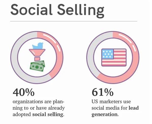
Analyzing an Infographic
PR Daily presents social media trends in this infographic. Categories include social selling, social listening, influencer marketing, ephemeral content, and social advertising.
The graphic is easy to read and uses several different data displays—some more meaningful than others. Data about social listening, one of the five categories, is at right.
Discussion:
Analyze the audience for the graphic and identify the communication objectives.
What works well about the entire graphic? Consider the organization, writing style, and data displays.
What could be improved?


Analyzing a Column Chart
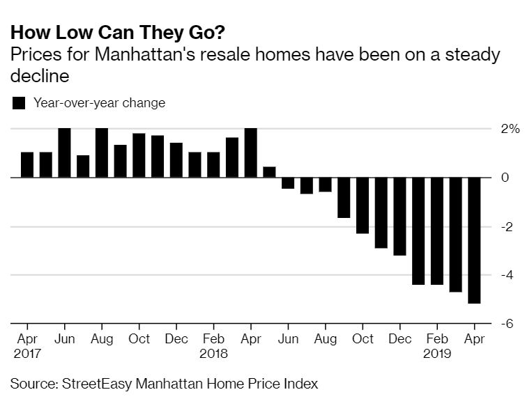
A Bloomberg article shows Manhattan resale home prices in a declining column chart. At a glance, the graph shows a clear, fairly steady decline since 2017.
When you mouseover the chart on the website (not here), the date and percentage appear.
Discussion:
Assess the chart title, “How Low Can They Go?” Why would the author or copywriter choose this title? How effective is it for the audience of business news readers?
Assess the chart format. What works well, and what could be improved?
What’s your view of using the mouseover instead of labeling bars. What other choices could work well?

A Pie Chart Totals 128%

A pie chart represents part of a whole, so how can numbers total more than 100%? They can’t. On Twitter, Dorsa Amir identifies additional problems.
The caption is also concerning: “High Support for Legalizing Marijuana.” Do we see evidence to prove this claim?
Note: This chart was created as a joke and posted on a sub-reddit.
Discussion:
What is the point of the chart?
What data would prove the point, and how could the designer have presented data differently?

Charts About Uber and Lyft

A New York Times article compares Uber and Lyft in four simple charts. As you might expect, Uber leads in bookings and revenue, but it has greater losses and expenses.
The graphics are traditional bar charts, which are horizontal. Although we call vertical graphics bar charts, technically they are column charts. Either way, the charts are easy to read and compare, but can they be improved?
Discussion:

How else can data about the two companies be compared? For example, would side-by-side bar charts work better? Or vertical instead of horizontal bars?
Can you think of a way to show all four categories of information in one chart? Would that help understanding or not?
What other suggestions would you make to the NYT designer?

Views About Social Media
Is social media influencing over lives positively or negatively? A Wall Street Journal/NBC poll found that Americans see more problems than benefits to society, although 70% of respondents use social media sites every day.


Respondents also don’t have high trust in technology companies, rating the federal government as more trustworthy, with Facebook getting particularly low grades. This is tough news for the tech firms considering Gallup’s research on confidence in institutions. Given a list of 15 institutions, including small business, the police, and the military, Americans have consistently rated Congress last.
Discussion:
Do these survey results surprise you? Why or why not?
The Gallup question is different, asking about “confidence” rather than “trust.” Could the wording make a difference in responses? Why or why not?
Evaluate these Wall Street Journal graphics. How well do they convey the information? What could be improved?