
Analyzing a Column Chart
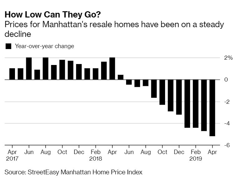
A Bloomberg article shows Manhattan resale home prices in a declining column chart. At a glance, the graph shows a clear, fairly steady decline since 2017.
When you mouseover the chart on the website (not here), the date and percentage appear.
Discussion:
Assess the chart title, “How Low Can They Go?” Why would the author or copywriter choose this title? How effective is it for the audience of business news readers?
Assess the chart format. What works well, and what could be improved?
What’s your view of using the mouseover instead of labeling bars. What other choices could work well?