
Problems with Medical Jargon

A new study identified specific phrases that patients would likely misunderstand from their healthcare provider. Students probably know that medical jargon causes problems, and they might be interested in analyzing their own provider’s communication.
The survey asked respondents to interpret these phrases, listed in the article supplement. In most cases, respondents were asked whether the news is good or bad. I can see how some could go either way. What does progressive, unremarkable, or impressive mean in a medical diagnosis? We could consider this issue a problem with humility in the medical profession.
Understanding didn’t improve with either age or education. In the demographic section, survey authors did provide non-binary options for gender: female, male, non-binary, other. A related article this week describes data scientists’ challenges when asking about gender. Although researchers found no significant differences in this study, in other studies, gender matters greatly, and students should consider this question carefully in their own primary research.
Public Talk of Layoffs

I remember when people where ashamed of being laid off. Old movies show men leaving for “work” months after they no longer had a job.
Today, people find community in discussing their fate, and they use their favorite platform—sometimes their former employer—to share their stories. Partly, the shame is lifted because of the numbers: 11,000 at Meta; 10,000 at Amazon; 3,700 at Twitter; 950 at Salesforce; and many others. In a colorful, but mostly unreadable chart, TrueUp logged 192,997 so far in 2022. (Maybe the logos could be scalable?)
The unfortunately named Blind app connects employees in several industries, particularly tech (95% of Twitter employees signed up). Students can review comments for an inside scoop just as they do on Glassdoor.
I feel encouraged by the public postings. In addition to the obvious compassion and vulnerability, the stories—good and bad about the layoff process and communication—keeps employers on their toes. Also, people are finding new jobs, and this will get easier as the market, once again, opens up.
SoftBank Tones Down Presentations
SoftBank is changing how it presents information. Gone are the “flamboyant” charts. At the latest earnings results presentation, CEO Masayoshi Son started by describing what will be different this time and going forward: he will no longer deliver results but will pass that responsibility to the chief financial officer.

First, he addressed directly concerns about his health. He says, “You may ask why . . . “ [translated to English] and proceeded to tell us in about 30 minutes. After background about his interest in the “information revolution,” he explained,
Goto [CFO] is more suitable than me for playing defense. Me, I’m an aggressive person, not a defensive person, and I’d like to concentrate on Arm [chip manufacturer] for the time being.
Son said he’ll still be active: “I’ll continue to do the shareholder meetings, and when something unpredictable happens, I’ll come back anytime.”
Son has shown infamous charts with golden geese, unicorns, and rainbows. I wrote about his “hypothetical” line charts—like the WeWork line chart above, with an arrow but no data—in Chapter 9 of Business Communication and Character.

The current earnings deck is notably different, and this slide shows why. Losses are mounting, Son’s more “subdued role” matches SoftBank’s less aggressive investing style. The company has taken a dose of humility.
Surgeon General's Report Example
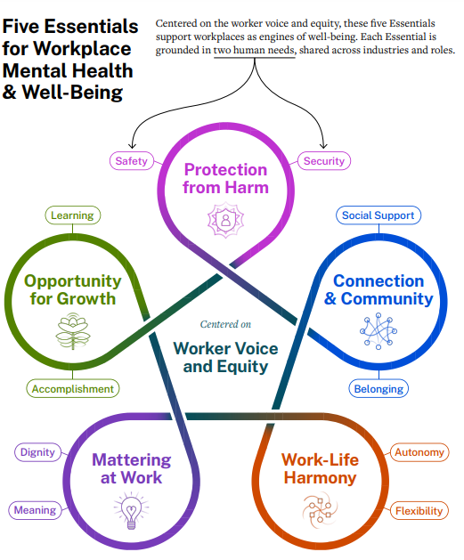
The U.S. surgeon general’s report, Framework for Workplace Mental Health & Well-Being, offers several discussion points for business communication students. The report itself is unusual, the first time a surgeon general has weighed in on what the media is framing as “toxic workplaces.” Coupled with over-reporting about “quiet quitting,” the report highlights problems at work.
An obvious discussion with students is about the report format and organization. It serves as a good example of a primarily text-based report, with few graphics except for the visual summary, which serves as an organizational cue throughout the 46 pages. We see some data and plenty of footnotes but no charts.
The report content—and how the U.S. surgeon general presented the findings on PBS NewsHour, for example—is worth exploring. First, of course, we want our workplaces to be more positive places. The recommendations presented are sound and perhaps obvious; in addition, as Vivek Murthy says, organizations have better outcomes when they are healthier places to work.
Second, what strikes me is the lack of accountability for organizational leaders and the challenges they face. Not once in the PBS interview does Murthy mention “leaders” or “managers”—actual people responsible for putting his recommendations in place. Murthy’s opening letter in the report is personal—about his immigrant parents—but his content summary is not. He blames the pandemic and uses impersonal subjects, for example, “organizations,” “we,” and “workplaces.” In the accompanying deck, titled “Reflection Questions,” “I” is never used, and “leaders” is used as the subject only once in the 20 questions; “we,” “workplace,” and “workers” prevail.
In the report, leaders, managers, and supervisors are called to action, sometimes in vague ways, for example, having the “opportunity” to do better. But the HR department gets no mention at all. A Wall Street Journal article summarizes, “The surgeon general’s guidance on the role of the workplace in well-being comes as many workers report work stress and difficulty concentrating.” I wonder how “workplaces” will respond.
Charts for Students to Analyze

NYU professor, author, and podcast host Scott Galloway has a new book, Adrift: America in 100 Charts, with good examples for students to analyze. His newsletter also describes charts, for example, a few that illustrate the U.S. incarceration problem. He uses data to conclude that our extraordinary incarceration rates do little to reduce crime.
On one page, he uses a bubble, a column, a paired column, a people graph, and a line chart. Each is chosen well for the purpose, although he doesn’t use message/descriptive titles, as business communication faculty would advise. Students will find other improvements, for example, maybe adding data labels to the first chart (despite the Y axis) and better distinguishing “All Men” in the people chart.
Galloway’s posts regularly offer examples to engage students in current political, tech, and business topics.

Not about charts, but this podcast episode (posted here) made me laugh out loud. Galloway describes text messages between Elon Musk, Satya Nadella, Jack Dorsey, and others. Turns out, they struggle with technology just like the rest of us. This is Musk’s response to Dorsey, who is waiting for him to join a meeting.
Overreliance on Annual Performance Reviews
Before and during the pandemic, several companies stopped doing annual employee reviews, but many have brought back the practice. Reports show that slowed hiring and increased layoffs are causing more pressure for employees to perform; managers want more ways to track and document performance. Without reviews, managers could appear to have lax standards, failing to hold employees accountable for outcomes.
The annual documentation, meeting, and goal-setting are not the real problems. Managers are uncomfortable giving feedback and rely only on once-a-year conversations. Employees need to know, ongoing, how their performance measures up to expectations so they have a chance to improve. When done well, annual reviews are a summary of what employees already know about where they stand. Ongoing feedback encourages self-accountability, holding oneself accountable without relying on external approval.

A Bloomberg Businessweek article (with simplistic, nonparallel charts) offers alternatives to the annual review, which could supplement the annual meeting. The recommendations are in line with good business communication: check in regularly, encourage the employee to reflect, focus on the future instead of the past, collect multiple opinions, etc.
Columbia’s Ranking, Data, and Communication Issues

The news of Columbia University’s tumble in college rankings from 2 to 18 offers business communication lessons for reporting data—and for persuasive arguments. In February 2022, Professor of Mathematics Michael Thaddeus identified discrepancies in how the Columbia reported data for U.S. News’s annual list. His analysis resulted in a persuasive argument with the following main points summarized in the introduction:
In sections 2 through 5, we examine some of the numerical data on students and faculty reported by Columbia to U.S. News—undergraduate class size, percentage of faculty with terminal degrees, percentage of faculty who are full-time, and student-faculty ratio—and compare them with figures computed by other means, drawing on information made public by Columbia elsewhere. In each case, we find discrepancies, sometimes quite large, and always in Columbia’s favor, between the two sets of figures.
In section 6, we consider the financial data underpinning the U.S. News Financial Resources subscore. It is largely based on instructional expenditures, but, as we show, Columbia’s stated instructional expenditures are implausibly large and include a substantial portion of the $1.2 billion that its medical center spends annually on patient care.
Finally, in section 7, we turn to graduation rates and the other “outcome measures” which account for more than one-third of the overall U.S. News ranking. We show that Columbia’s performance on some, perhaps even most, of these measures would plunge if its many transfer students were included.
New reports about Columbia’s fall credit Thaddeus’s analysis. The argument serves as an excellent example for our students, who might also explore their own views about the college rankings. In addition to data integrity, Thaddeus questions the value of these rankings and the influence they have on students’ college choice.
Students can also analyze the university’s response. In a statement posted on September 9, Provost Mary Boyce admitted, “we had previously relied on outdated and/or incorrect methodologies.” She also expressed “regret”:
The Columbia undergraduate experience is and always has been centered around small classes taught by highly accomplished faculty. That fact is unchanged. But anything less than complete accuracy in the data that we report—regardless of the size or the reason—is inconsistent with the standards of excellence to which Columbia holds itself. We deeply regret the deficiencies in our prior reporting and are committed to doing better.
The statement is more about future plans, for example, participating in the Common Data Set initiative, than about acknowledging wrongdoing. A fuller apology, including the impact of the inaccuracies and posted earlier than just days before rankings were published, would have demonstrated more humility and integrity.
New McKinsey Report with Charts
Business Communication and Character always includes a McKinsey report as a positive example, and the latest report about attrition and hiring doesn’t disappoint. Posted on the website without a fee, the report starts with a clear heading:
People keep quitting at record levels, yet companies are still trying to attract and retain them the same old ways. New research identifies five types of workers that employers can reach to fill jobs.
Main points are interspersed throughout the report in blue text, and descriptive headings with background images provide clear section divisions. The report is logical and easy to read, starting with the reasons for “The Great Renegotiation” or “The Great Attrition” (renamed from the “The Great Resignation” in previous news reports). Next, readers learn about “five personas”—types of workers and how to target each for employment.
As I always enjoy in McKinsey reports, the charts are clear, visually appealing, and varied. This report uses a simple color scheme and charts as they should be used: to interpret data and provide a lot of information at-a-glance.
Overall, this is a good example for our business communication students to follow.
U.S. DOT Airline Dashboard
The U.S. Department of Transportation (DOT) created what it calls a “dashboard” for passengers to know what to expect when their flight is delayed or cancelled. This work results from ongoing debate about airlines’ responsibility, particularly given the many issues travelers have experienced since the pandemic. Transportation Secretary Pete Buttigieg has pushed the airlines to offer at least free meals for 3-hour or longer delays and free hotel stays when passengers need to wait at an airport.

Although some airlines say they already offered these accommodations, DOT Deputy Secretary Polly Trottenberg said this is about enforcement: “Now that it’s in the customer service plans, it’s not something in discretion. It’s something we can enforce. And I think this dashboard is really going to kind of raise the state-of-the-art for consumers.”
As a visual, the dashboard works well. Looking across the rows, we see clearly what to expect from each of the airlines. Categorizing the actions by cancellations (shown here) and delays makes sense from the passenger’s perspective. However, the graphic is skewed right on the page because of the left-side column.

In addition, when I hear “dashboard,” I think of a more complex, interactive spreadsheet. The only functionality seems kind-of silly. The dropdown menu at top doesn’t add value because we can just as easily scan across to see what any airline provides. Also, I’m not sure why anyone would want the ability to “keep only” or “exclude” specific items—or to see repetitive text when they mouseover the markings. Finally, I chose “view data” and got the following in a pop-up window, which communicates nothing relevant.
I would call the visual a table, matrix, or grid. But I don’t want to disregard the good news: airlines are communicating what customers can expect, can be held accountable and, in some cases, are providing better service.
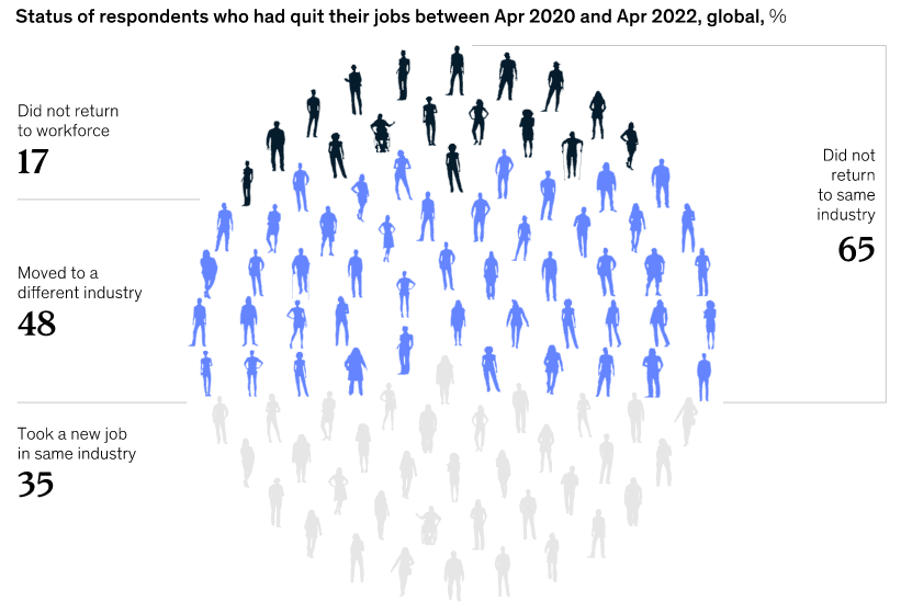
This Week’s Charts

A Wall Street Journal article includes a few simple data slides about people losing and finding jobs. The first line chart, shown here, is a good example of an at-a-glance picture of the employment rebound. The second chart, below, takes a bit longer to digest but provides more information. Both do what graphics should do: illustrate relationships of data to provide insights.
This Bloomberg image about SoftBank’s “epic losses” made me smile. I used the bank’s vague, data-less graphics as examples in Chapter 9 of Business Communication and Character. But in those SoftBank slides, one of which is below, the arrows pointed up, showing the bank’s overly optimistic view of WeWork.


Data Visualizations with Pop-Up Text

An NBC data visualization packs in a lot of data at-a-glance. With a simple table format and color, the graphic shows inflation for items over time. The chart is a good example of an alternative to the boring line and column or bar chart.
Later in the article, NBC does include two line charts, which work fine for more simple data—trends of single variables over time. But inflation is complicated, driven by key sectors, which this graphic illustrates.
The pop-up (hover over) text makes it easy to zoom into the data and add interactivity to graphics. Pop-up text functionality has been available in PowerPoint and Excel for years, and it’s easy to use. This feature add layers to data visualizations and can be effective for slide decks that people read on their own or for presenters to highlight important data points.
Argument Linking Marijuana to Violence

A Wall Street Journal opinion is a good example of a persuasive argument for business communication students to analyze. The articles uses logical arguments, emotional appeal, and credibility; evidence is stronger for some points than for others.
The author provides research to support increased marijuana use in young people and to link marijuana use to mental illness and hospital visits. Is the evidence linking use to violence strong enough to convince students? The first study referenced studies of teenagers with mood disorders; the second is a meta-study that concludes, “cannabis use appears to be a contributing factor in the perpetration of violence.” Both are from credible sources and illustrate data analysis principles from Chapter 9 in the text.
I find the article title, “Cannabis and the Violent Crime Surge,” a misleading stretch. Coming just days after an elementary school school shooting—and when gun violence is a news mainstay—the WSJ implies a conclusion that I don’t see in the evidence. The author uses an example as evidence: the Uvalde, Texas, shooter apparently had a history of smoking marijuana. In addition, the argument is complicated by the claim that the shooter was NOT smoking at the time. Yet, he could have been experiencing detox, which may include anger and irritability. The author doesn’t include these points.
The author ends with, “Maybe it’s time that lawmakers and voters rethink their pot-legalization experiment before more young lives are damaged.” Do students agree?
McKinsey Testifies About Role in Opioid Crisis
McKinsey’s managing partner testified about what the U.S. Oversight Committee considers a conflict of interest and issue of integrity: consultants worked for drug manufacturers like Purdue Pharma while working for the federal government. Several communication examples illustrate business communication principles:
The Committee’s full report, a 53-page analysis of the situation
The Committee’s press release about the hearing, which includes a summary of the report
Both persuasive communication examples use descriptive message titles throughout the report and provide evidence under each claim. The claims (main points) focus on McKinsey’s questionable actions, particularly how its private and public work may have influenced the other and how the company may have failed to disclose conflicts of interest.
Testimony during the hearing also illustrates persuasion communication. Here are two examples:
Jessica Tillipman, Assistant Dean for Government Procurement Law Studies, George Washington University Law School
Bob Sternfels, Global Managing Partner, McKinsey & Company
In addition to integrity, as Carolyn B. Maloney said in her opening, this situation is also about accountability and humility. Of course, compassion is a subcurrent throughout, with several impassioned comments about the toll of opioids, including Fentanyl.
Marimekko Chart Showing U.S. Aid to Ukraine

A New York Times graphic shows U.S. spending on the Russian war on Ukraine. The display is a Marimekko chart, a visualization of multiple data sets—an at-a-glance picture of a lot of data. In this case, the chart groups data and assigns colors to show traditional foreign aid, military supplies, military deployments and intelligence, and sanctions and other aid.
Although this chart is often called a Marimekko, or Mekko, this article author would call it a treemap because data isn’t displayed in all boxes, and we don’t see columns that add up to 100. I don’t find the distinction important, but the article is useful to see several ways to create a Marimekko chart. Perhaps the easiest is to select, within Powerpoint, a treemap as your chart type.
Data in Domino's TV Commercial
To fill work hours, companies are getting creative about recruiting. Domino’s, FedEx, and other companies are running commercials on TV and using social social media influencers to drum up applications.
The Domino’s ad features an employee who rose through the company ranks to become a franchise owner. She seems “relatable,” we say these days, so viewers can picture themselves working at Domino’s and maybe having the same success. Surprisingly, she is only 27 years old.
The company touts data: “95 of our franchisees started out as delivery drives or store employees.” That sounds impressive and potentially inspiring. But I want to know what percentage of drivers and store employees have become franchisees? Also, the commercial omits important information about the investment costs. Fees vary by store, but could range from $145,000 to $500,000, and a net worth of $250,000 may be required. Still, maybe the ad works to recruit new employees? I wonder.

Misrepresenting COVID-19 Study Findings
A study about COVID testing in schools is criticized for its authors’ conclusions. Researchers at Duke, in collaboration with the North Carolina Department of Health and Human Services, studied the “test-to-stay” approach for schoolchildren. With this approach, if a child tests negative after being exposed to someone who tests positive, that child can go to school. Researchers found this strategy to be effective in getting kids back to school—without increasing COVID transmissions.

The trouble, described in a Wall Street Journal opinion piece, is that authors concluded, “in schools with universal masking, test-to-stay is an effective strategy.” The writers explain their thinking:
“That invites readers to assume that test-to-stay doesn’t work without forced masking. But since they studied no unmasked schools, this conclusion is baseless. An honest report would either have said so or not mentioned masking at all.”
The writers believe that study authors are pushing their own agenda for schools to require masking. This is a good example of a study interpretation that is technically correct but omits important information for a fair comparison. In such cases, researchers might hurt their own credibility. On the other hand, do people assume, as the writers say, that “test to stay” doesn’t work in schools without mask mandates?
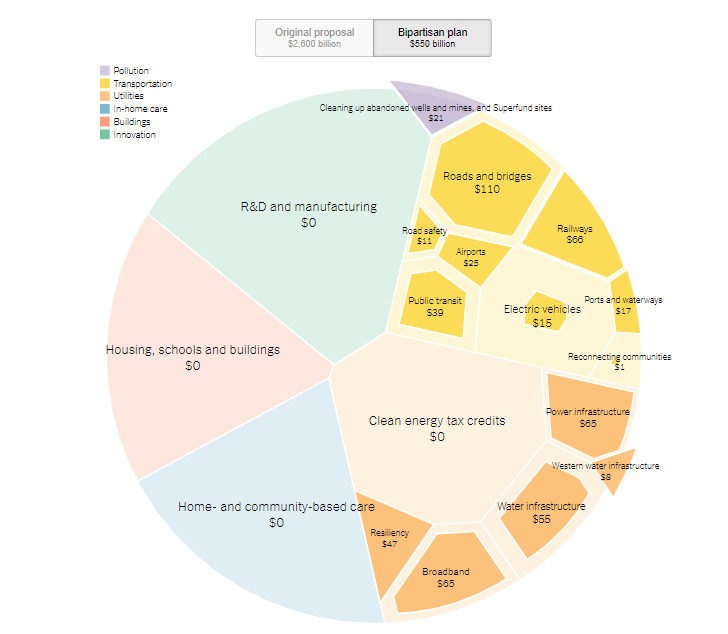
Visualizing Big Numbers
President Biden’s “Build Back Better” infrastructure plan may be difficult to visualize. When we consider trillions of dollars, traditional business charts—bars, pies, and lines—may not be the best choice.
Here are a few visualizations to compare:

Pie pieces (shown here)
These aren’t perfect comparisons because they cover different categories and are from different points in time, but they do give us options to help audiences understand data. What other visualizations can you find, and which are most effective for what purpose?

Failing Data Analysis in the Theranos Trial

The criminal trial against Theranos Founder and former CEO Elizabeth Holmes now focuses on testimony from Safeway, Walgreens, and Johns Hopkins University. Questions involve how these companies evaluated Theranos’ blood-testing technology and concluded that it was sound when, in fact, results was consistently false.
At this point in the trail, investors blame Holmes, whose defense is that the companies did due diligence and are responsible for their decisions. A Wall Street Journal article about the arguments highlights the companies’ and the university’s failings and over-reliance on Holmes’ claims.
As the relationship between Safeway and Theranos progressed, CEO Steve Burd wrote an email to Theranos with the subject, “Becoming Discouraged.” He testified, “I think whenever you start something new you’re going to have some rough spots, but we continued to have rough spots. We had samples that were lost. We had results that didn’t make any sense.”
We’ll see how the trial evolves, but clearly, experts needed to ask more questions up front. In some cases, they didn’t test the actual technology themselves. This story is a good example of failures in integrity and data analysis—perhaps for many involved.
Facebook Responds to President Biden's Criticism
Facebook is on the defensive after President Biden said the company is “killing people.” The president blamed Facebook for not managing misinformation about the COVID-19 vaccine and, as a result, causing more deaths: “Look, the only pandemic we have is among the unvaccinated. And they’re killing people.”
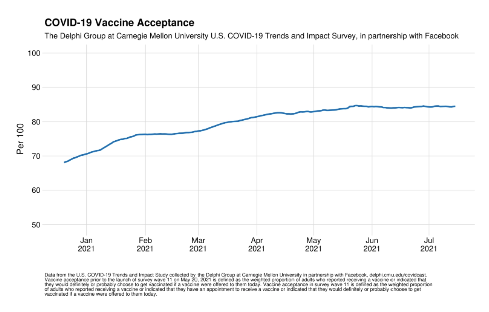
President Biden later softened his message, saying that information from about a dozen people is wrongly influencing people’s decisions: “Facebook isn’t killing people; these 12 people are out there giving misinformation. Anyone listening to it is getting hurt by it. It’s killing people. It’s bad information.”
In response, Facebook published a statement on its website, “Moving Past the Finger Pointing.” The writer, Guy Rosen, VP of Integrity, offers several points of evidence. He mentions partnerships with universities, the high vaccination rate among Facebook users (85%), and measures the company has taken, including promoting “authoritative information” and labeling “debunked” content.
Rosen disputes what is perhaps President Biden’s implied claim: that Facebook is the reason he missed his goal of having 70% of Americans vaccinated by July 4.
A New York Times Daily podcast analyzes the arguments and finds strengths and weaknesses on both sides. The reasons people don’t get vaccinated are complicated. At the same time, the reporter concludes, Facebook could do more to prevent the spread of misinformation.
This story is a good example of persuasion—and politics and business.
More Hope for Email’s Demise

A hopeful New York Times article surmises that Gen Z will save us all from email. The subtitle sums up the sentiment:
“It’s actually crazy how outdated it is.” People born after AOL Mail was invented seem to prefer to communicate in almost any other way.
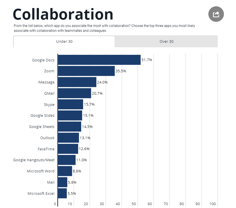
The article cites a study that describes the many collaboration tools employees use every day—tools from different companies that aren’t necessarily sanctioned by their organization. An employee might use Google Docs, Zoom, Apple iMessage, and Microsoft PPT or some other combination of products. This chart shows what tools people under 30 use more frequently.
One 24-year-old said she uses “literally anything but email” when given the choice. Email is viewed as a cause of stress, particularly having to check it often and because it often means task delegation: an email brings something that needs to get done. Because email takes time away from other tasks, employees also feel interrupted, and research tells us people need about a minute to get back on track.
A FastCompany writer hypothesizes that the younger generation might finally kill email, and iMessage, rather than Slack or Microsoft Teams, might be the bullet. I’m skeptical, but like these articles, I remain hopeful. Being older, I don’t have the emotional baggage of email because that’s how I grew up. But I understand the grace and simplicity of Apple tools and welcome them at work.