
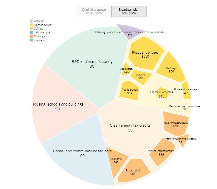
Visualizing Big Numbers
President Biden’s “Build Back Better” infrastructure plan may be difficult to visualize. When we consider trillions of dollars, traditional business charts—bars, pies, and lines—may not be the best choice.
Here are a few visualizations to compare:

Pie pieces (shown here)
These aren’t perfect comparisons because they cover different categories and are from different points in time, but they do give us options to help audiences understand data. What other visualizations can you find, and which are most effective for what purpose?

Failing Data Analysis in the Theranos Trial

The criminal trial against Theranos Founder and former CEO Elizabeth Holmes now focuses on testimony from Safeway, Walgreens, and Johns Hopkins University. Questions involve how these companies evaluated Theranos’ blood-testing technology and concluded that it was sound when, in fact, results was consistently false.
At this point in the trail, investors blame Holmes, whose defense is that the companies did due diligence and are responsible for their decisions. A Wall Street Journal article about the arguments highlights the companies’ and the university’s failings and over-reliance on Holmes’ claims.
As the relationship between Safeway and Theranos progressed, CEO Steve Burd wrote an email to Theranos with the subject, “Becoming Discouraged.” He testified, “I think whenever you start something new you’re going to have some rough spots, but we continued to have rough spots. We had samples that were lost. We had results that didn’t make any sense.”
We’ll see how the trial evolves, but clearly, experts needed to ask more questions up front. In some cases, they didn’t test the actual technology themselves. This story is a good example of failures in integrity and data analysis—perhaps for many involved.
Facebook Responds to President Biden's Criticism
Facebook is on the defensive after President Biden said the company is “killing people.” The president blamed Facebook for not managing misinformation about the COVID-19 vaccine and, as a result, causing more deaths: “Look, the only pandemic we have is among the unvaccinated. And they’re killing people.”
President Biden later softened his message, saying that information from about a dozen people is wrongly influencing people’s decisions: “Facebook isn’t killing people; these 12 people are out there giving misinformation. Anyone listening to it is getting hurt by it. It’s killing people. It’s bad information.”
In response, Facebook published a statement on its website, “Moving Past the Finger Pointing.” The writer, Guy Rosen, VP of Integrity, offers several points of evidence. He mentions partnerships with universities, the high vaccination rate among Facebook users (85%), and measures the company has taken, including promoting “authoritative information” and labeling “debunked” content.
Rosen disputes what is perhaps President Biden’s implied claim: that Facebook is the reason he missed his goal of having 70% of Americans vaccinated by July 4.
A New York Times Daily podcast analyzes the arguments and finds strengths and weaknesses on both sides. The reasons people don’t get vaccinated are complicated. At the same time, the reporter concludes, Facebook could do more to prevent the spread of misinformation.
This story is a good example of persuasion—and politics and business.
More Hope for Email’s Demise

A hopeful New York Times article surmises that Gen Z will save us all from email. The subtitle sums up the sentiment:
“It’s actually crazy how outdated it is.” People born after AOL Mail was invented seem to prefer to communicate in almost any other way.
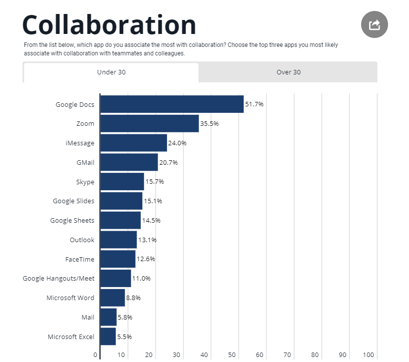
The article cites a study that describes the many collaboration tools employees use every day—tools from different companies that aren’t necessarily sanctioned by their organization. An employee might use Google Docs, Zoom, Apple iMessage, and Microsoft PPT or some other combination of products. This chart shows what tools people under 30 use more frequently.
One 24-year-old said she uses “literally anything but email” when given the choice. Email is viewed as a cause of stress, particularly having to check it often and because it often means task delegation: an email brings something that needs to get done. Because email takes time away from other tasks, employees also feel interrupted, and research tells us people need about a minute to get back on track.
A FastCompany writer hypothesizes that the younger generation might finally kill email, and iMessage, rather than Slack or Microsoft Teams, might be the bullet. I’m skeptical, but like these articles, I remain hopeful. Being older, I don’t have the emotional baggage of email because that’s how I grew up. But I understand the grace and simplicity of Apple tools and welcome them at work.
Clear Line Charts
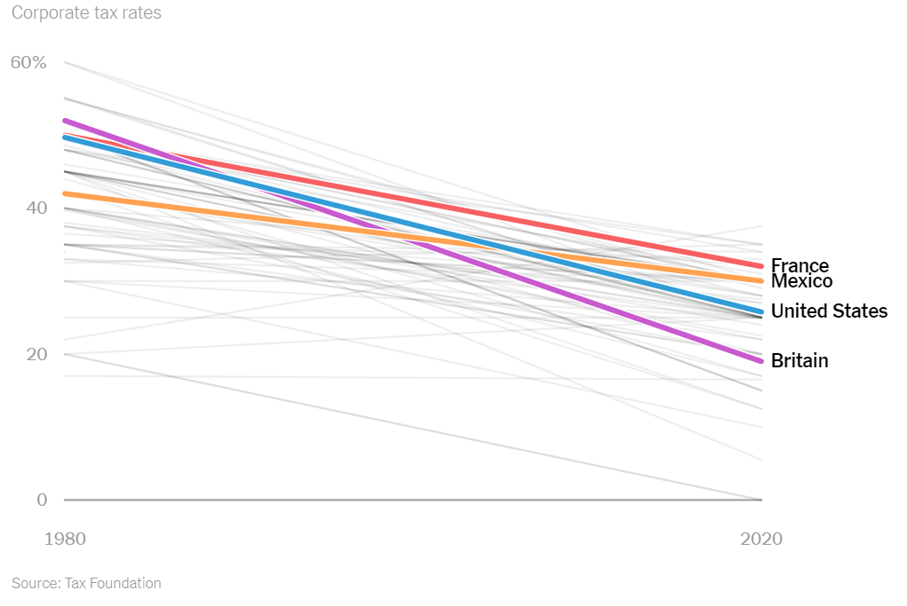
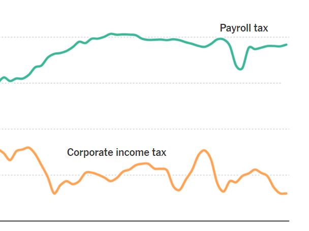
A New York Times opinion article illustrates the power of the line chart. With the title, “This Is Tax Evasion, Plain and Simple,” the author describes the U.S. corporate rate over time and compared to other countries.
The authors argue that countries have reduced corporate rates to compete for businesses, and over time, the rate has become too low. The chart at right compares the U.S. to other countries, while the chart below shows the change in U.S. wage and corporate taxes since 1950.

Additional charts show that companies have moved money to tax havens abroad, but economies and workers have not benefitted.
An economist and a writer and graphics editor paired up to produce the article. We see the influence of both—the data, plain language, and charts paint a vivid picture.

AstraZeneca's Data Problems
AstraZeneca has been accused of presenting “outdated and potentially misleading” data about the vaccine that has suffered implementation trouble in Europe. In a press release and a CNBC interview with the president, the company reported a 79% effectiveness rate, despite later results between 69 and 75%.
A group of independent experts wrote a letter to U.S. government officials to express their concern, as The Washington Post reports:

The DSMB is concerned that AstraZeneca chose to use data that was already outdated and potentially misleading in their press release,” the letter states. The data “they chose to release was the most favorable for the study as opposed to the most recent and most complete. Decisions like this are what erode public trust in the scientific process.”
The company promised a review: “We will immediately engage with the independent data safety monitoring board to share our primary analysis with the most up to date efficacy data.” But damage is already done.
The Washington Post explains, “But it appears to be the latest in a series of self-inflicted wounds from the team behind the vaccine, which has had months of stumbles involving messy science and bungled communication.”
This latest misstep only complicates a possible U.S. rollout and breeds more skepticism in those who fear the vaccine. Fears in some populations, such as Black Americans, are based on understandable mistrust of the healthcare system, and this news will not likely inspire more participation in plans for herd immunity.
As an issue of credibility, AstraZeneca is caught in a public quagmire. What might have been a small misstep is now viewed as part of a larger, potentially intentional plan to deceive, whether or not that is true. The company’s integrity is in question because they have not been fully transparent about the vaccine results.

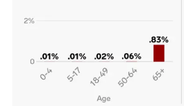
Fauci: "Numbers Don't Lie"
Dr. Anthony Fauci, the lead infectious disease expert in the U.S., was asked whether the nation has the worst COVID outbreak, and he said, “Numbers don’t lie.”
CNN’s Dr. Sanjay Gupta interviewed the doctor at a Harvard School of Public Health forum. Dr. Gupta asked, “We're not quite 5% of the world's population, yet represent 20-25% of the world's infections ... I mean, that has to be the worst. Is it not the worst?"
Dr. Fauci responded, “Yeah, it is quantitatively if you look at it, it is. I mean the numbers don't lie.”
The doctors are looking at infections per capita. Of course, we could look at other measures. In this interview, President Trump considers the number of deaths as a percentage of those infected.
Discussion:
Do numbers lie? Can they? What about this book: How to Lie with Statistics?
Find evidence to both support and dispute the claim that the U.S. is the “worst.” What measures can you find? Which do you find more meaningful?

Should I Go Outside? A Visual
Researches created a visual to help people make informed decisions as communities re-open during the pandemic. The group has a consulting firm that helps organizations assess risk, and the visual is a representation of their work.
The COVID-19 Risk Index uses color coding to identify the likelihood that you’ll contract the virus during various activities, such as visiting the hospital, grocery shopping, or going to the dentist (which I did yesterday).

Discussion:
How effective do you find the visual for helping you assess risk? On what criteria do you base your analysis?
What, if anything, is missing from the index? How could you adapt the tool for local regions?
Motion Charts
A New York Times article, “What Does Opportunity Look Like Where You Live?,” includes motion charts depicting life expectancy, commute times, and other variables across the U.S.
Although imperfect, the charts show changes over time. The movement is an effective way to dramatize differences between groups, as Gapminder has done with UN data for years.

Discussion:
The bubbles move when they are first loaded on the page, but I can’t seem to “interact” with them the way I expect to with an “interactive graphic.” What did you expect? Could these be improved?
Some charts have a truncated axis; for example, one about life expectancy starts at 60. What are the implications, and should this be avoided?
What, if anything, surprises you about the data presented?

COVID-19 Crisis Communication for Reopening the U.S.

What comes after we “flatten the curve” of COVID cases? New York Times opinion writer Charlie Warzel warns that, without a clear communication strategy for what’s next, people will distrust leaders.
Warzel cites six communication guidelines from the report of a working group at The University of Minnesota, The Center for Infectious Disease Research and Policy (CIDRP).:
Don’t Over Reassure.
Proclaim Uncertainty
Validate Emotions—Your Audience’s and Your Own
Give People Things to Do
Admit and Apologize for Errors
Share Dilemma
Discussion:
How should U.S. officials communicate now? What do they need to accomplish, and how well are our current leaders meeting the challenge? In other words, do you agree with Warzel that our leaders are falling short?
Read the entire report. What other principles does the group recommend?
Analyze the report: the audiences, objectives, writing style, organization, and so on. What are the strengths, and how could it be improved?
Similar COVID-19 Ads
Are all COVID-19 ads the same? A digital marketer compiled excerpts from recent ads showing similar images, music, and phrases. He titled his video, “Every Covid-19 Commercial Is Exactly the Same.”
Sean Haney describes why so many ads are the same:

What's the deal? In reality, many companies have found themselves short on cash, almost overnight. They needed to get a message out - and quick. They asked their teams to throw something together. Since they can't film a new ad because of social distancing, they compiled old stock b-roll footage and found the most inoffensive royalty-free piano track they could find. This, combined with a decade of marketing trends dictated by focus groups and design-by-committee, released a tsunami of derivative, cliche ads all within a week of one another. It's not a conspiracy - but perhaps a sign that it's time for something new.
A Morning Consult report offers guidance for companies. From 2,200 Americans at the end of March, we learn how companies should communicate. For example, people say they are more likely to purchase from a company that provides “a public statement about support being given to laid-off employees” compared to other types of statements.
Discussion:
What’s your view of these company ads? How do you react when you see them? Do you react differently to different companies’ ads?
Read the report. Analyze the audience, objectives, tone, organization, visuals, and so on. What principles of business communication are followed?
What else do you learn from the report about how companies should communicate during COVID-19?
Improving Column Charts

So many charts about COVID-19 could be improved. Here’s one from a Business Insider article, which compares death rates for the flu and COVID-19.
Discussion:
What issues do you see in the graphic? (Hint: Check the x axis, and describe what the percentage on the y axis represents.) How would you fix the problems?
What are the consequences of designing charts in this way?
Find another recent chart to analyze. In what ways does the graphic convey information accurately, and how does it fall short?
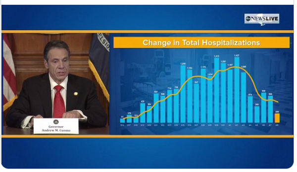
Misleading NY Covid-19 Chart
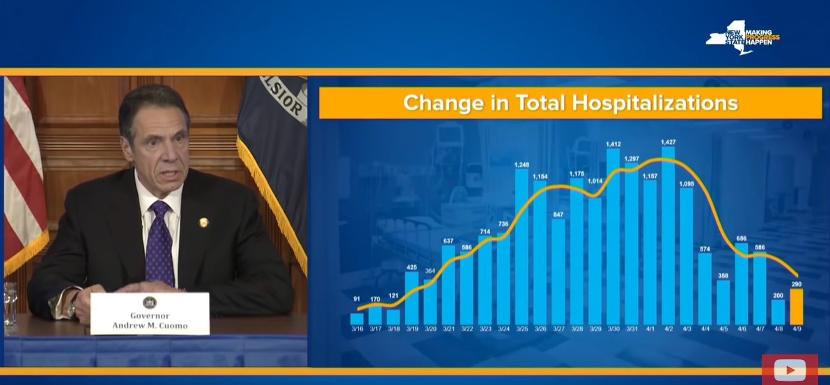
Thanks to Carl Quintanilla for posting this example of a misleading chart. New York Governor Andrew Cuomo has been lauded for his leadership during the coronavirus crisis, yet critics say one of the mainstay charts in his news conferences shows a skewed story.
When he shows this chart, Governor Cuomo describes, the decreasing numbers of new hospitalizations. The chart title is clear: “Change in Total Hospitalizations.” But what does the visual imply?
Similarly, he shows “Change in ICU Admissions” (approx.00:35 in the video).
Discussion:
Watch the first minute of the news conference. Is he clear, or could he be clearer in his explanation?
What’s your view of the two charts? Are they misleading? What are the possible consequences of showing the data in a misleading way?
How, if at all, should these charts be changed?

Luckin COO Fabricated Sales Data

Luckin’ Coffee, China’s largest coffee chain, is suffering the consequences of publishing false sales numbers. Ernst & Young discovered the misconduct, which took place in 2019, during an audit, concluding that “management personnel engaged in fabricated transactions which led to the inflation of the Company’s income, costs and expenses.” An investigation blames the chief operating officer and others.
A report details “the fraud and the fundamentally broken business,” including “smoking gun” evidence and “red flags.” The anonymous authors compare video recordings of store foot traffic to reported sales.
In response to the news, Luckin’s stock declined between 75 and 80%. Starting in February, when the anonymous report was made public, the company has been posting notices about the situation on its website.
Discussion:
Analyze the anonymous report, including the audiences, objectives, organization, writing style, etc. What works well, and how would suggest that the writer improve the report?
How well did the company address concerns? Begin with the first response in February.
What leadership character dimensions does this situation illustrate?

Singapore PM Lee Hsien Loong
Two students sent me Singapore Prime Minister Lee Hsien Loong’s news conference as a positive example. I can see why: he gives a model speech, balancing emotional appeal and straight talk. He is proud of Singapore’s response, and yet he is honest about the challenges ahead. The PM also gives examples from other countries and the lessons learned.
Discussion:
What are the strengths of the Prime Minister’s speech?
Assess his delivery skills.
How have leaders in other countries followed this example—or how have they fell short?
Which leadership character dimensions does the PM demonstrate in his speech?

Confusing Pie Chart
A former student sent me this chart, and he didn’t have a source, but it’s a good example of what not to do when creating pie charts. What problems can you identify?

Discussion:
What principles of creating pie charts are followed, and how does the chart fall short?
Is the pie chart the best choice for this data? What would be a better choice and why?
What does the text imply?
Email Scammers
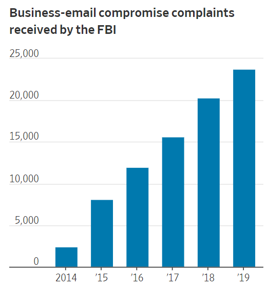
Remember those quaint email scams that were riddled with grammatical errors? A Wall Street Journal article describes new, sophisticated training for email scammers in Africa. A Nigerian is quoted: “You know how you guys play baseball when you are growing up? Here many of us learn fraud.”
Former scams involved people sending email asking for money for people in trouble or promising big returns on small funds. Today’s scams involve hacking into accounts and people learning about connections, for example, what vendors a company uses. A fake invoice to a known vendor is more likely to get paid. Using a grandson’s real name could lead a grandmother to Wal-Mart to send money to him, which happened to my friend’s mother.
About $1.7 billion was lost to email scams in 2019, and complaints are rising steadily. The article describes a “grooming” process “like organized crime.”
Discussion:
We hear a lot about victims’ vulnerability, but what creates a culture of scammers? What makes people vulnerable to commit this fraud? For more about this, watch The Weekly documentary about love scams on Facebook.
What’s your view of the bar chart in the WSJ article? How could it be improved? Would you prefer a more creative graphic, or does this work as is?
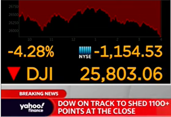
Comparing Headlines About the Market

How does the media describe the recent stock market decline? Let’s compare a few headlines:
Dow falls 1,191 points -- the most in history (CNN)
Coronavirus Drives Stocks Down for 6th Day and Into Correction (New York Times)
U.S. Stocks Slide Into a Correction as Virus Fears Show No Sign of Easing (Wall Street Journal)
Dow's point drop worst on record as stocks fall into correction (Fox News)
Dow drops 1190 points amid coronavirus fears, S&P 500 sees fastest correction in history (Yahoo Finance)
Of the five, Fox is the only one that didn’t place a headline about the market at the top of its web page.
Discussion:
What do you make of these headline choices, including placement? What might the wording indicate about the media group’s beliefs or audience?
In class after a previous decline, I took issue with headlines like CNN’s. Do you see an issue? (Hint: What does a raw number tell us?)

Report Criticizes Airline Safety and Oversight

A U.S. Department of Transportation report criticizes the Federal Aviation Association and Southwest Airlines for lax safety standards. A New York Times article summarizes the report findings:
“The report found that the Federal Aviation Administration had allowed Southwest to routinely provide inaccurate data to pilots and to operate more than 150,000 flights on planes whose airworthiness had not been confirmed.
“The agency also failed to investigate concerns raised by its own representatives ‘ranging from senior executives to local inspectors’ over Southwest’s safety culture.”
The DOT includes “Four SMS Components,” the FAA’s own description to fault safety culture in both organizations.
Discussion:
What business communication principles are illustrated in the report? Who are the primary and secondary audiences, and how well does the report meet its communication objectives?
The report does a particularly good job of using “message titles” (also called “talking headings”). What are some examples?
What else do you notice about the report? Consider the writing style, organization, and other features. What could be improved?
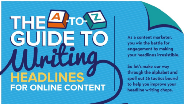
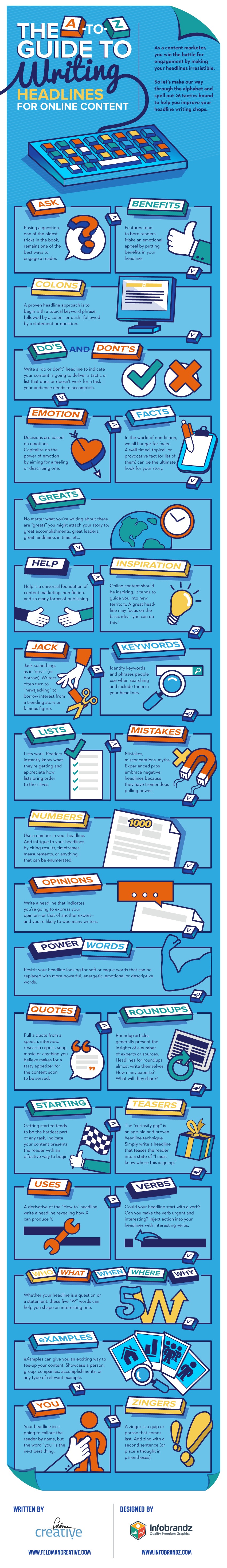
Tips for Writing Headlines

An infographic written by Feldman Creative and designed by Infobrandz offers tips for writing headlines, particularly for online content. The advice focuses on capturing attention, which makes sense in our cluttered online world: posing a question, focusing on the reader, using a colon or m-dash, and using visceral language.
Read the entire infographic on Ragan.com. Some of this advice is useful for email subject lines, which may inspire receivers to read or delete your email.
Discussion:
Read the past 50 or so subject lines of emails you have received. Which of these principles are followed? What differences do you notice in marketing and other emails?
What advice do you find useful from the infographic for online content? What about email subject lines that you write?