
Visuals About SAT Disparities
Charts showing SAT scores by family income provide useful data visualization examples for students to analyze. A New York Times report concludes, “New data shows, for the first time at this level of detail, how much students’ standardized test scores rise with their parents’ incomes—and how disparities start years before students sit for tests.”
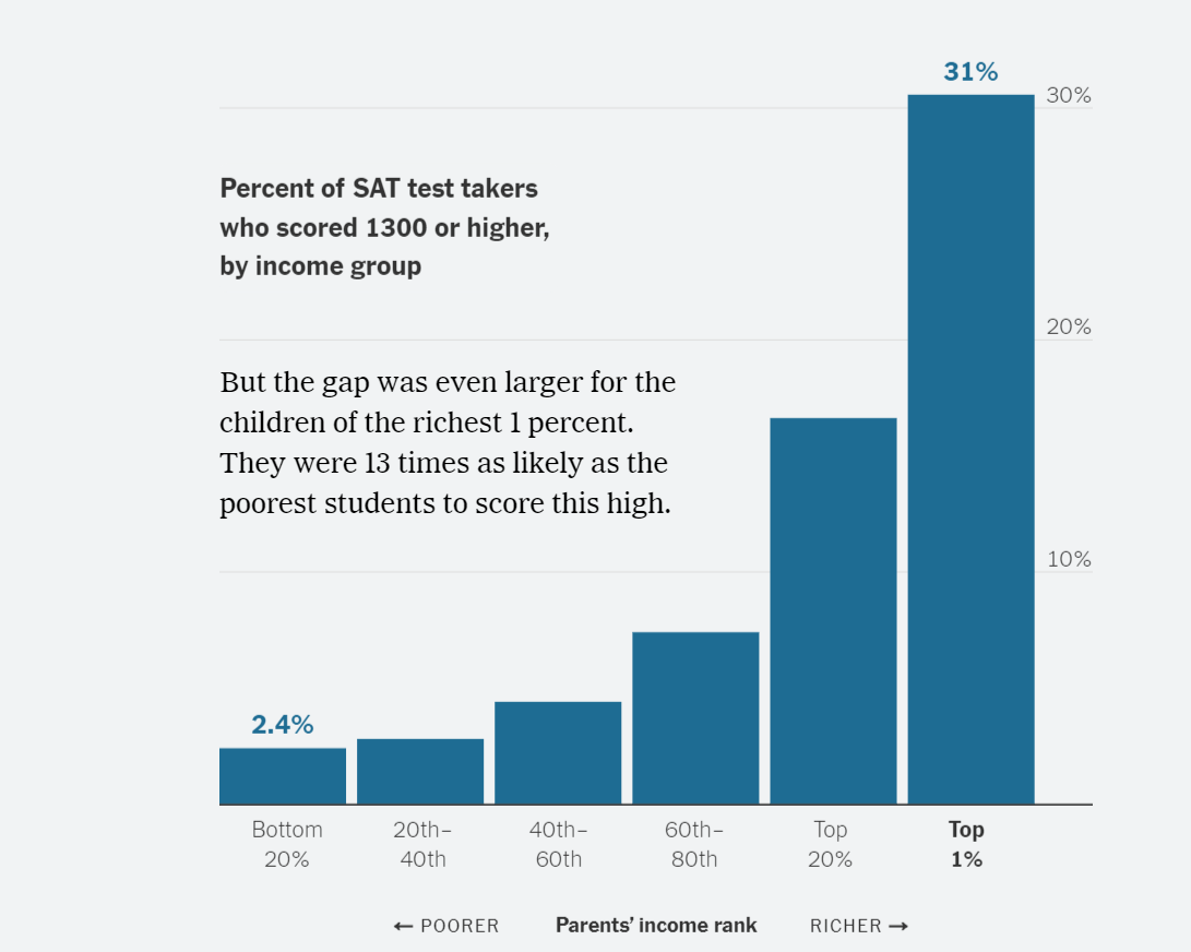
Progressive column charts show the increasing likelihood that a student will earn an SAT score of 1300 or higher as family income increases. The first chart shows students in the top 20% of income earners, and the second shows those in the top 1%, with dramatically higher chances of scoring 1300 or above.
One topic for discussion is the visual itself. Is a column chart the best representation for the data? It works well and is clear. Untraditionally, the X-axis labels are on the right side, but we don’t see much “chart junk,” although the horizontal lines seem superfluous. The X-axis is truncated (maxing out at 30%), so differences are exaggerated, but the data labels are clear. Data labels would be useful above all columns for consistency but would interfere with the text—and the author’s point of comparing the highest to the lowest. The chart shown here follows a previous one identifying the top 20%; this one “compares apples to oranges” (1% to 20%), but makes more sense with the earlier one for comparison. You’ll see more charts in the article, showing greater disparities still.
Another topic is data collection. The Times cites the original source, which includes more extensive reporting worth evaluating.
Of course, the Big Topic for discussion with students is the cause of this disparity. The article provides several reasons: kids attend preschool, attend better-resourced schools, etc. Asked for their opinions, students might identify the same reasons—or they might have different ideas that they should be prepared to support with evidence.