Annual Letter as Business Communication Genre

BlackRock CEO Larry Fink published an annual letter that’s gaining popularity like Warren Buffet’s letters. The letter is a good example for students to analyze for its organization, persuasive strategies, lack of visuals, and evidence.

Fink’s letter is long, and the audience is stated as BlackRock investors. But of course, he has broader ambitions, which are realized as we see the extensive media coverage. He wants to attract investors to BlackRock, but he also wants to change policy and company practices to fund retirement.

Fink explains “energy pragmatism” and “energy security,” giving up on the environmental, social, and governance (ESG) language that first was embraced and then drew cries of “wokeism.” Instead, he focuses on retirement as a broader, more acceptable crisis: an aging population with not enough saved. Fink also quit the threatening approach for CEOs to disclose more about their practices.

The main message of the letter is clear: “We focus a tremendous amount of energy on helping people live longer lives. But not even a fraction of that effort is spent helping people afford those extra years.” Fink argues that people are woefully unprepared for retirement. From a business communication perspective, the letter takes a while to get to the main point. Fink starts with emotional appeal, describing how his parents invested throughout their lives. This could be more effective if their behavior shaped his own thinking, but he admits that he had been at BlackRock for 25 years before discovering their surprisingly large nest egg. Still, the family connection feels relevant to his point.

In addition to the hidden main point, the letter could be better organized to reflect his recommendations. A class assignment could ask students to provide a bulleted list (which The New York Times summarized).

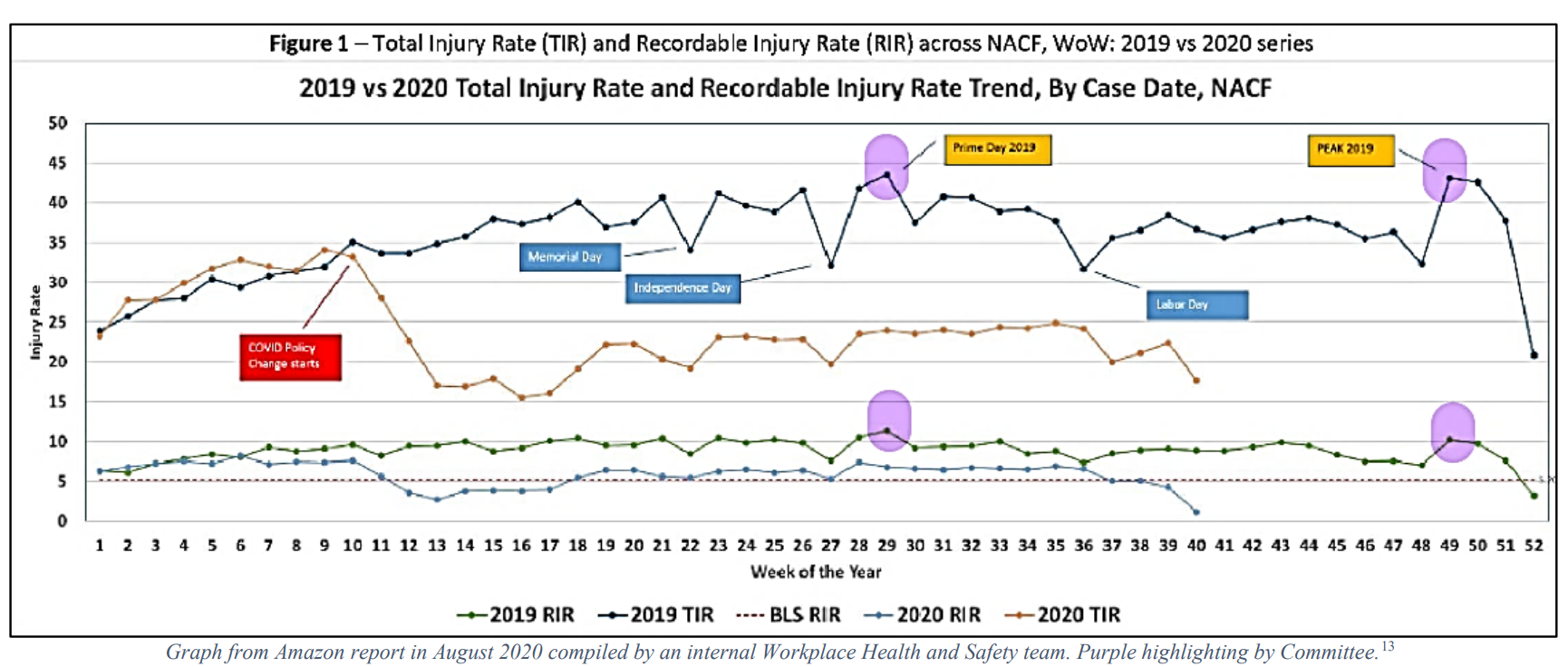
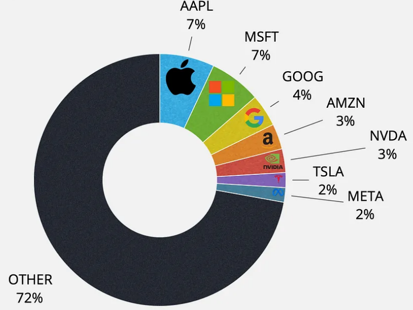
With only one confusing visual, shown here, the letter is meant to be read—as a letter. This genre seems particular to a few high-profile investment managers. The extensive footnotes are important to support Fink’s points but make this an unusual example for business communicators. It’s not quite the letter we see to introduce a company’s annual report. We might call it something like a personal report for the use of “I,” family stories, and observations plus citations and recommendations.

British Royal Family and the "Information Vacuum"

The British royal family (which, I just realized, has its own website), is facing pressure because of edited photos and secrecy about health issues.

News outlets have retracted a photo of the Princess of Wales, aka Kate Middleton, hugging her three children on U.K. Mother’s Day. The princess is an amateur photographer, as she explains in her apology, which came more than a long day after the news broke. According to a Wall Street Journal report, the retraction is unusual but happened because the photos were so obviously edited. The family didn’t share the original photo, raising questions about what exactly was changed.

The reporter described the family’s secrecy regarding recent health issues as well. The princess underwent “abdominal surgery,” while the king is undergoing treatment for cancer. The vague descriptions seem only to fuel speculation. As the WSJ reporter says and business communicators know happens, in an “information vacuum, conspiracy theories have come to rest.”

He also raises ethical and regulatory issues, reminding us that “this is a partly taxpayer-funded monarchy, and they have constitutional roles . . . to uphold.” They need to balance individual privacy with their obligation to keep the public informed about their health.

A Princeton sociology and public policy professor has a different take, questioning the “We pay, they pose” mentality. She also challenges a double standard between calls for Catherine’s privacy and no similar respect for Meghan Markle, the Duchess of Sussex. These differences could be explored with students as well.

Still, the princess’s photo was an attempt to show that everything is alright, perhaps even perfect, which is why people doctor images—to delete imperfections. But her editing has revealed the opposite: that everything is, literally, not right. The situation raises issues of integrity and trust, integrity meaning wholeness and consistency. When the family releases photos in the future, they will be scrutinized more closely.

The Visual Pull of Tech Stocks

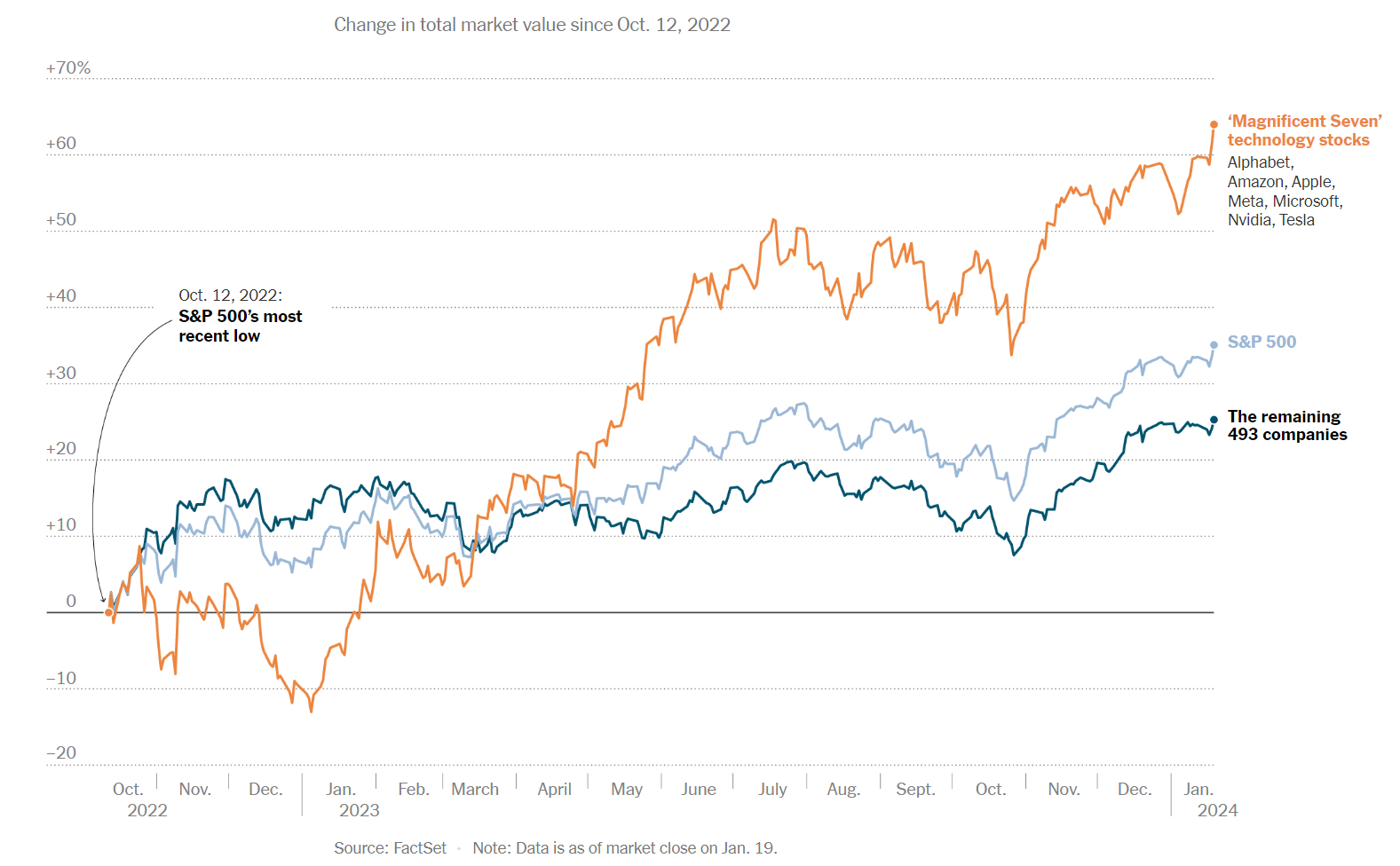
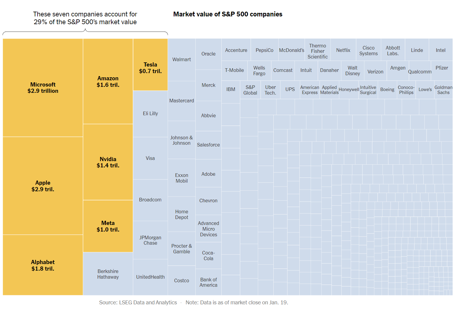
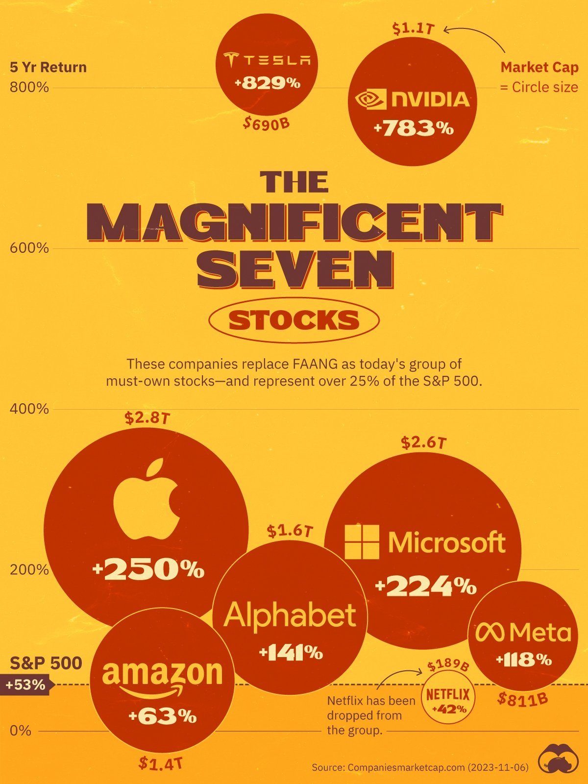
Line charts show how the “Magnificent Seven” tech stocks—Alphabet, Amazon, Apple, Meta, Microsoft, Nvidia, and Tesla—affect the S&P 500. Students can analyze the potential audience and objective of each of these visual displays, find others, or create their own. Hover over for comments about each, and click on the slide for the original source. The data represents different timeframes, so the charts aren’t quite comparable.

Students also might be interested in evaluating whether Tesla should remain part of the Magnificent Seven. Some believe it’s lackluster performance makes it unworthy of the designation.

China Changes Youth Unemployment Measure

After a five-month lapse, China reported youth unemployment data, which looks better because of new metrics. The change raises questions about data integrity and reporting.

According to China’s National Bureau of Statistics, the unemployment rate of people between 16 and 24 years old dropped from a high of 23.1 in June to 14.9 in December. But the rate doesn’t mean more young people are employed. The Bureau now excludes students enrolled in school, even if they’re seeking part-time employment. Reports also will now separate people between 25 and 29 from those between 25 and 59. A record number of college graduates are having a particularly difficult time finding jobs, partly because of restrictions on tech, real estate development, and education fields and because of a slow recovery from the pandemic, which Chinese officials seem reluctant to admit.

The youth data change might not have been as alarming if China hadn’t stopped reported data after that record high in June.

Students might discuss the significance of these changes and compare how China reports jobless data to U.S. methodology (see U.S. Bureau of Labor Statistics). This situation is a good project for students to dig into the data and also analyze, for example, differences between urban and overall rates.

Students also can find or create charts to visualize the change over time. They’ll likely find mostly line charts like the one at right that shows the urban rate over the past two years. As many do, this chart has a truncated Y axis, exaggerating the differences (and yet, one percentage point is a lot of people out of work).

Hasan Minhaj Defends Embellishing Stand-Up Comedy

The comedian Hasan Minhaj isn’t cowering after a New Yorker reporter fact checked and criticized his Netflix series Patriot Act and other performances. His response is an unusual approach for crisis communication. Students might discuss issues of integrity and analyze evidence in this situation.

In her article, “Hasan Minhaj’s ‘Emotional Truths’,” Clare Malone wrote,

[A]fter many weeks of trying, I had been unable to confirm some of the stories that he had told onstage. . . . Still, he said that he stood by his work. “Every story in my style is built around a seed of truth,” he said. “My comedy Arnold Palmer is seventy per cent emotional truth—this happened—and then thirty per cent hyperbole, exaggeration, fiction.”

In part, Malone’s focus was on the consequences of Minhaj’s fabrications (he might say “embellishments”). When comparing his stories to George Santos’s, Minhaj says Santos’s are "pointless,” whereas his have societal value, which gives him moral standing. Students can discuss how much is too much “stretching the truth.” How might standards of integrity differ for comedians, politicians, organizational leaders, entrepreneurs, job applicants, etc.?

People make difficult decisions about whether and how to respond to criticism. Minhaj fought back. A New York Times writer summarizes Minhaj’s response well:

Typical crisis management dictates you should move on, not fixate. But in our attention economy, where the most popular Netflix specials of the past year featured Chris Rock talking about the Slap and John Mulaney joking about going to rehab, comedians are wise to consider Rahm Emanuel’s famous political advice: Never let a good crisis go to waste. Minhaj split the difference. He did not linger on the story but dedicated a solid chunk of jokes to it that got one of the biggest responses of the night. There were moments when I even thought this scandal might be the best thing that ever happened to him.

During a recent Beacon Theater show, Minhaj quipped to the audience, “Don’t fact check me.” He said of the New Yorker report, “I got caught embellishing for dramatic effect,” and said it was too bad it was such “a dorky scandal” and not one involving, for example, child abuse.

In a 21-minute video watched, so far, 1.9 million times, Minhaj addressed criticism head-on, showing headlines and a Bill Maher clip. He apologized to those hurt by his routines and addressed three stories in detail. He distinguished between what really happened and how he changed details to create a funny/poignant story. Supporting his points, Minhaj played audio from the interview with the New Yorker reporter. As he acknowledges during the video, his explanations are a bit much (saying at one point, “If you’re still here,” and, I admit, I dropped off soon after). But he does provide good evidence of the reporter ignoring or missing information. (For a deep dive of disputed facts, read this Slate analysis.) Naturally, Malone posted a short statement on X, defending her reporting.

To his credit, Minhaj has enough perspective to conclude with a main point (direct organization plan—up front!): he didn’t “fake racism.” Students can draw their own conclusions and whether they are convinced by Minhaj’s presentation of the evidence.

This situation gives students a different perspective on crisis communications. Minhaj highlighted rather than downplayed criticism, which may have avoided his getting “cancelled” and might even elevate his reputation.

Missing Communications Prep in University Testimony

If students need an example of the value of crisis communication, the university presidents’ testimony this past week proves the point. An embarrassment to all three colleges, Harvard, University of Pennsylvania, and MIT, the public hearing ended with apologies from two of the leaders and the resignation of Penn’s.

A New York Times article describes how a law firm prepared both the Harvard and Penn presidents. As business communication faculty know, legal advice protects the organization from litigation. But crisis communication advice protects the organization’s, and the leader’s, reputation.

To a PR expert, the lack of proper preparation, including practicing answering a range of difficult questions, is clear. NY Representative Elise Stefanik asked the most pointed question: “Does calling for the genocide of Jews violate Harvard’s rules of bullying and harassment? Yes or No?“ Presidents focused on speech vs. conduct and said it “depended on the context.” Harvard President Claudine Gay gave vague answers about Harvard’s “commitment to free expression” and “rights to privacy.” Stefanik and other lawmakers accused Gay of not speaking with “moral clarity.”

To me, the character dimension most at issue is integrity—the universities’ commitment to DEI and free speech, yet what some see as an inconsistent application. All three presidents issued statements after the hearings:
  • Harvard: President Gay issued a short statement, contradicting her response to Stefanik’s question: "There are some who have confused a right to free expression with the idea that Harvard will condone calls for violence against Jewish students. Let me be clear: Calls for violence or genocide against the Jewish community, or any religious or ethnic group are vile, they have no place at Harvard, and those who threaten our Jewish students will be held to account.” In an interview with the Harvard Crimson, she apologized and demonstrated compassion, “I am sorry,” “Words matter,” and “When words amplify distress and pain, I don’t know how you could feel anything but regret.”

  • MIT: In a statement, President Kornbluth linked to her opening statement and wrote generally about community and fighting against hate. She didn’t directly address the hearings or her responses to questions.

  • Penn: Demonstrating humility in a video message, President Magill admitted that she should have responded differently: “In that moment, I was focused on our University’s longstanding policies aligned with the U.S. Constitution, which say that speech alone is not punishable. I was not focused on, but I should have been, the irrefutable fact that a call for genocide of Jewish people is a call for some of the most terrible violence human beings can perpetrate. It's evil—plain and simple.”

Magill has since resigned from Penn along with the Board chair. Alumni pressure at Penn was particularly strong even before the hearings. Hedge fund manager Bill Ackman, possibly the loudest voice, is calling for the other presidents to resign as well. A Harvard graduate, Ackman wrote an additional letter to his alma mater, a good example of persuasive communication if you’re prepared to manage fallout from a heated class discussion.

Image from source.

John Oliver Blasts McKinsey

Last Week Tonight produced a 26-minute segment criticizing management consultancy McKinsey. Students can decide whether John Oliver was fair in his conclusion that, “McKinsey’s advice can be expensive but obvious, its predictions can be deeply flawed, and it’s arguably supercharged inequality in this country.” He contrasts these conclusions with the CEO saying, “Our purpose is to create positive, enduring change in the world.”

Here are a few areas to explore, or you can just show the fake recruiting ad starting at 23:00, which is pretty funny.

Timing

I’m curious why Oliver created this segment now. McKinsey’s role in the opioid crisis, which he covers at around 12:00, was most highly litigated back in 2021 - 2022. He doesn’t point to anything specific since then.

Evidence

To make his points, Oliver uses a variety of evidence but mostly examples in the form of stories. If this were a serious rebuke of McKinsey, students might expect more data. I also question the many references to a 1999 film. Maybe things have changed since then? The inexplicable timing contributes to the segment feeling like the attack that it is, rather than a balanced piece. But I forget: This is “late-night news,” not actual news.

The Example of Eliminating Signatures

The example of identifying cost savings for an energy client is just silly (at 7:30). I wonder whether this is just a terrible example—or whether more information about the situation, or more examples in the original video, would make it less embarrassing. We don’t see the context.

Oliver’s Indignance

Oliver jokes about his British accent sounding “smug” (6:33), but his style is part of the reason I don’t watch him or other talk-show hosts. I’m guessing a lot of students find him funny because of his style. This might start an interesting discussion about delivery styles.

McKinsey’s Response

I don’t see any response from McKinsey, and I don’t think it would be wise. But it’s a worthy discussion point with students. Why wouldn’t the company respond? What are the arguments for responding? What, if anything, could the company say or do?

Other Perspectives

Business communication faculty—and journalism faculty—teach students to offer multiple, sometimes conflicting perspectives. At around 21:00, Oliver does present other sides. He acknowledges that other consulting firms sometimes act unethically or have questionable client relationships, which (sort-of) addresses criticism that he’s singling out McKinsey. Oliver also describes how McKinsey responded to an inquiry from the show a few days before airing and admits that he’s presenting examples, which McKinsey would say don’t represent their work. But he argues against these claims by saying that the harm McKinsey has done outweighs the good.

Character

Starting at around 22:30, Oliver calls out the character dimensions students will associate with this story. He calls for greater accountability and transparency, which I describe as part of integrity. That cues up the parody McKinsey recruiting video, which starts at 23:00 for students’ enjoyment.

Of course, the entire segment raises questions about Oliver’s own integrity. Then, again, the show is what it is intended to be: entertaining.

Visuals About SAT Disparities

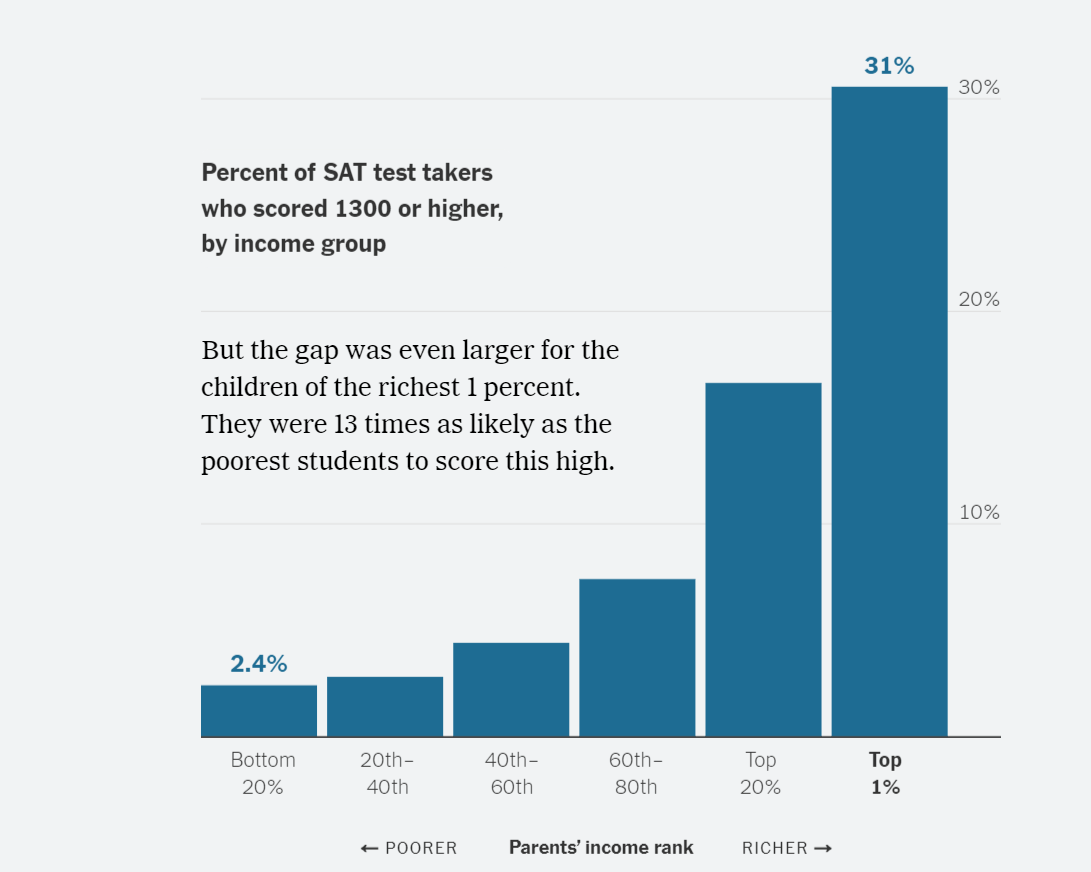
Charts showing SAT scores by family income provide useful data visualization examples for students to analyze. A New York Times report concludes, “New data shows, for the first time at this level of detail, how much students’ standardized test scores rise with their parents’ incomes—and how disparities start years before students sit for tests.”

Progressive column charts show the increasing likelihood that a student will earn an SAT score of 1300 or higher as family income increases. The first chart shows students in the top 20% of income earners, and the second shows those in the top 1%, with dramatically higher chances of scoring 1300 or above.

One topic for discussion is the visual itself. Is a column chart the best representation for the data? It works well and is clear. Untraditionally, the X-axis labels are on the right side, but we don’t see much “chart junk,” although the horizontal lines seem superfluous. The X-axis is truncated (maxing out at 30%), so differences are exaggerated, but the data labels are clear. Data labels would be useful above all columns for consistency but would interfere with the text—and the author’s point of comparing the highest to the lowest. The chart shown here follows a previous one identifying the top 20%; this one “compares apples to oranges” (1% to 20%), but makes more sense with the earlier one for comparison. You’ll see more charts in the article, showing greater disparities still.

Another topic is data collection. The Times cites the original source, which includes more extensive reporting worth evaluating.

Of course, the Big Topic for discussion with students is the cause of this disparity. The article provides several reasons: kids attend preschool, attend better-resourced schools, etc. Asked for their opinions, students might identify the same reasons—or they might have different ideas that they should be prepared to support with evidence.

PwC Report for Students to Analyze

If you’re looking for a sample report with mixed text and graphics, “PwC’s 26th Annual Global CEO Survey: Winning today’s race while running tomorrow’s” is a good one for students to analyze. With open access, the report is designed as a webpage built around survey questions. Here are a few points to explore with business communication students:

Audience Analysis and Communication Objectives: As a public document, the report provides information for business leaders, but the primary objective is to market PwC’s work. The report starts with a hook: “Evolve or die, say 4,410 chief executives in our 2023 CEO Survey. But are they spending enough time on business reinvention? Many tell us no.” In other words, hire PwC to help you survive.

Organization: The introductory paragraph follows classic business writing principles: convey the main point (the conclusion or recommendation) and preview up front. The organization is clear in the last paragraph: “We’ve organised this year’s survey summary into nine tough questions—which naturally fall into three groups—about what it takes to operate in our dual-imperative world.” However, the sequence of groups and questions within them don’t follow a logic I can follow.

Writing Style: As expected for this type of report, the tone reflects a strong sense of urgency (“The race for the future”). Still, I find myself tripping over some sentences, like this one:

Last year’s optimism, reflecting hope that economic conditions would continue improving as the global pandemic eased, was dashed in 2022 by shocks such as Europe’s largest land war since World War II, knock-on effects like surging energy and commodity prices, and accelerating general wage and price inflation.

“Dashed,” “shocks,” “knock-on effects,” “surging,” “accelerating”—that’s a lot to take. Students also might have fun omitting extraneous words, for example, “Last year’s optimism, reflecting hope . . .”

Graphics: Of about 15 charts in the report, only one is a line chart. The other are rather traditional versions of bar and column charts but offer lessons in choosing stacked and other formats—ways to incorporate multiple data points.

Site Functionality: Report navigation is clear with the organizational structure in table format, shown above, and right-side mouse-over links. You might consider a report assignment that includes bookmarks within Word documents or PDFs that students can create easily. The downloadable graphics are a nice touch. Users get pages—with the PwC logo, of course—they can slip into any deck.

You’ll find other lessons in the report. Overall, it’s a good example of clear content, but, for me, the marketing purpose overshadows the message.

Analyzing Data Visualizations for Rent or Mortgage

Charts about U.S. rents and mortgages provide good examples of visualizing data. The topic might interest students who will likely rent but could consider buying a home someday. Depending the city, rent money put towards a mortgage could buy a lot or very little square footage. Here are a few charts from the NY Times and from the original source—data from Point2, a real estate analysis company, which provides a few visualizations and clear explanations.

List of Cities. In this NY Times chart, which is essentially a table, the winners and losers are clear in chronological order. But students might see better graphics: a line chart, horizontal bar, or vertical (column) bar chart might be too much with so many data points, but including fewer cities would work well. I’m also wanting to see percentages, which I often miss in data visualizations. In the Point2 article, you’ll see a bar chart within a table that’s a bit more visual.

Map. For a bigger picture, The Point2 article (not shown here) provides two U.S. maps with pinpoints showing the most affordable cities. Curiously, they present separate maps with most and least, and I wonder whether they could be combined, particularly to see the obvious geographic spread between eastern and western cities.

Tree Map. Shown here, this tree map is a great at-a-glance visual with mouseovers for more detail (see Point2 for the functionality). In addition to the proper sizing for each box, the designer added color to show in which cities you get the most space for the rent money.

Point2 makes the data practical by including insurance and property taxes. However, the researchers admit, “[W]e assumed a 20% down payment was covered.” Unfortunately, despite getting more space, buying instead of renting is still impossible for a lot of people. The article clarifies this obstacle and others. Overall, the article is a good example of presenting useful data for decision making.

Quantitative Data Needs Context

A Wall Street Journal interview illustrates the importance of context when presenting quantitative data. The segment, “95,000 Hours Saved: Unique Ways Companies Are Tackling Worker Frustration,” describes several ways efficiency can be quantified, but some of them invite questions.

Two examples illustrate lessons from Chapter 9 of Business Communication and Character about comparing and explaining data. What do the numbers really mean? Why do they matter? To help students think more critically about data, consider discussing these examples from the WSJ story, posted as a podcast on YouTube:

  • 1:58: To reduce meeting time, Shopify eliminated 12,000 events and saved 95,000 hours. I have questions, and students should too. What percentage of events does this represent? What types of events? What is the context for 95,000 hours: how many employees work how much time total? What was the result? What was gained? What was lost? Are employees doing something productive with their new-found time, or are they working fewer hours, or have jobs been eliminated? In other words, so what?

  • 6:35: AT&T reduced time by eliminating a process that sounds insane: listing on an expense report everyone who came to an employee celebration (e.g., an anniversary). The company saved 28,500 hours. As of January 2023, AT&T had about 161,000 employees (down from 280,000 in 2017!). I’m curious about the number of parties and how much time people spent entering names. Also, with 161,000 employees working, let’s say, a 35-hour week for 50 weeks per year, that’s 281,750,000. 28,5000 represents 0.0101% of the total work hours. Is that significant? Maybe.
    Regardless, the data point seems a bit silly when extrapolated, but the process was silly too. I wonder why the process existed and whether employees do similar tasks that might reflect management’s distrust. That seems to be a more useful question for the company to address.

Without a fuller picture of the “efficiencies,” these numbers seem more like sound bites than meaningful statistics for decision making. This is a news report, so let’s hope companies are clearer about why this matters when they communicate with employees and shareholders.

Affirmative Action Decision in Charts

The New York Times published two charts to support the opinion that “in practice, affirmative action mattered a great deal for very few and very little for most.”

The first graphic is an interactive bubble chart (which you can hover over online) to show selectivity. The more selective schools are most highly impacted by the U.S. Supreme Court decision to restrict affirmative action in admissions decisions. With the explosive number of schools at the bottom of the graphic, the designer illustrates how few schools currently use race in admissions decisions. As the article authors explain, “the ruling will make little difference for most college students.”

The second chart, below, is a classic column (or bar) chart, illustrating a related point: “Notice how relatively few Black and Hispanic students attend schools with an admission rate of 20 percent or less.” At a glance, we see the distribution of students, including the obvious divergence of Asian students, by level of selectivity.

Both charts work well for the purpose, but the authors’ main point, about educational justice, is more difficult to illustrate. Students might compare these charts to those of the Chronicle of Higher Education, which are simpler but not interactive or as easy to see at a glance.

Retracted Behavioral Science Studies

The process of discovering fraud—and the aftermath—in a Harvard Business School professor’s work is a lesson in evidence, data integrity, and ethics for business communication students. I’ve admired Francesca Gino’s work and cited her research on learning and authenticity in Building Leadership Character. But three of her studies are being retracted, and Harvard has placed her on administrative leave.

News outlets love headlines like NPR’s, “Harvard professor who studies dishonesty is accused of falsifying data,” and, this almost identical one from The Guardian, “Harvard professor who studies honesty accused of falsifying data in studies.” Fair enough, but her work is far broader—more about management decision making than honesty or ethics.

On their blog Data Colada, researchers describe how they discovered falsified data. Their sleuthing involves a fascinating dive into hidden Excel files that, the detectives say, proved that data was* moved and changed. Students might be interested to learn how much data Excel stores.

As examples of crisis communication, responses to the news are mixed. To date, Harvard hasn’t commented on reports or the decision to place Gino on leave. Announced in a blurb, at least one of her scheduled presentations has been cancelled. In a Chronicle article, collaborators and other behavioral scientists expressed their concern and/or defended their own work. Rational folks suggested waiting until more information is revealed, and work is ongoing to document the origins of all study data. Gino wrote nothing about the controversy on her own website, but she did post a short statement on LinkedIn. Her voice is reserved but clear, expressing humility and gratitude—both appropriate for the situation and early findings.

* Random: I use data as a singular noun, which is more common in business. This article explains my reasons well.

Darden and Ruth’s Chris Acquisition Announcement

Darden’s announcement about buying the parent company of Ruth’s Chris Steak House is a typical acquisition press release. The news is good for Darden, prompting in a 10% stock jump. With unnecessarily large type and an exceedingly long first sentence, the statement describes the news and the value of the restaurant chain to the company. Standard quotes are included from both CEOs.

Because Darden is less well known, mainstream news articles include the more recognizable “Olive Garden” in headlines. For example, CNBC posts, “Olive Garden owner Darden Restaurants buys Ruth’s Chris Steak House for $715 million,” and The Wall Street Journal posts, “Olive Garden Owner to Buy Ruth’s Hospitality Group.” Yet, appropriately, Olive Garden’s website includes no announcement.

Ruth’s Chris’s website also includes no announcement, which makes sense because it’s a consumer-focused site and Darden is acquiring the entire company. The parent company, Ruth’s Hospitality Group, which includes only the one brand, includes a short statement that mirrors Darden’s.

Students can explore Ruth’s March 2023 deck as a related communication example. The deck follows principles we teach for creating decks, particularly balancing text and graphics and using clear, descriptive message titles (although they are not all parallel).

Image source.

Example for Creating a Graphic from Text

A Business Insider article about U.S. airline rankings could make a useful class assignment. Each airline is presented in a separate paragraph with data, like this list about Southwest, the lowest ranked airline:

  • Delays: 3.49/18

  • Denied boardings: 2.95/15

  • Price: 2.79/10

  • Total score: 23.39/100

Students can get creative in how they visualize the data. With your instructions about what to include, they can create an at-a-glance chart or interactive graphic, maybe incorporating it into a short deck or slide for a defined audience.

Related topics could be how the ranking is determined and how customer communication factors into the list. The source, WalletHub, provides additional data to include. Unlike Business Insider, WalletHub drew charts, some of which are interactive, so data is more easily parsed, but I still find them cramped, like the one I posted here.

Avoiding Email Scams: Amazon's Message

Although not traditionally part of business communication courses, I wonder whether faculty should help students identify scams. This past week, I received a message impersonating the president of our professional organization, the Association for Business Communication. The writer said she didn’t have WiFi access and asked me to pay a bill via Zelle. I’m the Finance Committee chair, but still, this made no sense, so I ignored it and let her know someone is using her name.

Also this week, a friend got roped into a fake call from her insurance company. The “agent” got personal with her, saying she was distressed and needed funds to pay rent in the Philippines. My friend was ready to send her cash, but the scammer insisted on a bank transfer, and then, fortunately, she refused.

Amazon sent an email including suggestions, shown here, specific to Amazon orders. The U.S. Federal Trade Commission has a webpage, “How to Recognize and Avoid Phishing Scams,” with examples of what scammers do, ways to avoid getting these messages, and what to do if you receive one—or respond to one. This is useful information to know.

Four Charts About SVB Don't Tell the Whole Story

WSJ visuals illustrate the failure of Silicon Valley Bank and how four chart types are used for different purposes.

The first is this bubble chart comparing SVB to the next largest bank implosion since 2001: Washington Mutual Bank. The chart—and the article title, “Here is what the second-largest bank failure in U.S. history looks like in graphics”—might exaggerate the issue. Yes, the data and title are accurate, but SVB’s customer base was limited to “a very exclusive group of companies: tech startups and venture-backed health care companies,” as my friends at The Strebel Planning Group explain well. In other words, large, more diversified, and more cautious banks are not likely to fail, despite dramatic headlines.

The second visual, a bar chart (technically a column chart because the bars are vertical), effectively shows when inflows of money turned to outflows. The purple shows the steep, immediate decline, ending in $42 billion—hence, the “run on the bank” that SVB couldn’t cover.

The third graphic is a 2D, stacked area chart, which is used to show the magnitude of a change, something the WSJ clearly wants to emphasize. Again, the chart looks bad, and it is, but a joint statement by the Treasury, Federal Reserve, and FDIC promised to cover all loses, even those not covered by FDIC insurance.

With a simple line chart, the last graphic (not shown here) illustrates how much SVB depended on bonds, which have lost value over time. The chart type is a good choice for showing a change, including a steep incline in 2021.

All these charts illustrate different types well but, at-a-glance, don’t tell the full story. Perhaps one or two more visuals that puts SVB in greater context of other banks would give a more complete picture of the banking industry’s potential exposure. This could ease public concern and maintain confidence in the system.

Warren Buffett's Letter Refers to “an Economic Illiterate”

Warren Buffett’s annual letter to Berkshire Hathaway shareholders is always greatly anticipated, and this year, it doesn’t disappoint. All letters since 1977 are archived on this page of the company’s bare-bones website, which is a class topic in itself.

Last year was rocky for investors, but 92-year-old Buffett maintains confidence. As usual, his writing tone is straightforward and no-nonsense; for example, he writes, “‘Efficient’ markets exist only in textbooks. In truth, marketable stocks and bonds are baffling, their behavior usually understandable only in retrospect.” The most quoted excerpt seems to be his defense of stock buybacks:

When you are told that all repurchases are harmful to shareholders or to the country, or particularly beneficial to CEOs, you are listening to either an economic illiterate or a silver-tongued demagogue (characters that are not mutually exclusive).

Buffett’s style is also conversational. This paragraph demonstrates his humility as well:

At this point, a report card from me is appropriate: In 58 years of Berkshire management, most of my capital-allocation decisions have been no better than so-so. In some cases, also, bad moves by me have been rescued by very large doses of luck. (Remember our escapes from near-disasters at USAir and Salomon? I certainly do.) Our satisfactory results have been the product of about a dozen truly good decisions – that would be about one every five years – and a sometimes-forgotten advantage that favors long-term investors such as Berkshire. Let’s take a peek behind the curtain.

In addition to the writing style, the letter is a good example of clear organization, audience focus, and varied sentence structure. Finance students may enjoy reading his billionaire’s wisdom, just as his investors do.

Student Handout: Tips for Using ChatGPT

This handout guides students through using ChatGPT responsibly. I take a realistic approach, assuming that students will use the program regardless of our insistence not to.

Revise and use as you wish; you can also download this Word document. I would appreciate knowing what changes you make, so I can consider revisions.

Tips for Using ChatGPT for Your
Business Communication Assignments

Ask ChatGPT for help generating ideas.

If you’re having trouble coming up with or honing an idea for a writing assignment or presentation, ask ChatGPT. The program can help you move past writer’s block, clarify your thinking, and narrow down a topic. Practice asking follow-up questions until you get better responses.

Think of ChatGPT as a writing partner.

Imagine that the program is a tutor or writing center consultant, who would ask you questions and give you ideas and feedback—not write for you. Use ChatGPT as part of an iterative thinking process.  

Use your natural, authentic voice.

ChatGPT is a robot and sounds like one. You’re taking this class to find your own personal writing and speaking style. If ChatGPT writes for you, you’re missing the opportunity to convey your personality. What differentiates you at work is your character—who you are as a person. No AI technology can ever match your sense of humor or style. 

Adapt writing to your audience.

Every assignment in this class has a defined audience. ChatGPT can’t build a relationship; only you can do that. You’re more likely to inspire or persuade someone when you use your emotional intelligence to understand what moves and motivates someone, and then tailor your writing to that person.   

Beware of misinformation.

ChatGPT tends to “hallucinate”—invent information that doesn’t exist, particularly sources like books and journal articles. If you ask the program to provide evidence to support claims, check everything and add sources after 2021, which ChatGPT can’t access. For your own credibility, do your own research.

Learn from ChatGPT’s corrections.

If you ask ChatGPT to correct your grammar, ask it to explain the mistakes it corrected and the grammar rules, so you can learn for the future.

Plan ahead and expect change.

As of now, ChatGPT is often overloaded, so you’ll need to plan ahead if you rely on it. Also, these suggestions are based on ChatGPT as of January 2023. The program will evolve.


Developed by Amy Newman, February 2, 2023. Revise and use as you wish.

Inspired by Lance Cummings, @LanceElyot, “Student Contract for AI Creativity (draft),” Twitter, January 10, 2023.

FDA Suggests Less Lead in Baby Food

The U.S. Food and Drug Administration (FDA) issued guidance for baby food manufacturers, and the messages serve as good examples of reports and persuasion:

  • Action Levels for Lead in Food Intended for Babies and Young Children: Draft Guidance for Industry. This is a text report that students could analyze for organization, writing style, evidence, data visualization (or lack there of), etc.

  • Federal Register Notice. This legal-sounding document explains how to submit comments, either by “electronic submission” or “written/paper submission,” an archaic-sounding process. People also can order paper copies of the draft guidance, something you might do in 1970: “Send two self-addressed adhesive labels to assist that office in processing your request.”

Several times, on the website and within in each document, the agency reminds us, “Contains Nonbinding Recommendations Draft-Not for Implementation.” The agency further describes the “guidance”:

In general, FDA’s guidance documents do not establish legally enforceable responsibilities. Instead, guidances describe FDA’s current thinking on a topic and should be viewed only as recommendations, unless specific regulatory or statutory requirements are cited. The use of the word should in FDA guidances means that something is suggested or recommended, but not required.

The approach attempts to involve industry and consumer groups, who likely have a lot to say about the FDA’s data and recommendations. In the introductory website text, the agency says it considers the goals “achievable by industry when control measures are taken to minimize the presence of lead.” We’ll see whether others agree. Already, one consumer group weighed in, saying the guidance “doesn’t go far enough,” while Gerber and other companies are “reviewing” the proposal.