
Visualizing $1 Trillion
Elon Musk is the world’s first trillionaire, and SpaceX’s current valuation is $2.1 trillion. Students may use this example to find ways to visualize large numbers for their audiences.
The Wall Street Journal published creative, interactive graphics. The authors use three examples: a slider, scrolling down a page, and numbers of pennies.
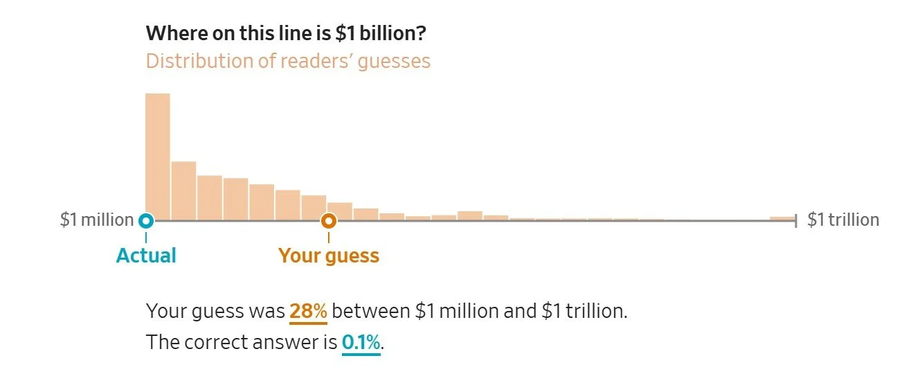
The slider and scrolling are nifty ways to show how much more $1 trillion is than $1 million—one million times more. My guess along the slider was completely off.
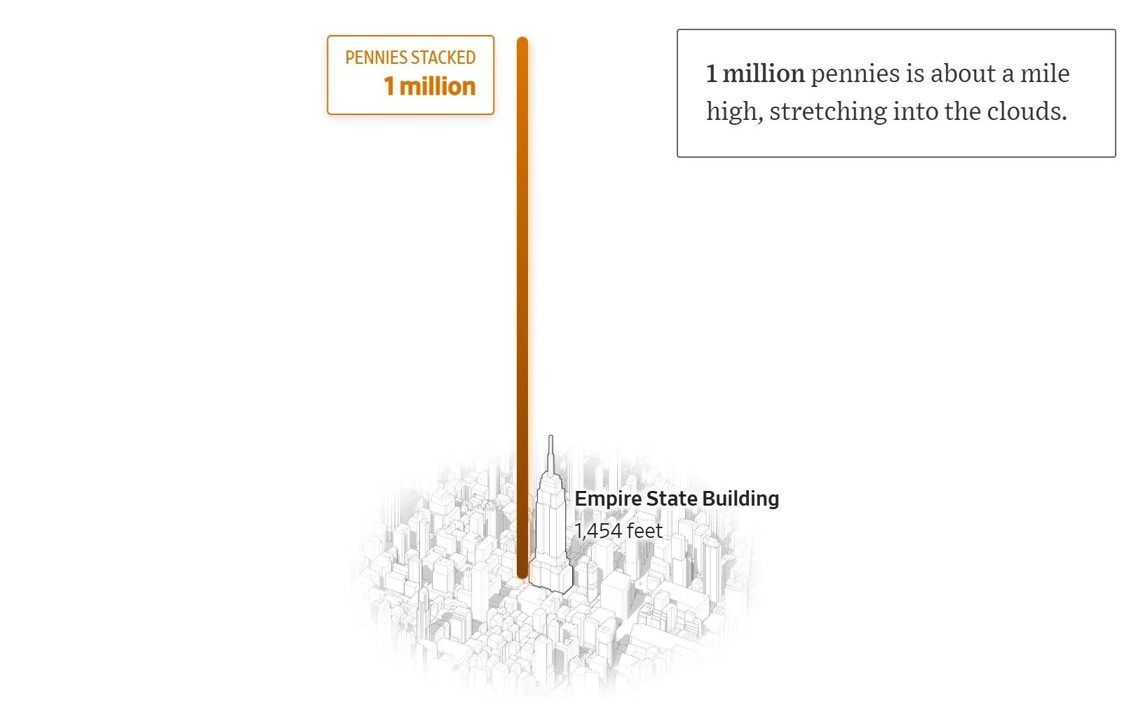
The number of pennies creates a fun illustration, but a billion is too tall to show in this graphic. Also the comparison doesn’t seem to relate to a point. Instead, students may be challenged to think of other ways to visualize $1 trillion. Comparisons should support their communication objectives. Here are a few examples:
IPO success: Compare SpaceX’s valuation to Meta’s IPO valuation.
Market domination: Compare SpaceX’s valuation to that of established Magnificent 7 companies.
Global wealth: Compare Musk’s net worth to the net worth of all billionaires.
Income inequality: Compare Musk’s net worth to that of the average American citizen.
Concentrated wealth: Compare Musk’s net worth to a country’s GDP. (This is a common numerical comparison.)
Government spending: Compare Musk’s net worth to federal budgets for NASA, education, etc.
This exercise may help students translate other numbers in their proposals and presentations, for example, visualizing excessive spending. Of course, they may find ways to normalize large numbers, for example a capital expenditure, if that serves their communication objectives. For Elon Musk’s wealth, that might prove difficult.