
What Label Redesigns Teach Us About Typeface and More
After 50 years, the Campbell’s soup can label got a makeover. The new design illustrates evolving typography and marketing strategies.
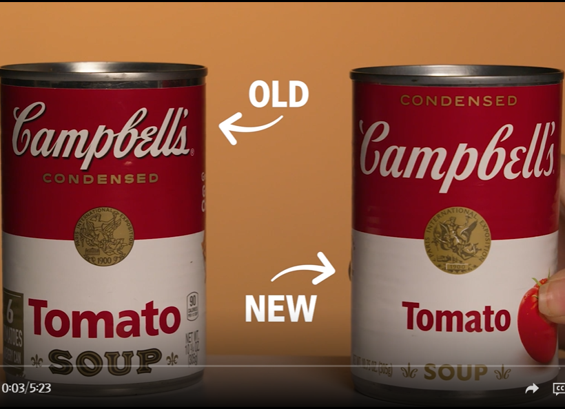
In a Wall Street Journal video, a brand strategist describes the importance of not straying too far from the iconic design (made famous by Andy Warhol), with the goal of looking like something that “feels at home in your pantry versus one that you remember seeing in grandma or grandad’s pantry.” Fun fact: the red and white label was “inspired by the Cornell football team’s uniforms.”
The new design updates the typeface. The company nixed the dated drop shadows with text that looks “simpler, more modern,” as the narrator says. This is a good lesson for students tempted to add text shadows to their PowerPoint decks and other heading text. The “SOUP” text is changed from serif to sans serif without outlining, another more modern look, and it’s smaller—maybe because it’s obvious. The name of the soup (for example, tomato) is smaller too.
Major additions include a picture and descriptions of the ingredients. Slimmer text allowed more space for a tomato to attract younger customers who value healthy ingredients. For chicken noodle soups, the brand expert says the picture makes Campbell’s stand out among others that show a bowl of soup, but I find the chicken and noodle weird looking and unintuitive.

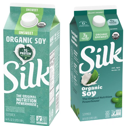
Recently, my soy milk brand was redesigned with similar principles. Note the emphasis on ingredients on the right-side image: the soy bean, green leaf, and subtle leaf shapes in the dot over the “i” and the “k.” We also see finer lettering and more sentence case than all caps. Health benefits are more prominent: 0 sugar and vitamin D. The protein grams are moved left, reflecting a shift from the protein-obsessed heath craze to other customer preferences.
“Milk” appears only at the bottom in fine lettering, maybe pending the lawsuit trying to prevent plant-based products from using the description. The FDA only recently proposed guidelines to allow them to do so.
Students might find these and other product redesign changes interesting and will see ways to incorporate principles into their own page, web, and visual design.