
Four Charts About SVB Don't Tell the Whole Story
WSJ visuals illustrate the failure of Silicon Valley Bank and how four chart types are used for different purposes.
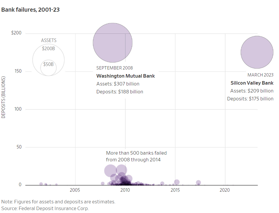
The first is this bubble chart comparing SVB to the next largest bank implosion since 2001: Washington Mutual Bank. The chart—and the article title, “Here is what the second-largest bank failure in U.S. history looks like in graphics”—might exaggerate the issue. Yes, the data and title are accurate, but SVB’s customer base was limited to “a very exclusive group of companies: tech startups and venture-backed health care companies,” as my friends at The Strebel Planning Group explain well. In other words, large, more diversified, and more cautious banks are not likely to fail, despite dramatic headlines.

The second visual, a bar chart (technically a column chart because the bars are vertical), effectively shows when inflows of money turned to outflows. The purple shows the steep, immediate decline, ending in $42 billion—hence, the “run on the bank” that SVB couldn’t cover.
The third graphic is a 2D, stacked area chart, which is used to show the magnitude of a change, something the WSJ clearly wants to emphasize. Again, the chart looks bad, and it is, but a joint statement by the Treasury, Federal Reserve, and FDIC promised to cover all loses, even those not covered by FDIC insurance.

With a simple line chart, the last graphic (not shown here) illustrates how much SVB depended on bonds, which have lost value over time. The chart type is a good choice for showing a change, including a steep incline in 2021.
All these charts illustrate different types well but, at-a-glance, don’t tell the full story. Perhaps one or two more visuals that puts SVB in greater context of other banks would give a more complete picture of the banking industry’s potential exposure. This could ease public concern and maintain confidence in the system.