
Visualizing AI’s Effect on Bond Market
AI borrowing is increasing bond supply, which could push bond yields and borrowing costs up. Students can analyze a Vanguard chart showing corporate debt over time and another, wonky stacked bar.
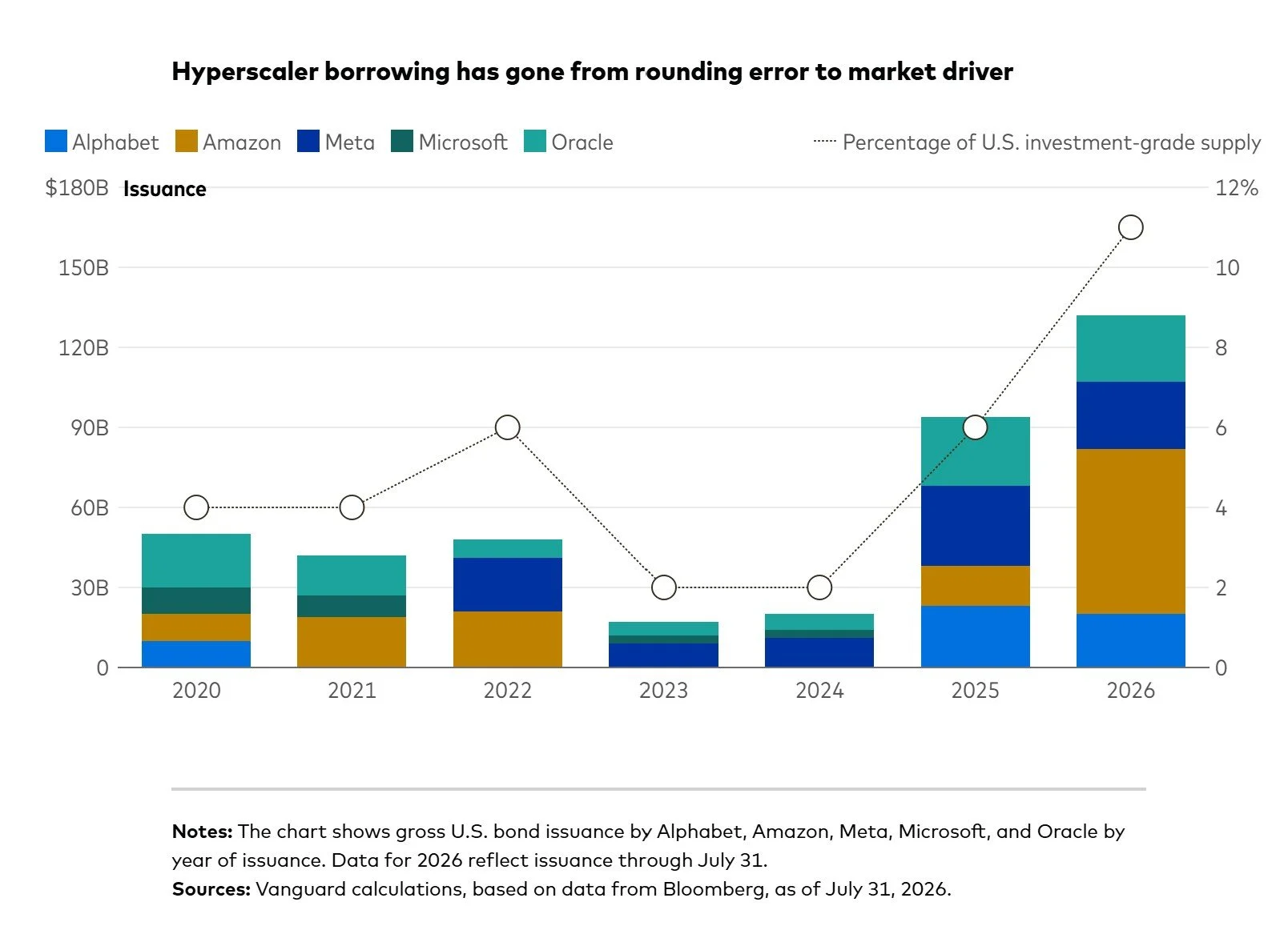
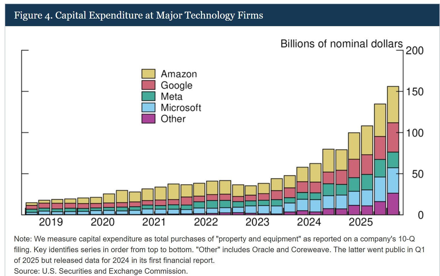
Students might compare the Vanguard chart and the second one, from the Federal Reserve, showing capital expenditure over time for tech companies. With the comparison, the Vanguard rendition looks great. The purpose and audience differ for each, which students might identify. In addition, here are a few points about the visualizations, and students will find more:
The stacked column chart is useful to show parts of a whole over time.
On the Vanguard chart, the second Y-axis is useful but muddies the chart’s purpose.
Blue and green colors next to each other are hard to distinguish, particularly for people who are color blind.
The Fed’s multiple bars are dizzying. Do they represent quarters? Without x-axis date labels for all bars, the differences aren’t meaningful. A link to table data might work better for those interested in more detail.
Both charts lack data labels (at the tops of stacked bars), which would help with comprehension.
The Fed refers to Google, but Google stopped trading as a separate company in 2015, when it’s shares automatically converted to Alphabet.
As the Vanguard article says, this may be “the beginning of a multiyear shift in corporate bond supply.” The AI effect on the corporate bond market includes a higher weight of tech companies’ debt, longer bond maturities, and more private financing of data centers (meaning risk is harder to determine). We saw the impact on the economy this week; falling bond prices typically increase yields, which could make borrowing more expensive for consumers.
Students might create other graphics to show the potential impact on individual investors and consumers. For example, higher mortgage rates and borrowing costs have already affected housing starts. How can students visualize that relationship or trend?