Gates Annual Letter
The Gat es Foundation's 2017 annual letter is far from a traditional annual report. Instead, it's a letter to Warren Buffet, who, in 2006, gave much of his fortune to support the Foundation's work.
The report starts with a 2016 letter from Buffet asking Bill and Melinda Gates to, in part, to help "people better understand why success in philanthropy is measured differently from [sic] success in business or government."
The response focuses on "the stunning gains the poorest people in the world have made over the last 25 years." Data include the number of children's lives saved, 122 million.
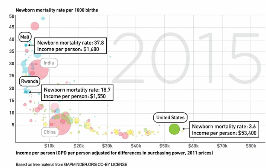
With quotes from Melinda and Bill, the report includes progress on fighting disease and many charts to show declines in mortality rates around the world. We see such a rich variety of chart types: bar, pie, line, area, and area. In addition, the letter includes a table, photos, videos, and a wonderful bubble chart from Gapminder.org, founded by the recently deceased data visualization pro Hans Rosling.
Discussion:
- Analyze the Gates letter. What do you find most and least effective?
- Analyze each chart type against principles in Chapter 9. Is each the best choice for the data displayed? Could any be replaced with a more effective type of chart?
- How are photos and videos used strategically? What is their purpose?
- I wrote "[sic]" within Warren Buffet's quotation. What does this mean?
