
Comparing 404 Error Pages
Students can compare how companies communicate bad news in their 404-page messages. They’ll see differences in tone and brand reinforcement.
Students might first research 404 errors and page functions. In short, a 404 error occurs when a page can’t be found—sometimes when a page was moved or deleted but often when a user mistypes a URL. Unlike 503 errors, which indicate a web server issue, 404 errors may indicate a user error, so these messages need to be gentle.
A custom page keeps people on the site and presents an opportunity to reinforce the brand. Best practices for 404 error pages include the following:
Start with a short heading
Include a short explanation
Suggest navigation options
Avoid heavy graphics so the page loads quickly
Match your brand/website design and tone
Here are a few examples. Students can find their own by going to their favorite companies’ websites and typing nonsense (for example, apple.com/3utyldfj).
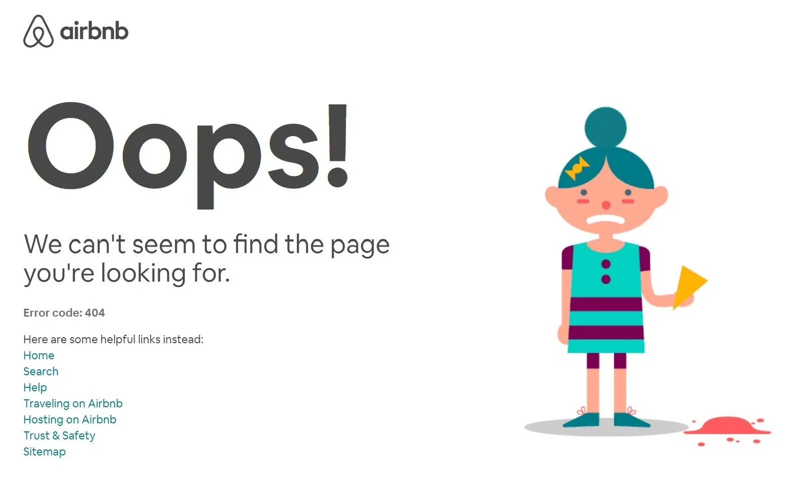
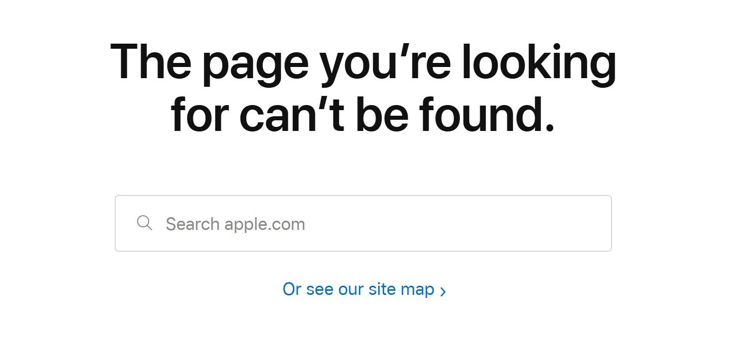
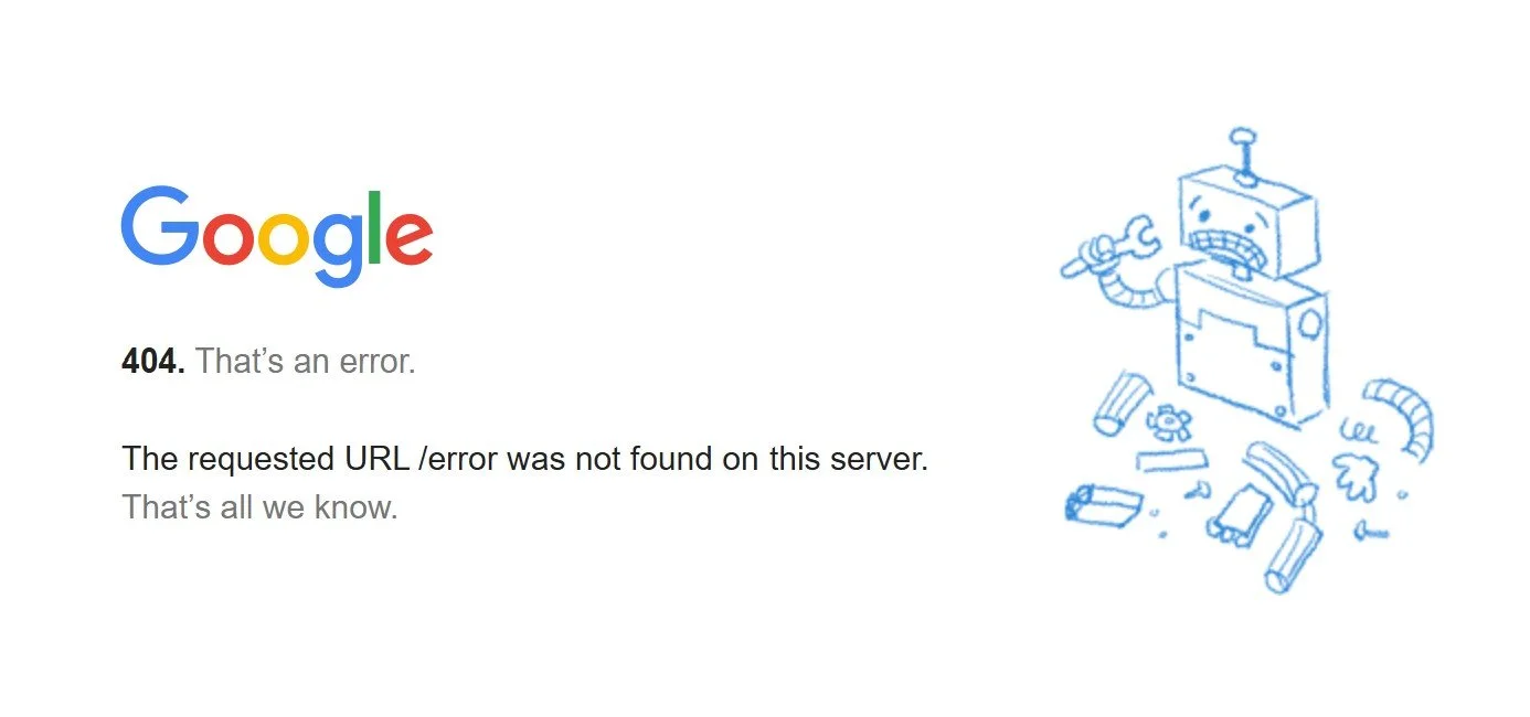
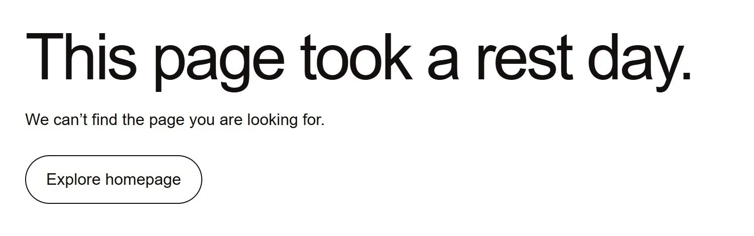
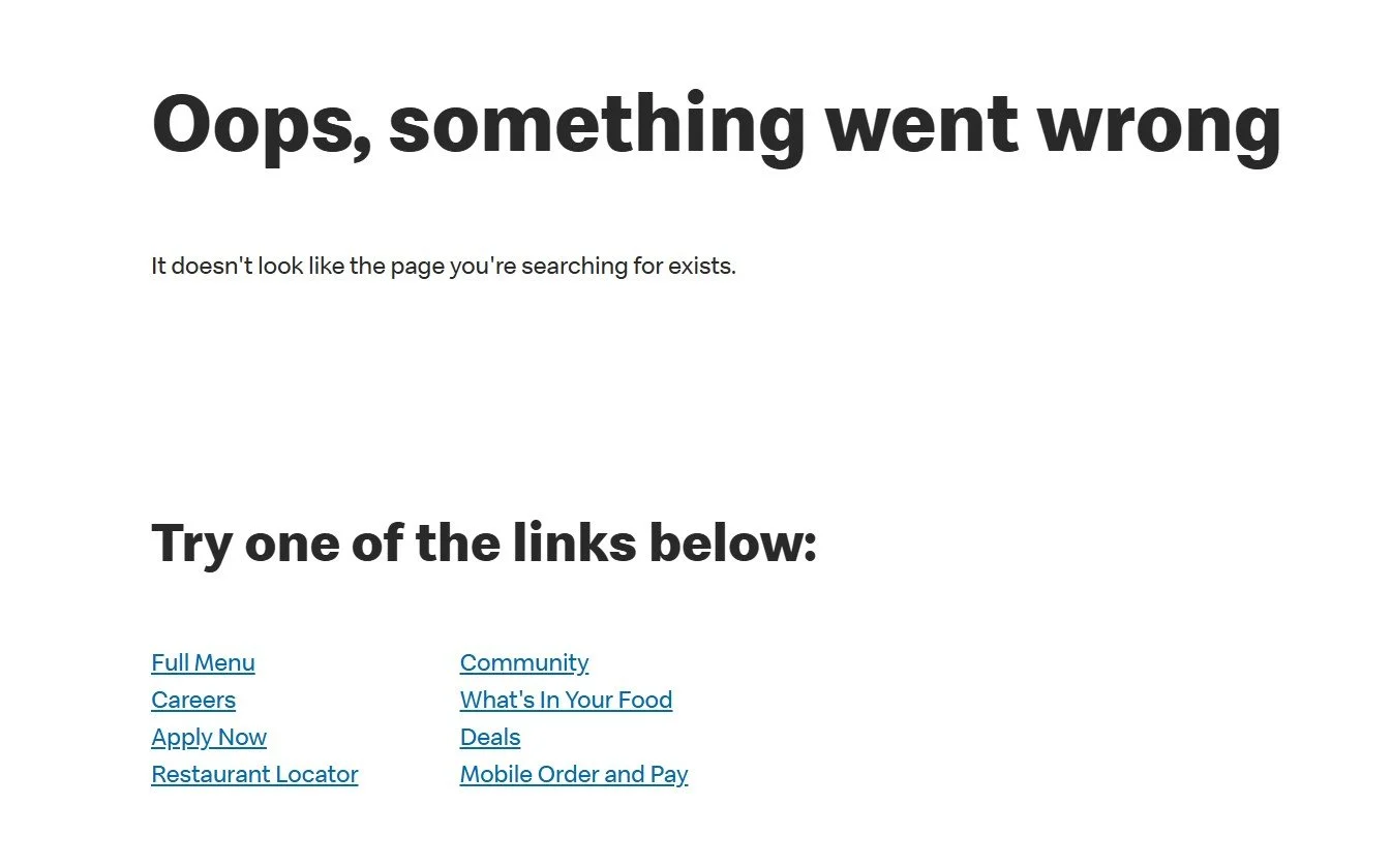
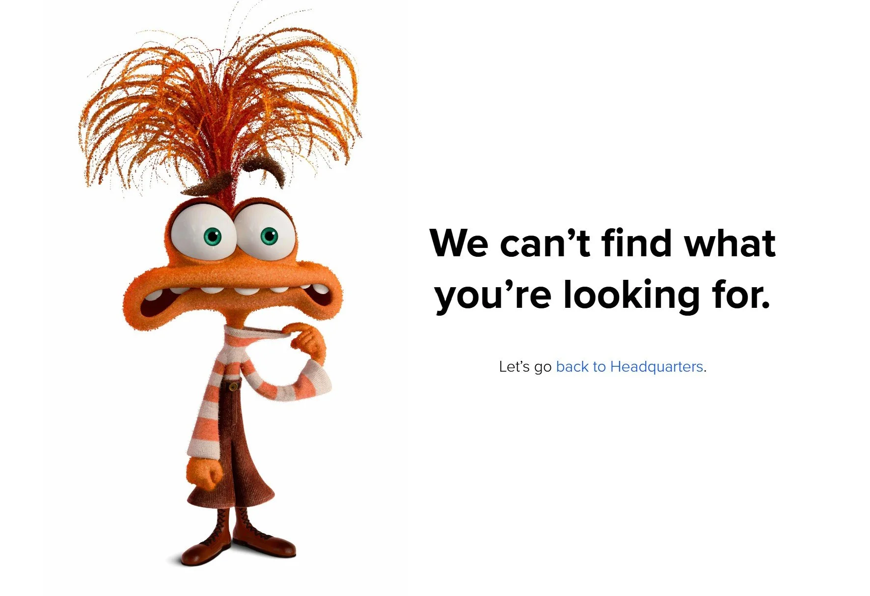
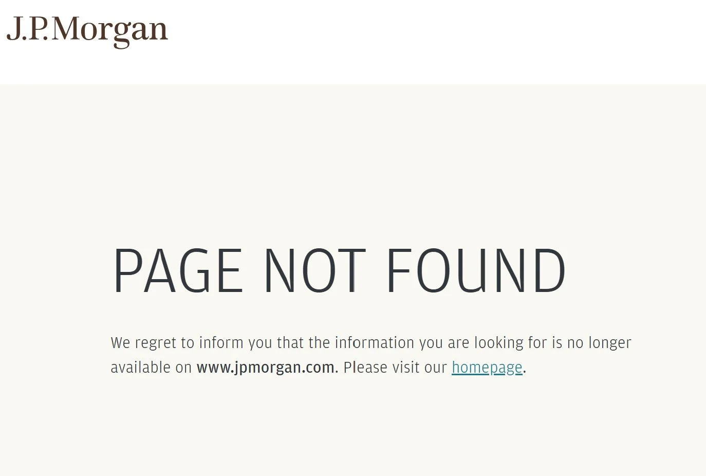
The two “Oops” examples are from folksier business-to-consumer brands, whereas the most formal page, as we would expect, comes from a financial company. J.P. Morgan’s is perhaps too stodgy for a mistyped URL, but it gets credit for being the only one in the bunch with a distinctive cream-colored background. Lululemon gets “on brand” points for connecting the message to exercise, and Pixar’s character is adorable, although the graphic might take longer to load (ditto for Airbnb).
Companies need to balance the cute with the practical. But Google’s is a bit odd: a broken robot cartoon, a formal message, and “That’s all we know,” which sounds like, “Don’t bother us.”