
Amateurs believe the new Coca-Cola font is just like the Marlboro font, but “font nerds” know better, and comparisons to another addictive substance are easy meme fodder.
Announced in a frenetic video emphasizing Coke Zero, the company shows off the new font as iconic, unified, and authentic.
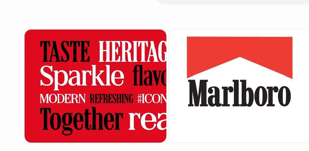
At a glance, Coke’s new font and Marlboro’s may look similar. Both are bold, upright serif typefaces, with high stroke contrast (large differences between thick and thin parts) and sharp wedge serifs (small pointed endings rather than blunt rectangles).
Of course, both brands use similar red and white colors, so the likeness isn’t a stretch. But maybe the graceful little serif lines look old-timey, as in, all old things look alike.
The fonts are quite different. Coke’s lowercase r ends in an arrow, while Marlboro’s ends in a circle. Also, the Coke r’s foot is angled at the bottom, while Marlboro’s is a right angle. Looking at the lowercase a in each, Coke’s stroke begins with a pointed edge, while Marlboro’s is rounded; the foot is rectangular, while Marlboro’s is round. For what it’s worth, the Coca-Cola typeface is custom, while Marlboro uses Neo Contact.
One article, “Everyone's saying the same thing about the new Coca-Cola font” (ad populum), describes the likeness as an “awkward resemblance,” as people refer to Coke as a “fridge cigarette.” An X post is funny: “Love that they just leaned into the fact that soda is the new cigarettes by just straight up doing the Marlboro font.”
Students might discuss whether Coca-Cola, its branding agency, or the type designer should have been more careful to avoid the association. In defense, the designer explains the history, which builds on previous fonts for the company.